Showing 365 slides
in Data Visualization

View full slide →
✓
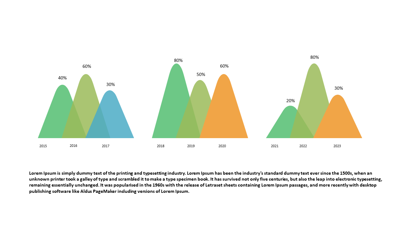
Represent percentage distributions effectively with this triangular area chart.
View full slide →
✓
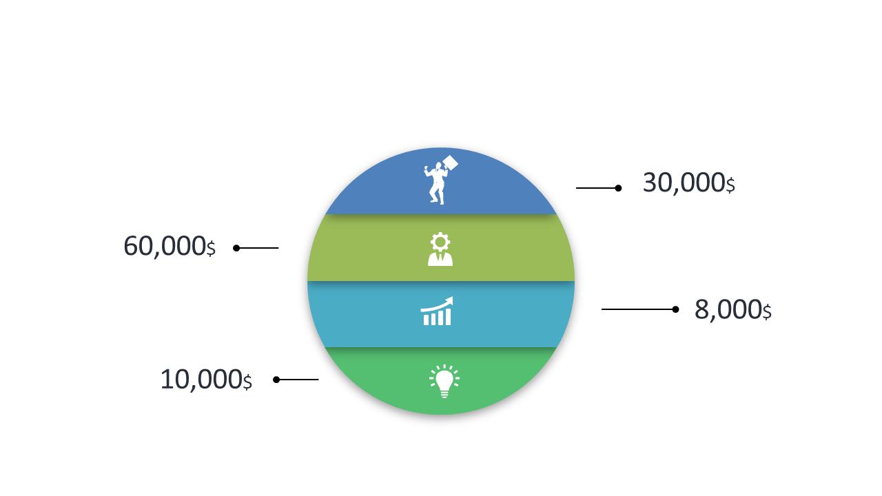
Engage your audience with a segmented doughnut chart for effective data visualization.
View full slide →
✓
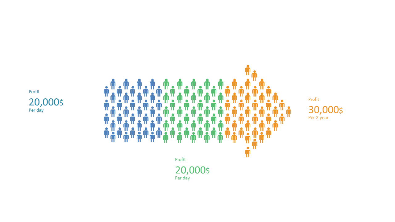
Visualize profit data over time using this engaging layout with icons and arrows.
View full slide →
✓
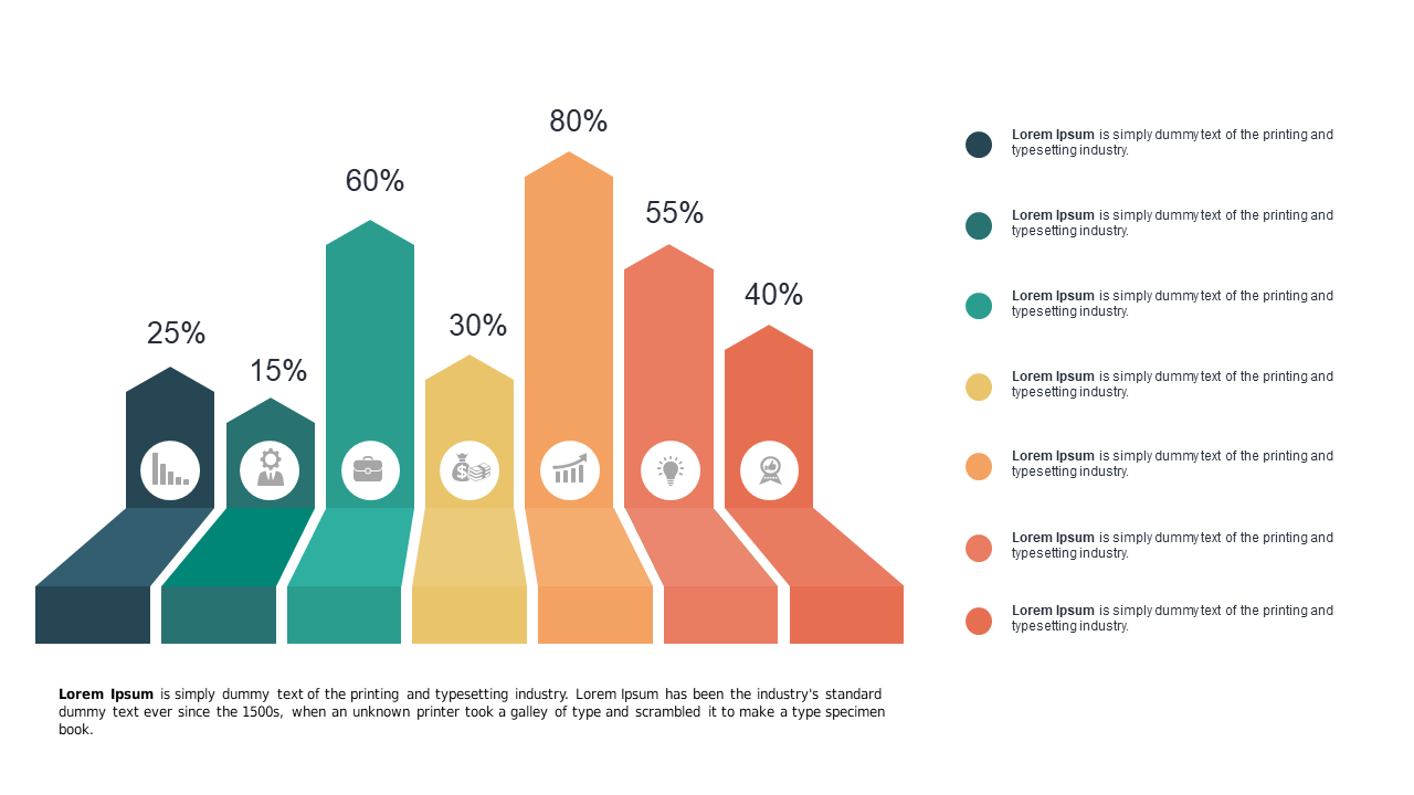
Use this colorful step chart to visualize trends and data comparisons effectively.
View full slide →
✓
Engage your audience with colorful progress bars for effective KPI representation in PowerPoint and Google Slides.
View full slide →
✓
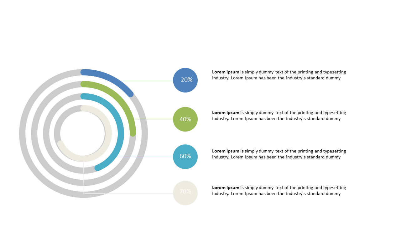
Enhance your presentations with circular progress indicators for effective data visualization.
View full slide →
✓
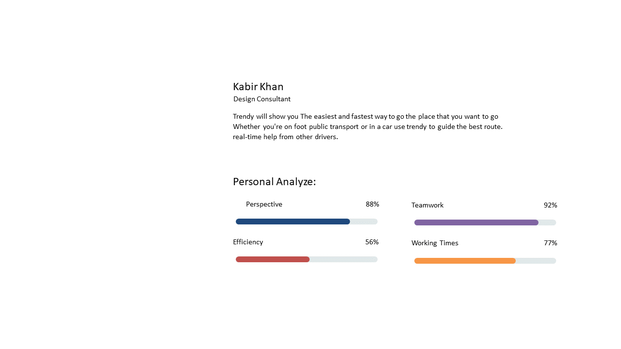
Present personal performance metrics using this editable bar chart template.
View full slide →
✓
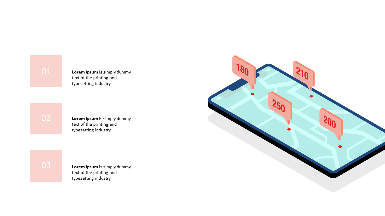
Present geolocation analytics effectively with this smartphone map layout in PowerPoint.
View full slide →
✓
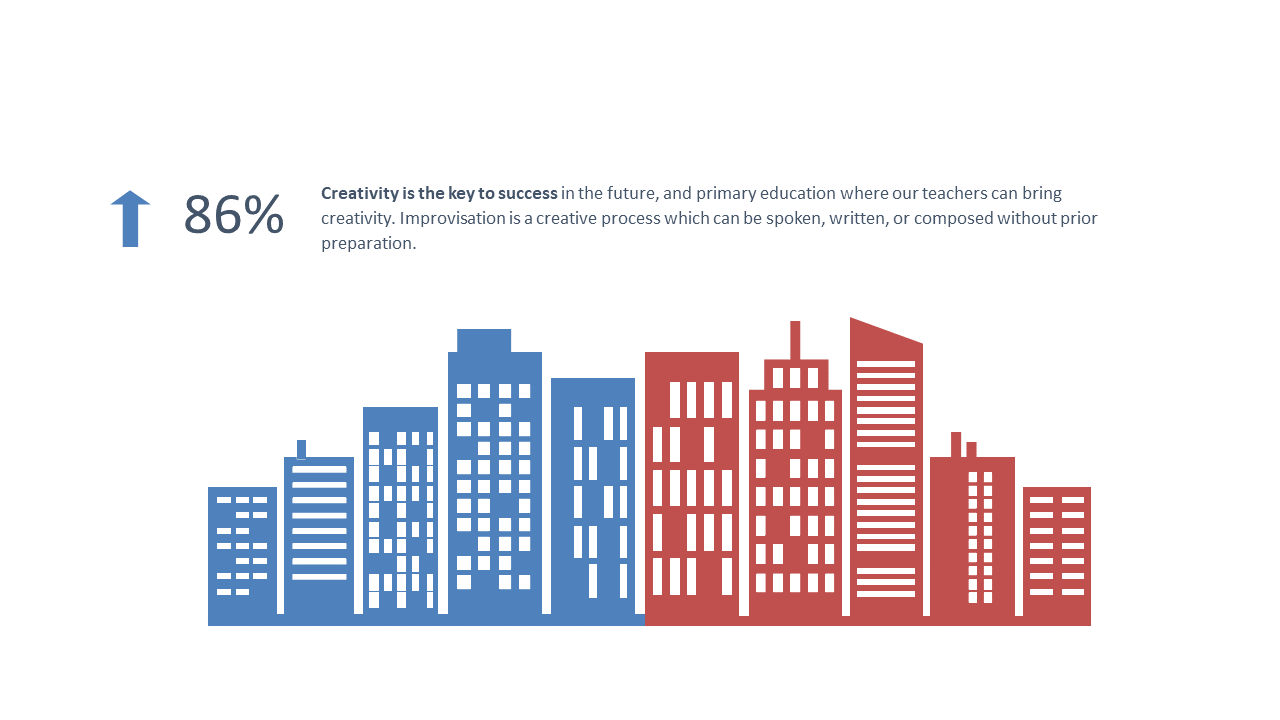
Use this engaging city skyline visualization to present creativity metrics in PowerPoint and Google Slides.
View full slide →
✓
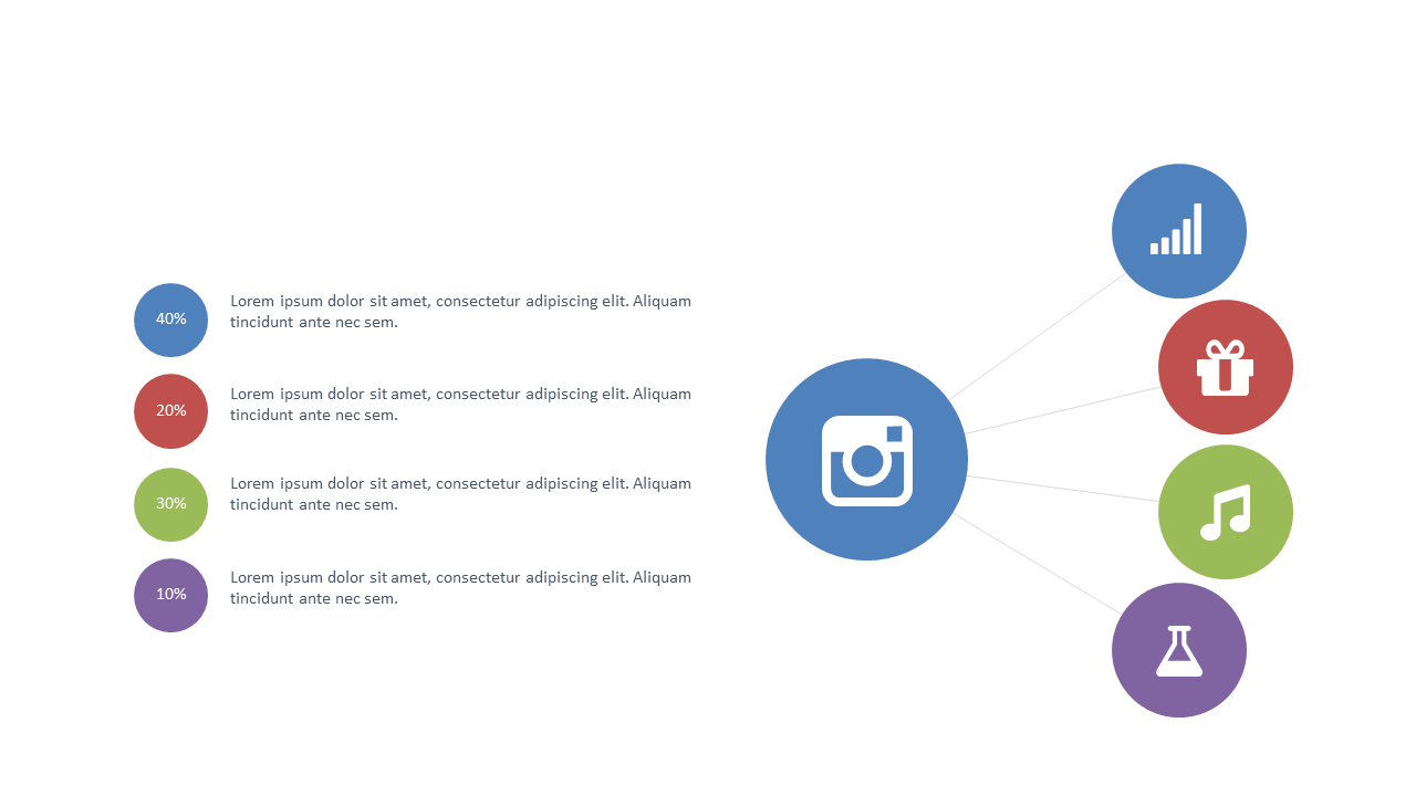
Showcase social media metrics with this editable layout for presentations.
View full slide →
✓
Visualize social media engagement metrics with editable layouts.
View full slide →
✓
Present social media engagement data visually with customizable designs.
 SlideSwift