SlideSwift
By Category
💼Business 📊Infographics □Minimal 🕐Timelines ✨Neumorphic 🗑Diagrams 🔄Flow Charts ✨Glassmorphism 🎨Creative 🌍Abstract 🔄Cycle Diagrams 💎Isometric 🖼Illustrations 📱Social Media 🗺MapsBy Slide Type
🚀Pitch Deck 📌Roadmap 🔍SWOT Analysis 📅Timeline 📈Gantt Chart 🏢Org Chart 📋Funnel ⚖Comparison 📄Case Study 📋Agenda ⭐Icons & Lists 👏Thank You
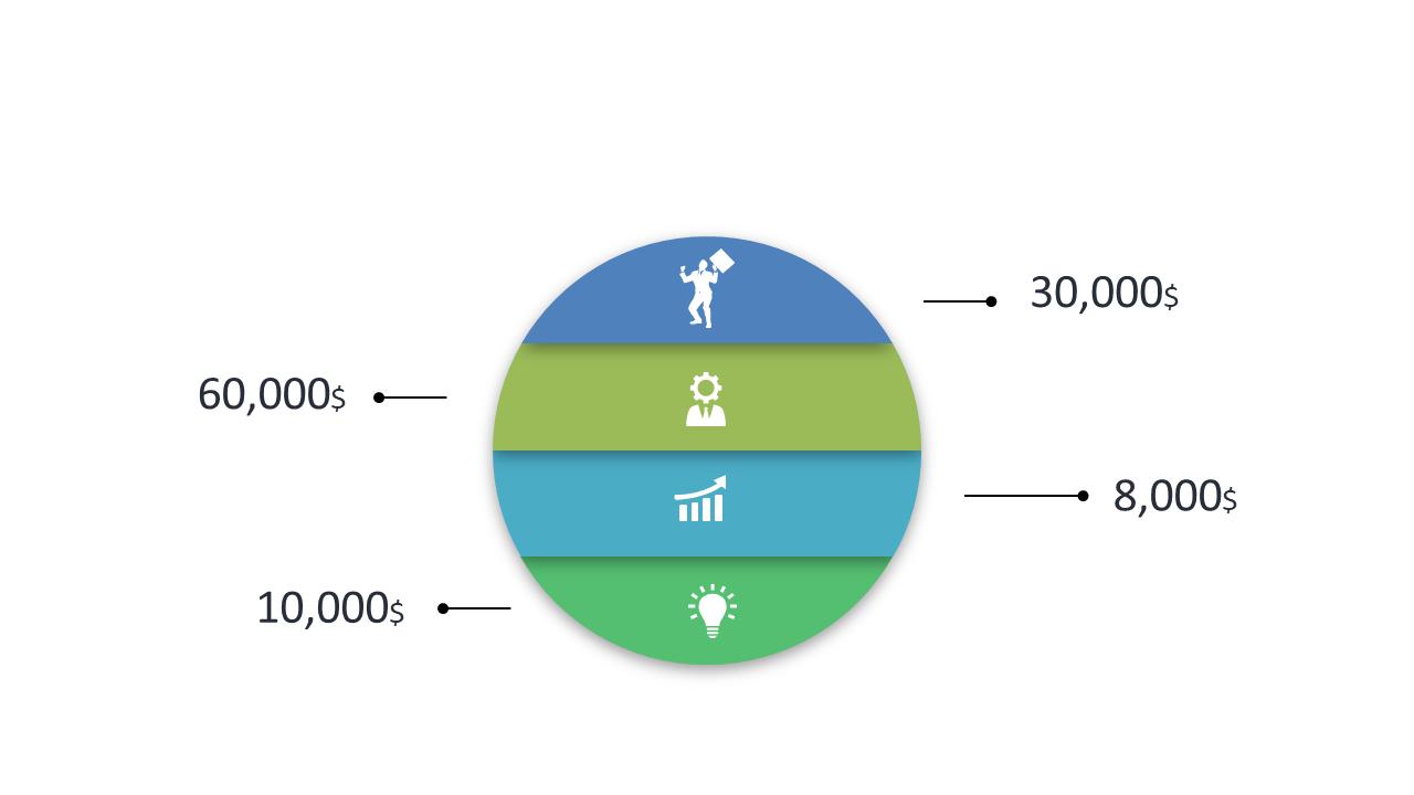
When you’re presenting financial data, clarity is key. It’s easy to get lost in numbers and percentages, leaving your audience confused about the insights you want to convey. This segmented doughnut chart slide provides a straightforward way to visualize your data categories using distinct color bands, making it easy for viewers to grasp the information at a glance. Each segment is labeled with values, ensuring your audience understands the breakdown of financial allocations or market segments. For the finance lead, this slide is perfect for showcasing budget allocations during team meetings. A data analyst can use it to highlight trends in financial performance over different periods, allowing for informed decision-making. Meanwhile, a business analyst can present market segment analysis to stakeholders, illustrating how different segments contribute to overall performance. You can easily customize the colors to match your brand or presentation theme. $0.99 — add this single slide to any deck from the SlideSwift Slide Library. No subscription needed. Mix slides from any category to build your perfect deck.
Add more from this category to your custom deck