SlideSwift
By Category
💼Business 📊Infographics □Minimal 🕐Timelines ✨Neumorphic 🗑Diagrams 🔄Flow Charts ✨Glassmorphism 🎨Creative 🌍Abstract 🔄Cycle Diagrams 💎Isometric 🖼Illustrations 📱Social Media 🗺MapsBy Slide Type
🚀Pitch Deck 📌Roadmap 🔍SWOT Analysis 📅Timeline 📈Gantt Chart 🏢Org Chart 📋Funnel ⚖Comparison 📄Case Study 📋Agenda ⭐Icons & Lists 👏Thank You
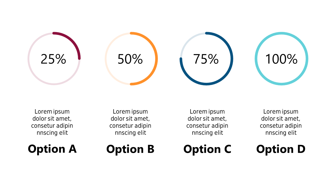
Understanding earnings and metrics can be a challenge, especially when trying to convey complex data in a way that is easily digestible. You need a solution that allows for quick comparisons and clear insights to inform your decisions. This circle chart is designed to visually represent earnings and audience metrics over a timeframe, making it easier to grasp trends at a glance. With clean lines and distinct sections, this slide helps your audience follow the data without confusion. A finance lead can use this slide to present quarterly earnings alongside key performance indicators in a meeting. A data analyst can drop this chart into their report to highlight significant changes in audience engagement metrics over the months. Similarly, a business analyst might find it useful for showcasing year-over-year growth and market trends in a client presentation. Feel free to customize the titles and data values to fit your needs perfectly. $0.99 — add this single slide to any deck from the SlideSwift Slide Library. No subscription needed. Mix slides from any category to build your perfect deck.
Add more from this category to your custom deck