SlideSwift
By Category
💼Business 📊Infographics □Minimal 🕐Timelines ✨Neumorphic 🗑Diagrams 🔄Flow Charts ✨Glassmorphism 🎨Creative 🌍Abstract 🔄Cycle Diagrams 💎Isometric 🖼Illustrations 📱Social Media 🗺MapsBy Slide Type
🚀Pitch Deck 📌Roadmap 🔍SWOT Analysis 📅Timeline 📈Gantt Chart 🏢Org Chart 📋Funnel ⚖Comparison 📄Case Study 📋Agenda ⭐Icons & Lists 👏Thank You
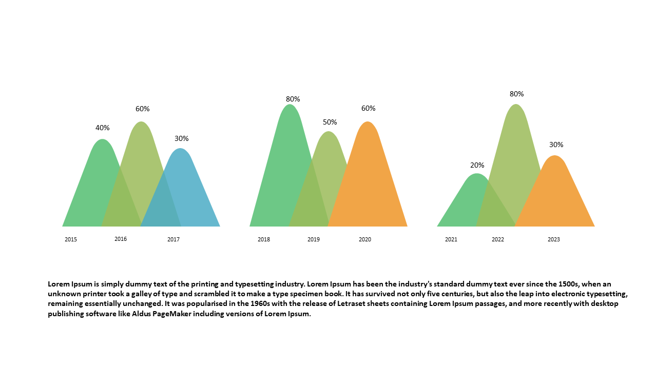
In today’s fast-paced environment, conveying complex data simply is a challenge many face. This triangular area chart is designed to visualize percentage distributions, allowing you to effectively communicate trends over multiple years. With its unique shape, this chart stands out in any PowerPoint presentation, making it easier for your audience to grasp the key insights at a glance. A business analyst can use this slide to present historical data, emphasizing shifts in engagement metrics over time. Meanwhile, a BI developer might incorporate this chart into a dashboard setup, allowing stakeholders to quickly understand performance metrics. For finance leads, this slide simplifies the analysis of budget allocations and variances, fostering more informed decision-making. You can easily customize this chart by editing the data points to fit your specific needs. $0.99 — add this single slide to any deck from the SlideSwift Slide Library. No subscription needed. Mix slides from any category to build your perfect deck.
Add more from this category to your custom deck