Showing 117 slides
in Charts and Graphs

View full slide →
✓
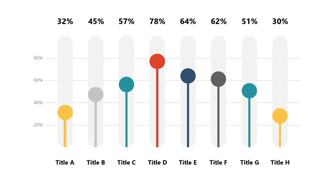
Visualize data comparisons effectively using horizontal bar charts with circle indicators in PowerPoint and Google Slides.
View full slide →
✓
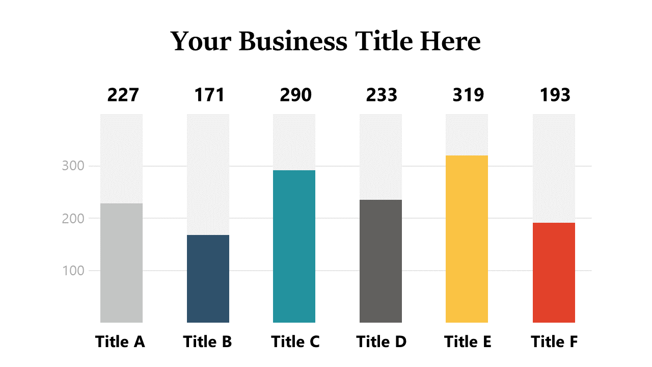
Utilize vertical bar charts with data labels for clear business data comparisons in PowerPoint and Google Slides.
View full slide →
✓
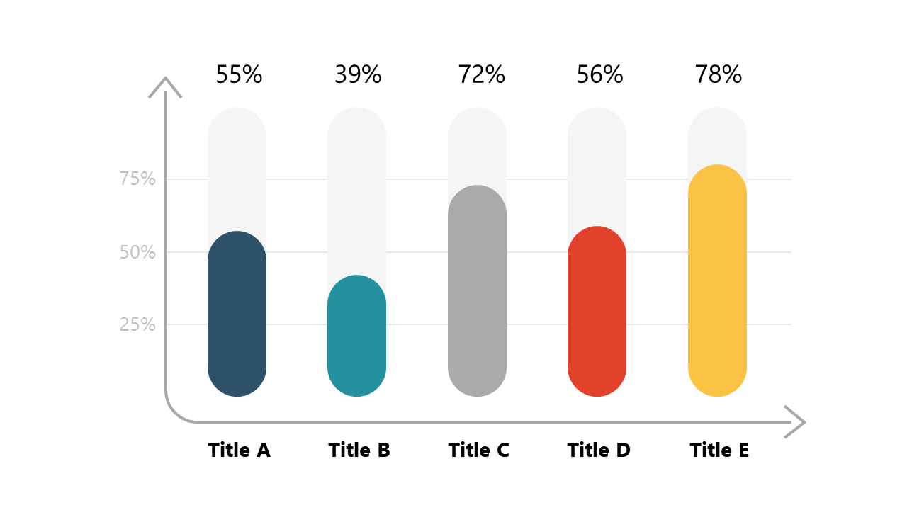
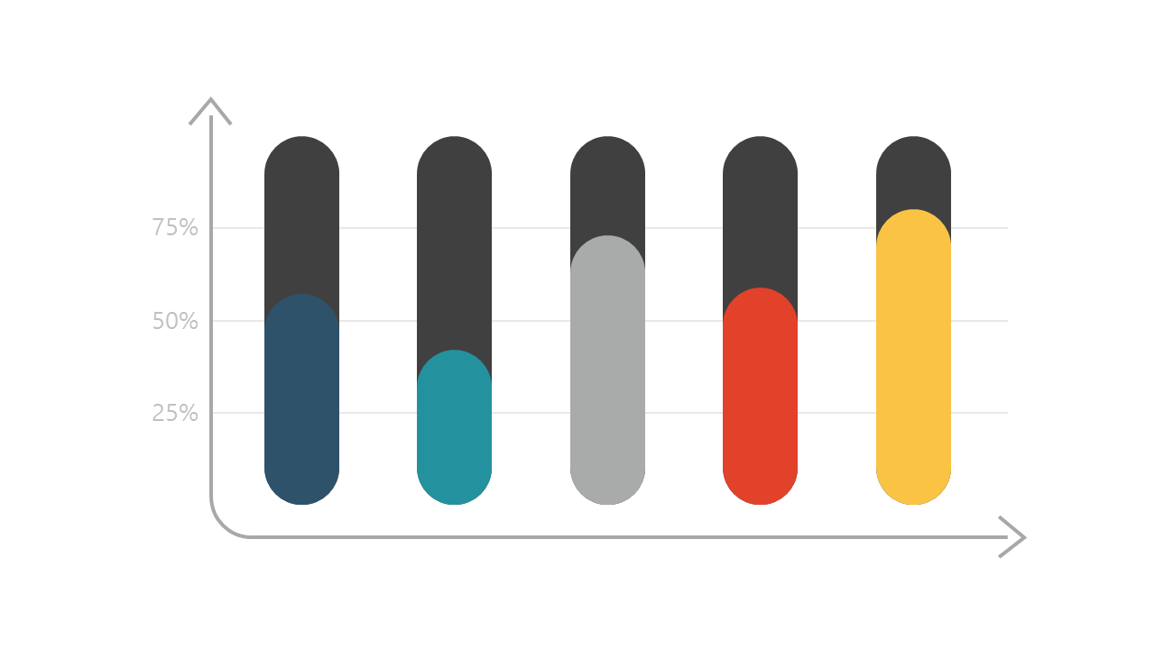
Present percentage comparisons clearly using vertical bar charts in PowerPoint and Google Slides.
View full slide →
✓
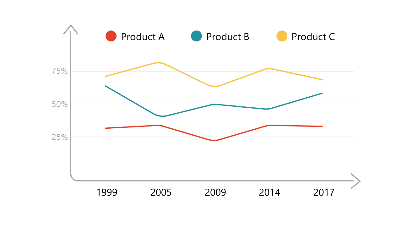
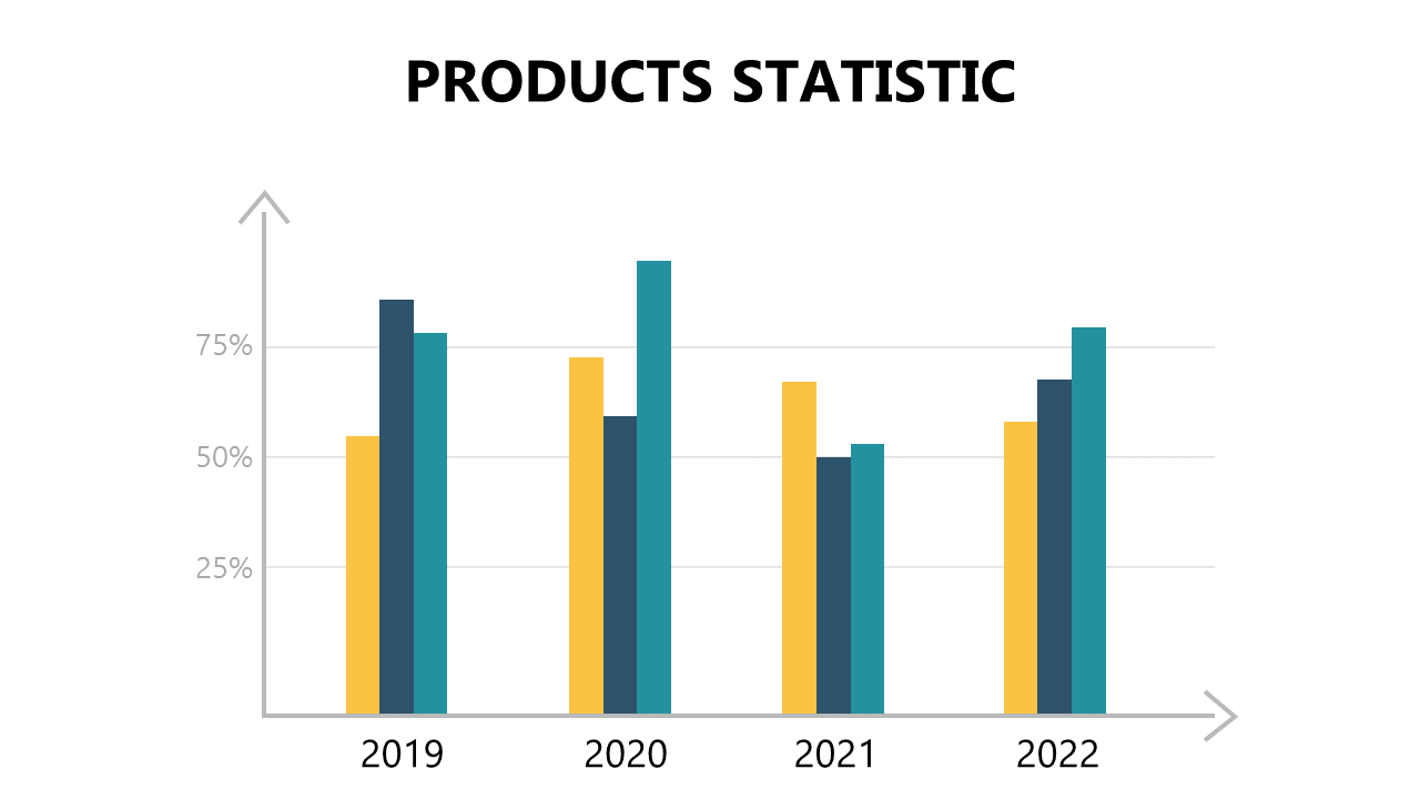
Use trend line charts in PowerPoint or Google Slides to analyze product performance over time.
View full slide →
✓
Use this colorful vertical bar chart for effective data visualization in business presentations.
View full slide →
✓
Illustrate quantitative comparisons using this segmented bar chart design in PowerPoint.
View full slide →
✓
Use color-coded bar charts in PowerPoint or Google Slides to visualize progress and performance metrics.
View full slide →
✓
Utilize horizontal bar charts in PowerPoint or Google Slides for effective data comparisons and performance visualization.
View full slide →
✓
Utilize this vertical bar chart with trend arrow in PowerPoint to visualize performance metrics effectively.
View full slide →
✓
Showcase statistical data trends using this vertical bar chart with trend arrow in PowerPoint.
View full slide →
✓
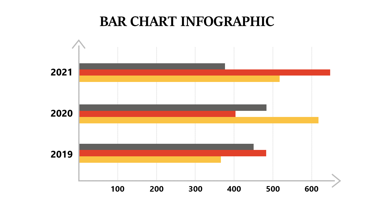
Use this horizontal bar chart with color variations to present comparative metrics in PowerPoint.
View full slide →
✓
Effectively visualize comparative data using this horizontal bar chart with color variations in PowerPoint.
 SlideSwift