SlideSwift
By Category
💼Business 📊Infographics □Minimal 🕐Timelines ✨Neumorphic 🗑Diagrams 🔄Flow Charts ✨Glassmorphism 🎨Creative 🌍Abstract 🔄Cycle Diagrams 💎Isometric 🖼Illustrations 📱Social Media 🗺MapsBy Slide Type
🚀Pitch Deck 📌Roadmap 🔍SWOT Analysis 📅Timeline 📈Gantt Chart 🏢Org Chart 📋Funnel ⚖Comparison 📄Case Study 📋Agenda ⭐Icons & Lists 👏Thank You
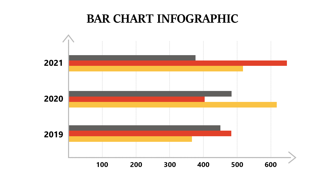
As a business analyst, you often navigate through a sea of data, and the challenge is to present it clearly. This slide provides a striking horizontal bar chart that simplifies complex information, making your data comparisons straightforward. The design enables quick updates to colors and data values so you can customize it to fit your needs. For a reporting manager, this slide serves as an effective tool to showcase project metrics and performance indicators, keeping stakeholders informed at a glance. A data analyst can leverage this chart to highlight trends over time in a presentation, making it easier for the audience to grasp insights without getting lost in numbers. With its user-friendly layout, you can easily adjust the details to match your presentation style. $0.99 — add this single slide to any deck from the SlideSwift Slide Library. No subscription needed. Mix slides from any category to build your perfect deck.
Add more from this category to your custom deck