SlideSwift
By Category
💼Business 📊Infographics □Minimal 🕐Timelines ✨Neumorphic 🗑Diagrams 🔄Flow Charts ✨Glassmorphism 🎨Creative 🌍Abstract 🔄Cycle Diagrams 💎Isometric 🖼Illustrations 📱Social Media 🗺MapsBy Slide Type
🚀Pitch Deck 📌Roadmap 🔍SWOT Analysis 📅Timeline 📈Gantt Chart 🏢Org Chart 📋Funnel ⚖Comparison 📄Case Study 📋Agenda ⭐Icons & Lists 👏Thank You
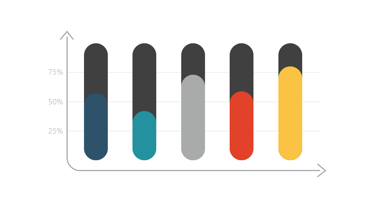
When you’re faced with the challenge of presenting complex data in a clear and engaging manner, a well-designed chart can make all the difference. This slide showcases a horizontal bar chart with rounded edges and vibrant colors, making it easy to compare different metrics visually. The intuitive design not only grabs attention but also aids in understanding key data points at a glance. As a business analyst, you can use this slide to display performance metrics and drive impactful discussions in your next meeting. A reporting manager can leverage this chart to illustrate quarterly sales comparisons, making it easier for stakeholders to grasp trends. Meanwhile, data analysts can utilize this slide to represent survey results, ensuring that the insights are delivered with clarity and precision. Customizing this slide is a breeze; simply adjust the colors and data to fit your specific needs. $0.99 — add this single slide to any deck from the SlideSwift Slide Library. No subscription needed. Mix slides from any category to build your perfect deck.
Add more from this category to your custom deck