Showing 365 slides
in Data Visualization

View full slide →
✓
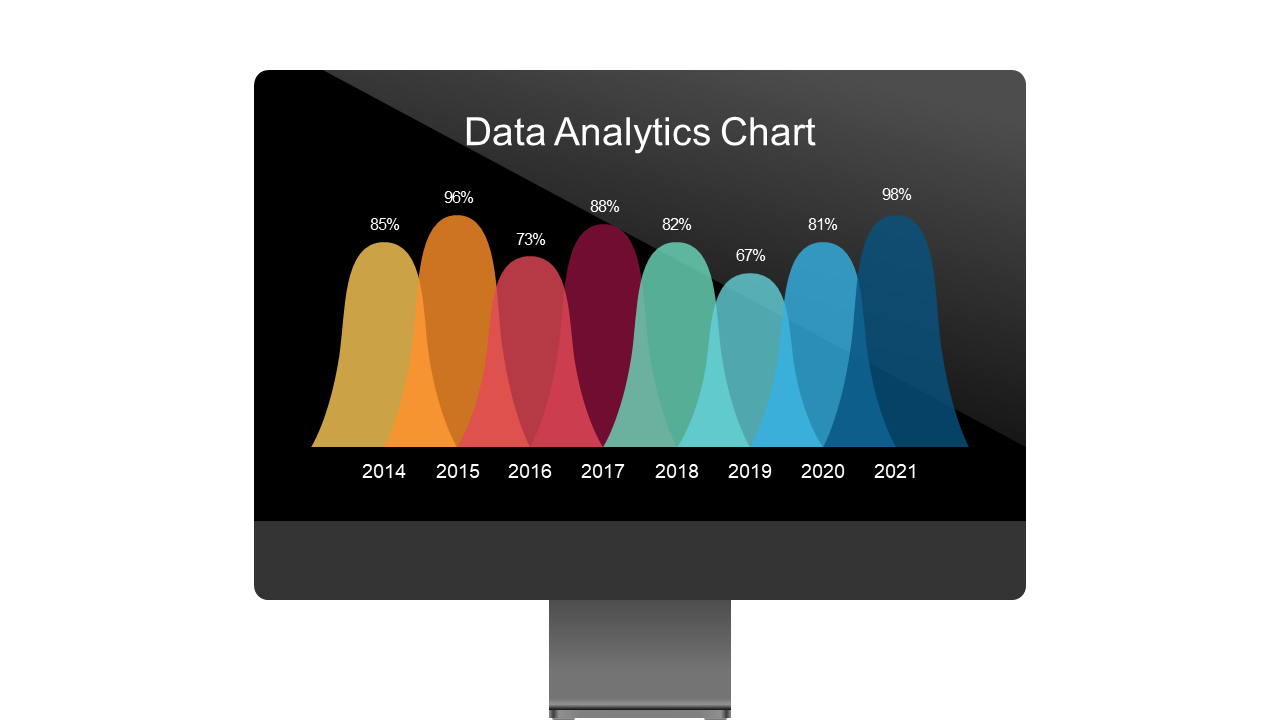
Showcase analytics over time with a multi-year area chart layout.
View full slide →
✓
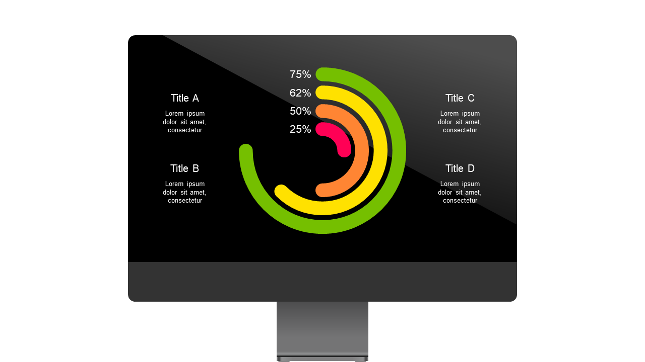
Engage audiences with circular progress indicators for performance metrics.
View full slide →
✓
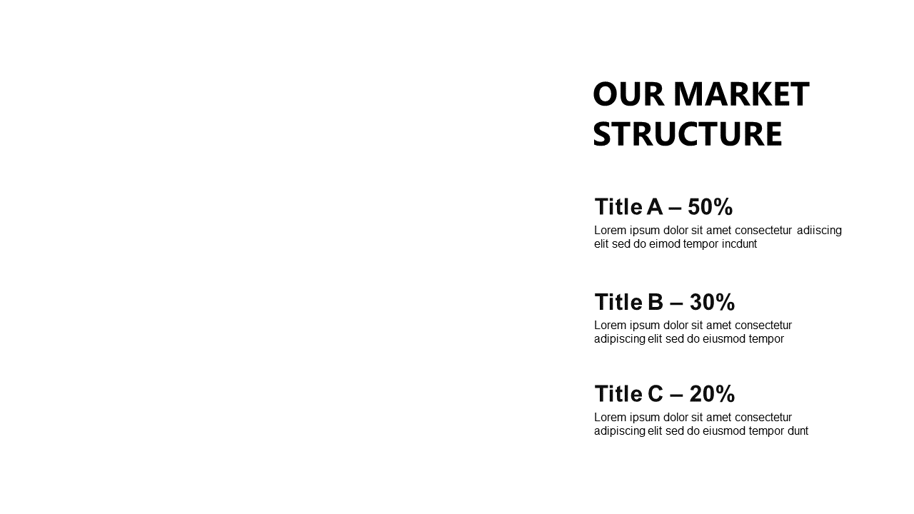
Present market segment distributions clearly with this editable layout for PowerPoint and Google Slides.
View full slide →
✓
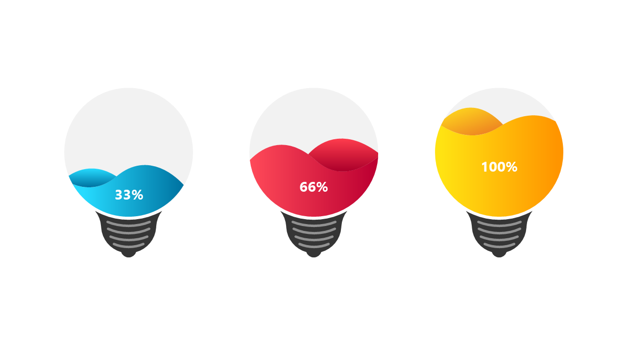
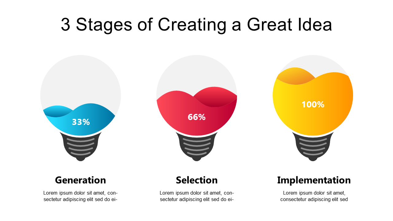
Visualize progress using colorful light bulb indicators for marketing and project management.
View full slide →
✓
Showcase progress visually with colorful light bulb indicators for impactful presentations.
View full slide →
✓
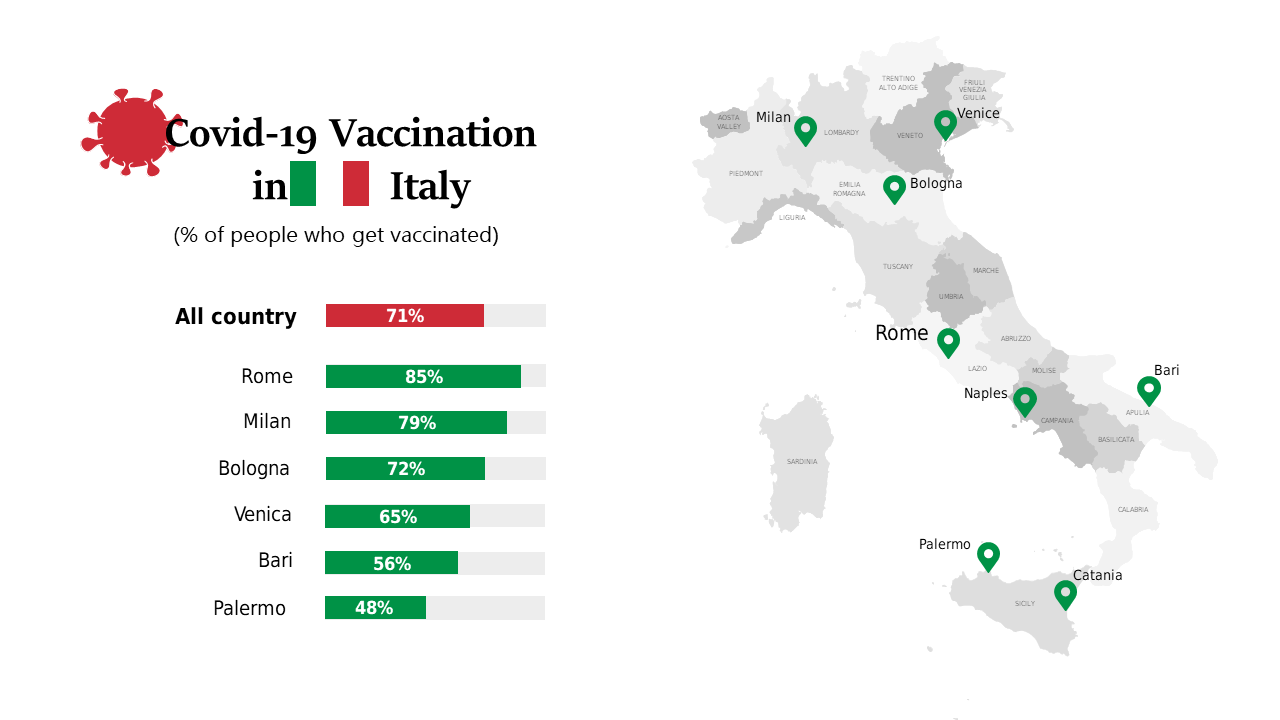
Present vaccination data in Italy using a map and bar graph for clear communication.
View full slide →
✓
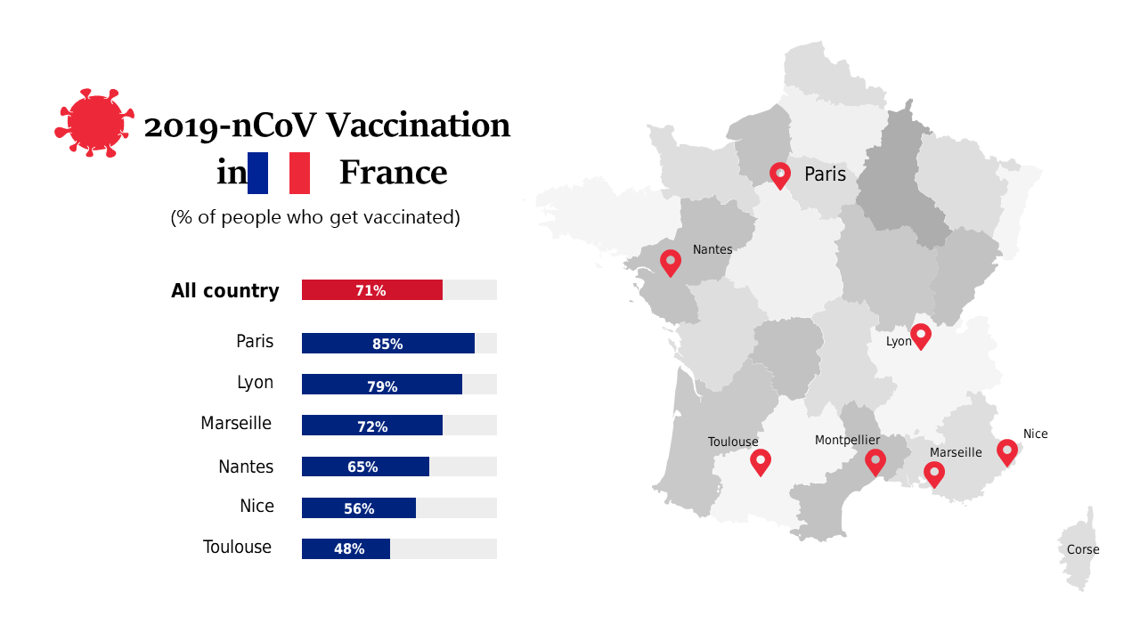
Explore vaccination rates in France with this editable map for healthcare professionals.
View full slide →
✓
Show COVID-19 vaccination rates by city in France with this customizable data visualization slide.
View full slide →
✓
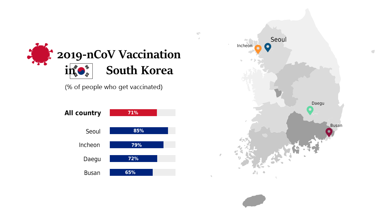
Present vaccination rates by region in South Korea with this clear map and data visualization.
View full slide →
✓
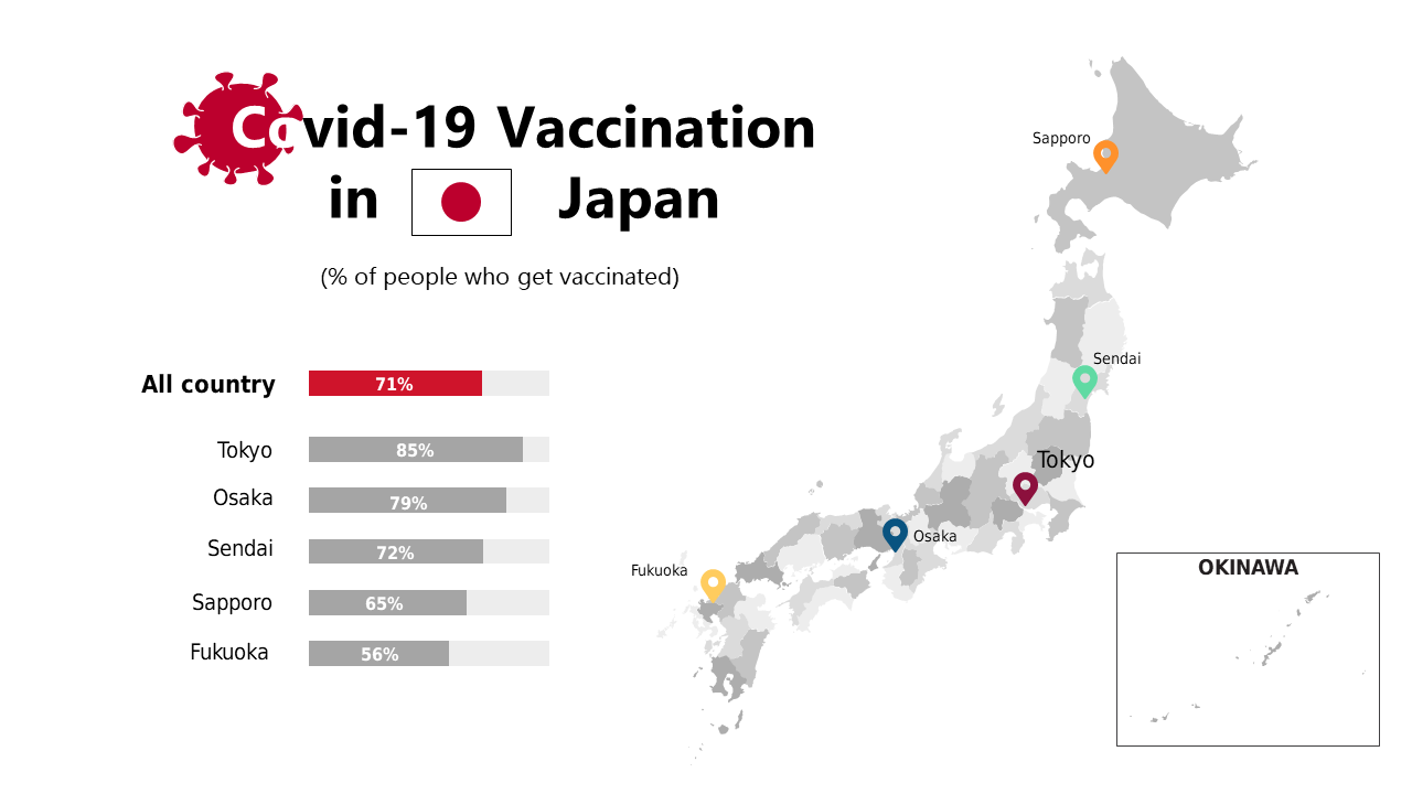
Showcase vaccination statistics in Japan using a combined map and bar chart layout.
View full slide →
✓
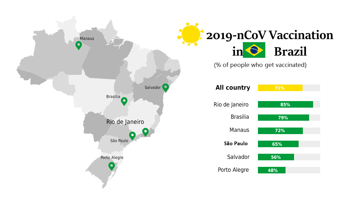
Present vaccination rates across Brazilian cities with this informative map layout.
View full slide →
✓
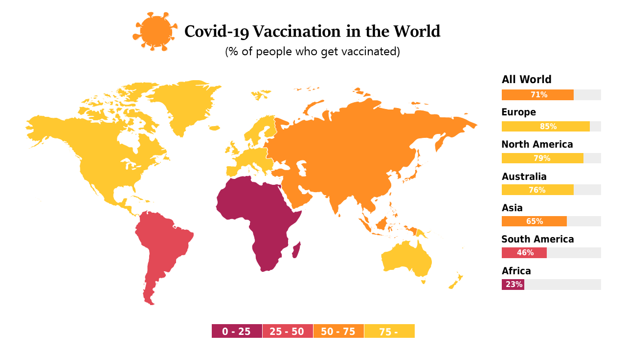
Visualize global COVID-19 vaccination rates with this customizable map for health professionals.
 SlideSwift