SlideSwift
By Category
💼Business 📊Infographics □Minimal 🕐Timelines ✨Neumorphic 🗑Diagrams 🔄Flow Charts ✨Glassmorphism 🎨Creative 🌍Abstract 🔄Cycle Diagrams 💎Isometric 🖼Illustrations 📱Social Media 🗺MapsBy Slide Type
🚀Pitch Deck 📌Roadmap 🔍SWOT Analysis 📅Timeline 📈Gantt Chart 🏢Org Chart 📋Funnel ⚖Comparison 📄Case Study 📋Agenda ⭐Icons & Lists 👏Thank You
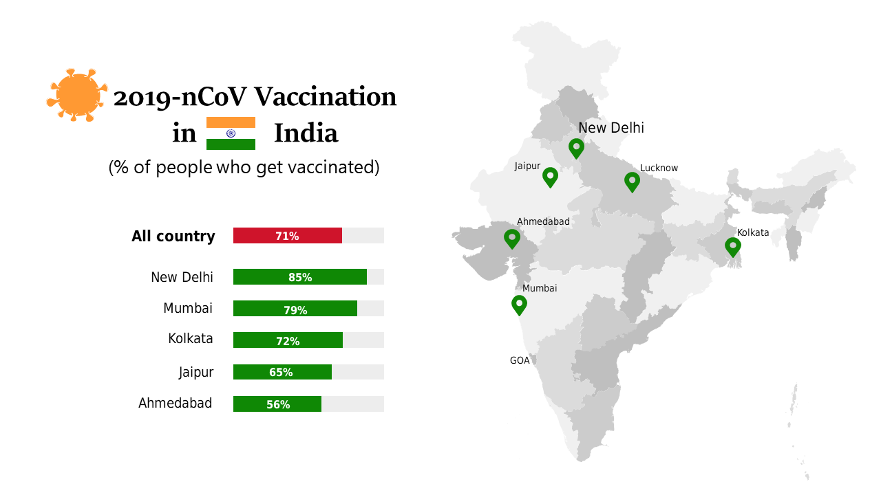
Understanding vaccination rates is crucial for making informed decisions, especially in the finance sector where public health impacts economic stability. This slide offers a detailed map visualizing COVID-19 vaccination rates across major cities in France, clearly displaying percentage data that’s easy to interpret. As a finance lead, you can use this slide to present data-driven insights to your stakeholders about health trends and their potential economic implications. Similarly, data analysts will find this slide valuable for visualizing complex datasets, enabling them to pinpoint areas of concern or success in vaccination efforts. For business analysts, the information presented can facilitate discussions on how vaccination rates correlate with economic performance in different regions. Customizing the map with specific colors or additional data points is simple, ensuring that it meets your unique presentation needs. $0.99 — add this single slide to any deck from the SlideSwift Slide Library. No subscription needed. Mix slides from any category to build your perfect deck.
Add more from this category to your custom deck