SlideSwift
By Category
💼Business 📊Infographics □Minimal 🕐Timelines ✨Neumorphic 🗑Diagrams 🔄Flow Charts ✨Glassmorphism 🎨Creative 🌍Abstract 🔄Cycle Diagrams 💎Isometric 🖼Illustrations 📱Social Media 🗺MapsBy Slide Type
🚀Pitch Deck 📌Roadmap 🔍SWOT Analysis 📅Timeline 📈Gantt Chart 🏢Org Chart 📋Funnel ⚖Comparison 📄Case Study 📋Agenda ⭐Icons & Lists 👏Thank You
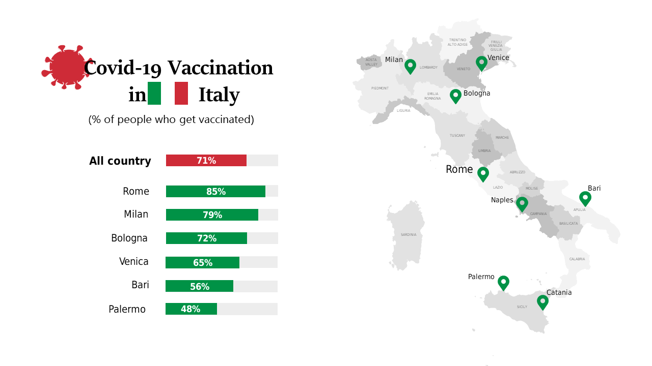
In today’s fast-paced environment, having clear and impactful data is essential. Presenting COVID-19 vaccination rates can be challenging, especially when aiming to communicate complex information effectively. This slide provides a geographic map of Italy that highlights vaccination rates, complemented by a bar graph for comparative analysis. The visual clarity makes it easier to digest the data at a glance. As a business analyst, you can use this slide to track regional vaccination progress and identify trends relevant to your analysis. A BI developer can leverage this slide to create compelling dashboards that inform stakeholders about public health initiatives. For finance leads, this slide serves as an effective tool to assess the economic implications of vaccination rates, supporting strategic budgeting decisions. Customizing the map and graph to suit your presentation style is straightforward, ensuring your data resonates with your audience. $0.99 — add this single slide to any deck from the SlideSwift Slide Library. No subscription needed. Mix slides from any category to build your perfect deck.
Add more from this category to your custom deck