SlideSwift
By Category
💼Business 📊Infographics □Minimal 🕐Timelines ✨Neumorphic 🗑Diagrams 🔄Flow Charts ✨Glassmorphism 🎨Creative 🌍Abstract 🔄Cycle Diagrams 💎Isometric 🖼Illustrations 📱Social Media 🗺MapsBy Slide Type
🚀Pitch Deck 📌Roadmap 🔍SWOT Analysis 📅Timeline 📈Gantt Chart 🏢Org Chart 📋Funnel ⚖Comparison 📄Case Study 📋Agenda ⭐Icons & Lists 👏Thank You
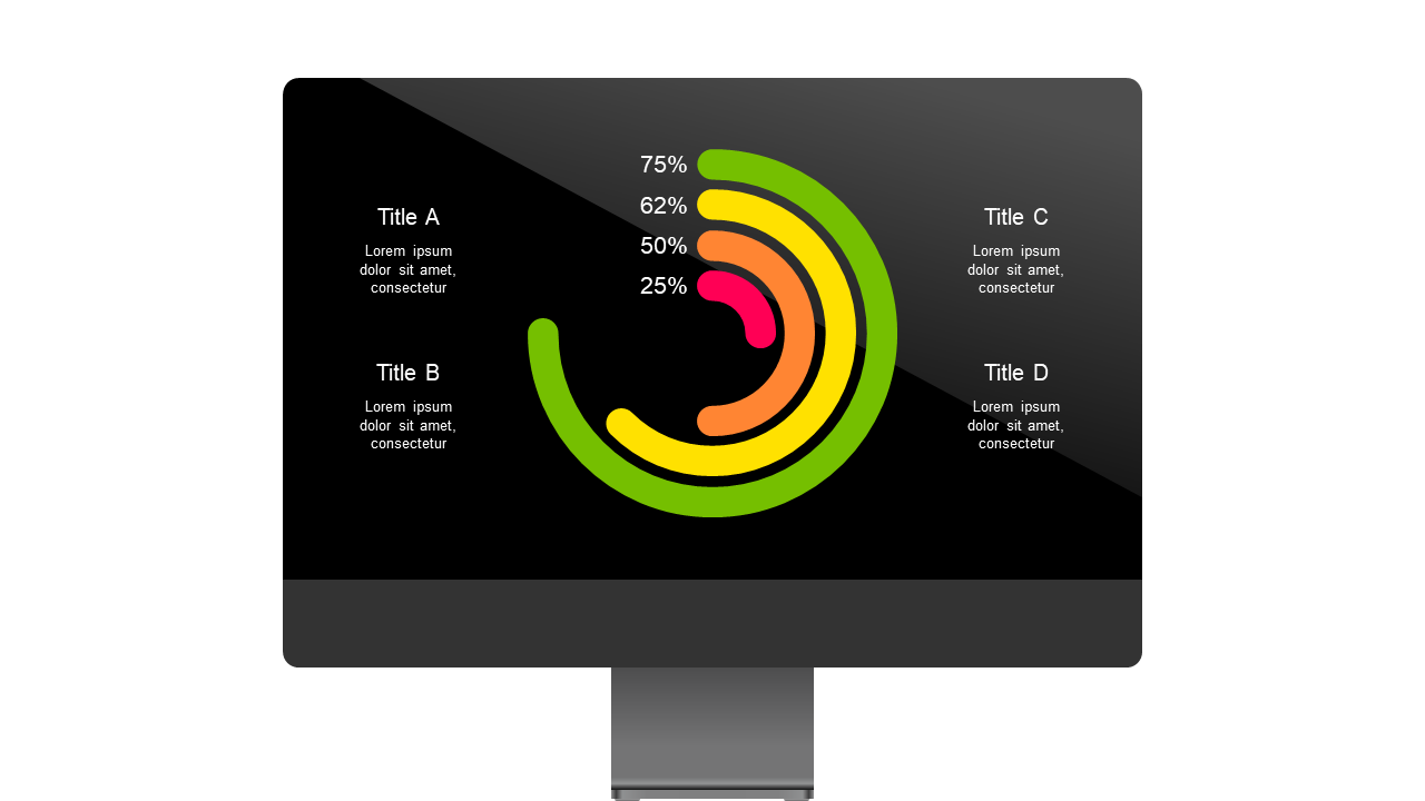
In the fast-paced world of data analysis, presenting information clearly is crucial. You have a wealth of performance metrics to communicate, but how do you make them easily digestible? This slide offers a striking visual with circular indicators, each displaying percentage values for key metrics. The design is clean and modern, ensuring your data stands out in any presentation. A data analyst can use this slide to show progress on specific KPIs, making reports more engaging for stakeholders. Meanwhile, a business analyst may find it ideal for illustrating trends over time, allowing for quick comparisons at a glance. For BI developers, integrating this slide can simplify the relay of complex data visualizations into user-friendly formats. Each circular indicator is customizable with different colors and text, so you can tailor it to your brand or specific data set. $0.99 — add this single slide to any deck from the SlideSwift Slide Library. No subscription needed. Mix slides from any category to build your perfect deck.
Add more from this category to your custom deck