SlideSwift
By Category
💼Business 📊Infographics □Minimal 🕐Timelines ✨Neumorphic 🗑Diagrams 🔄Flow Charts ✨Glassmorphism 🎨Creative 🌍Abstract 🔄Cycle Diagrams 💎Isometric 🖼Illustrations 📱Social Media 🗺MapsBy Slide Type
🚀Pitch Deck 📌Roadmap 🔍SWOT Analysis 📅Timeline 📈Gantt Chart 🏢Org Chart 📋Funnel ⚖Comparison 📄Case Study 📋Agenda ⭐Icons & Lists 👏Thank You
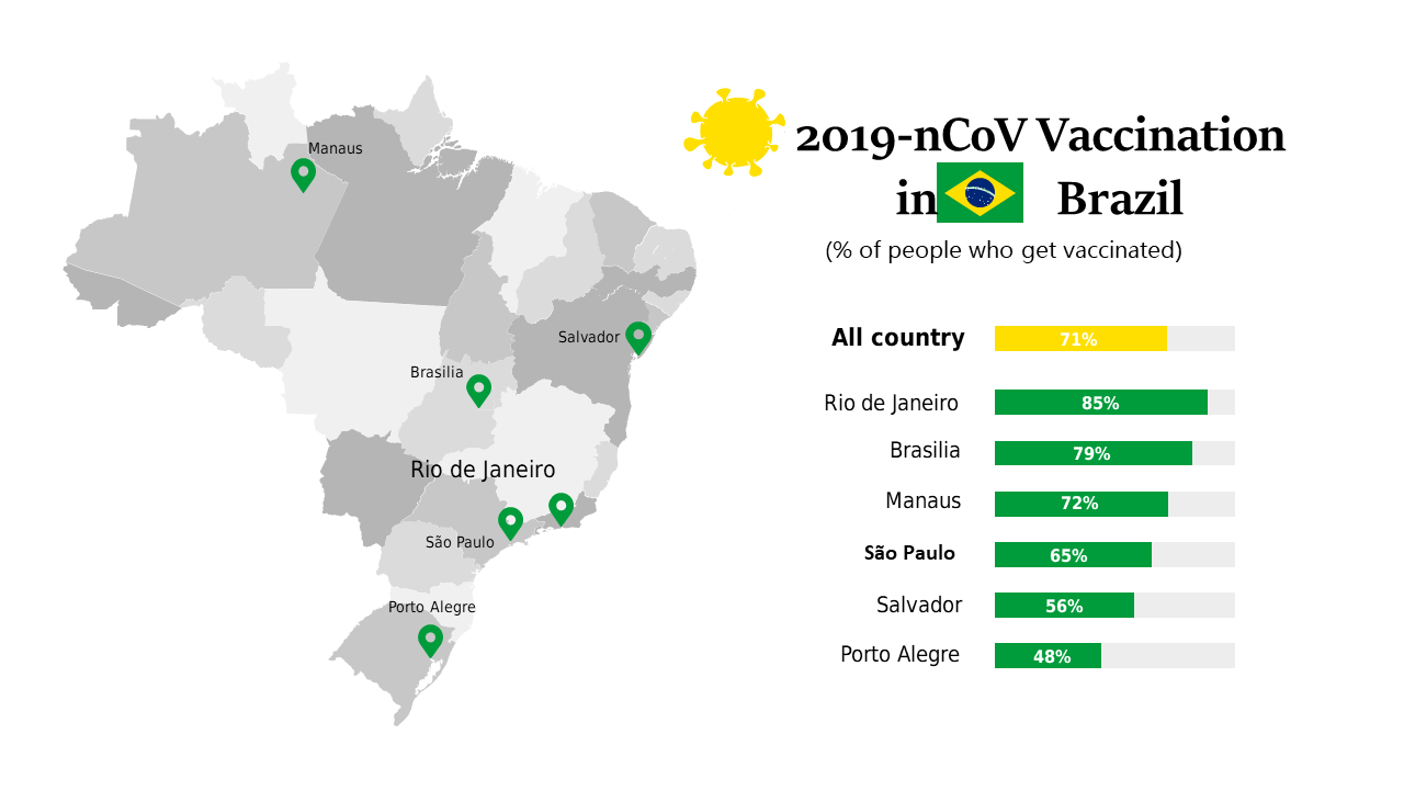
Navigating the world of data can be challenging, especially when you need to present complex information clearly. This slide provides a visually engaging map layout that showcases COVID-19 vaccination rates across various cities in Brazil. With editable map locations and vaccination percentages, you can tailor this slide to meet your specific needs. For a BI developer, this slide can be a powerful tool to support data-driven decisions during presentations. A finance lead could utilize this slide to explain funding allocations based on vaccination rates, helping stakeholders understand the impact of health initiatives. Meanwhile, a data analyst can leverage this visual to identify trends and patterns that inform future health strategies. Customization is straightforward, allowing you to adjust colors and data points as needed. $0.99 — add this single slide to any deck from the SlideSwift Slide Library. No subscription needed. Mix slides from any category to build your perfect deck.
Add more from this category to your custom deck