Showing 365 slides
in Data Visualization

View full slide →
✓
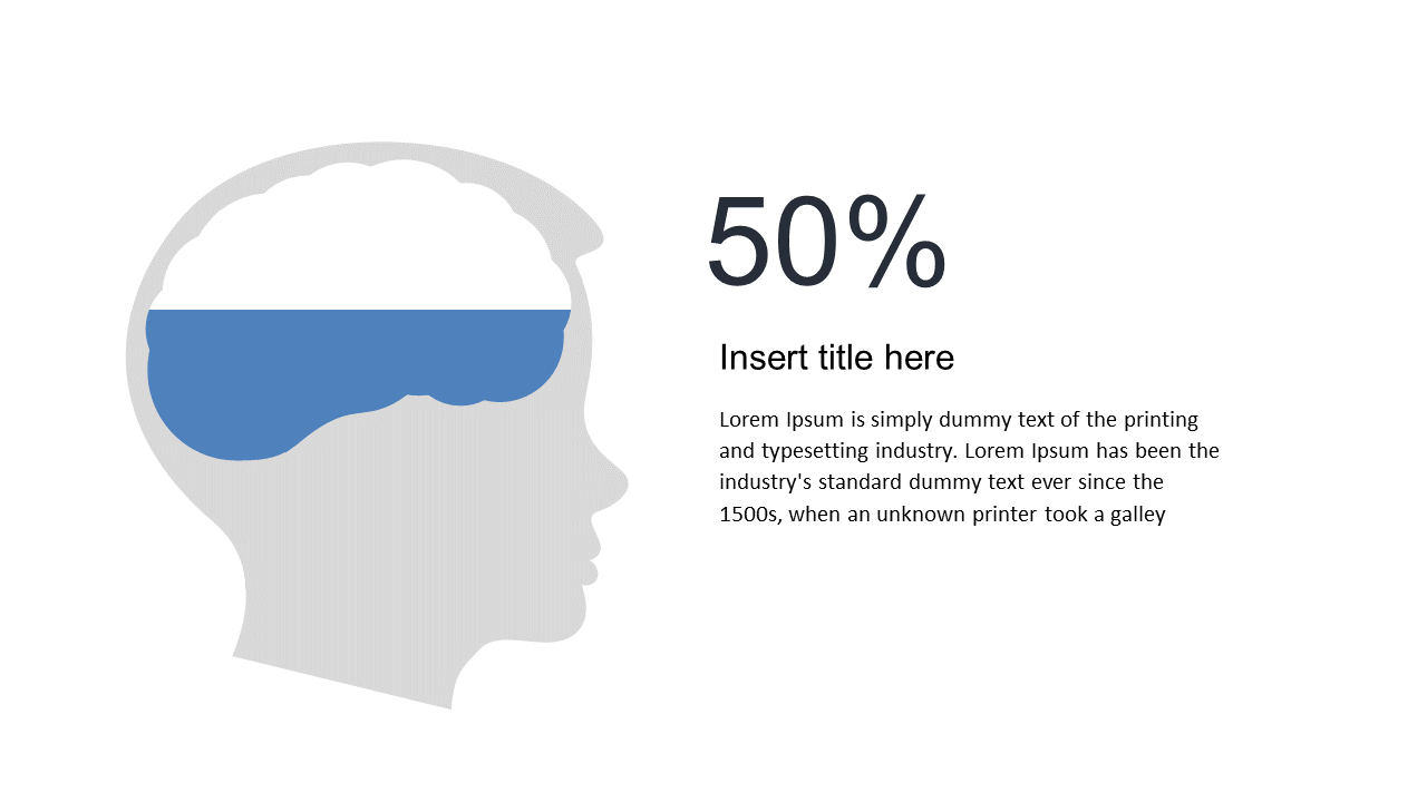
Represent data percentages effectively with this brain graphic layout.
View full slide →
✓
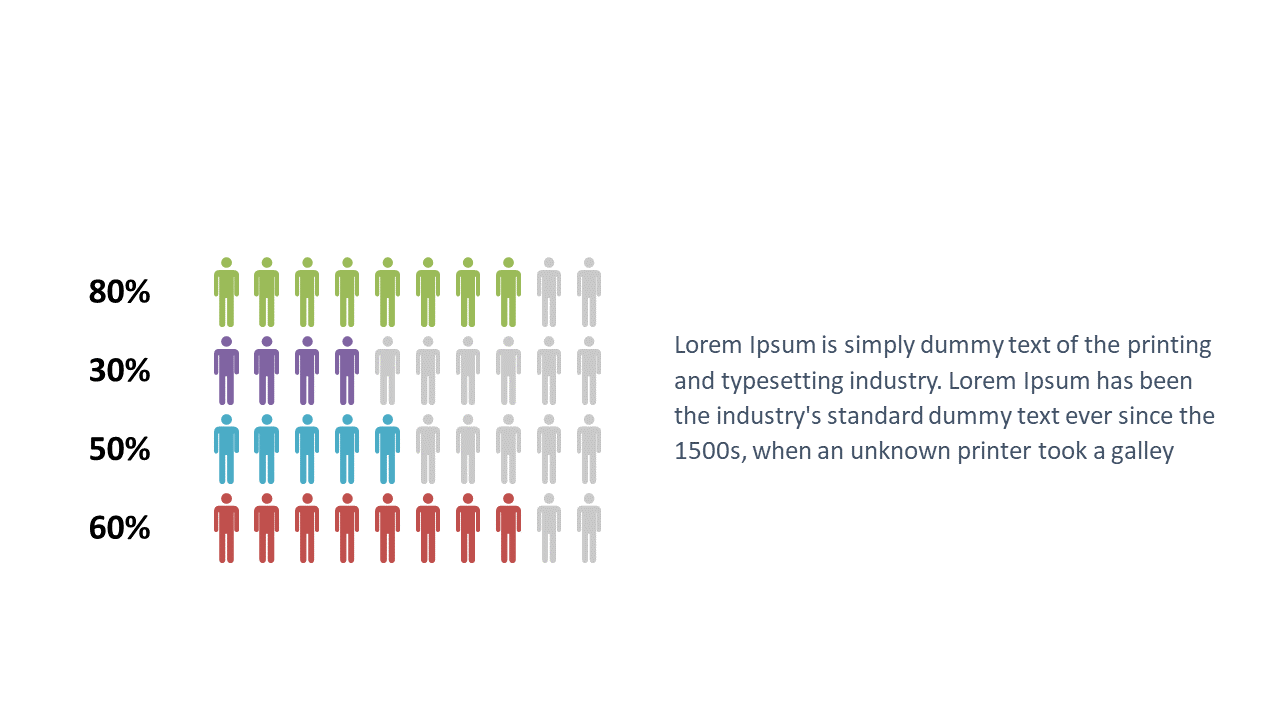
Present population data clearly with this color-coded distribution layout.
View full slide →
✓
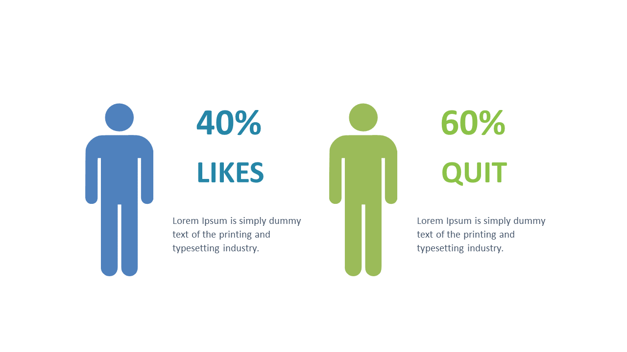
Visualize comparative metrics effectively using this percentage layout.
View full slide →
✓
Present impactful data using this customizable 3D bar graph layout.
View full slide →
✓
Showcase data sets effectively using this engaging 3D cylinder layout.
View full slide →
✓
Visualize performance metrics using this interactive 3D bar graph.
View full slide →
✓
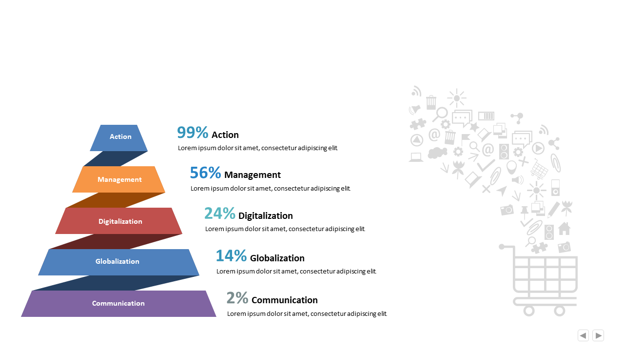
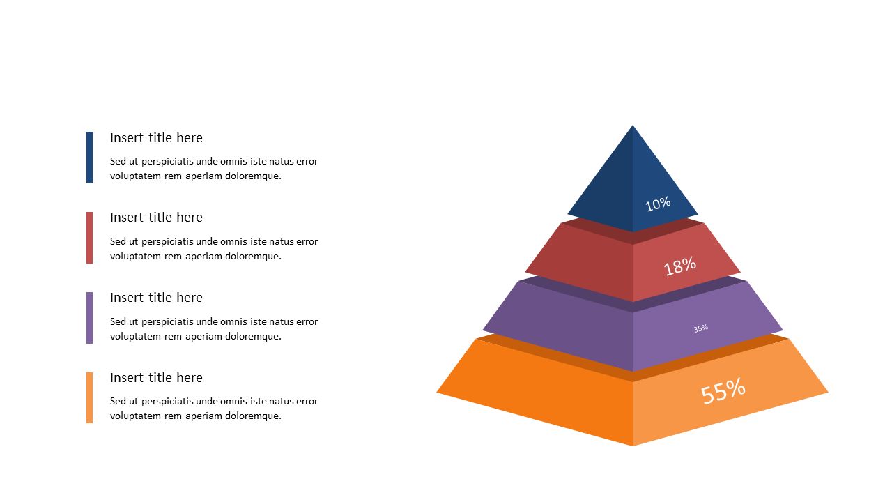
Use this PowerPoint pyramid chart to showcase percentage distribution across categories.
View full slide →
✓
Present percentage distribution clearly with this editable pyramid chart for PowerPoint.
View full slide →
✓
Utilize this pyramid diagram to visualize percentage distribution in your presentations.
View full slide →
✓
Effectively represent percentage distribution with this editable pyramid diagram.
View full slide →
✓
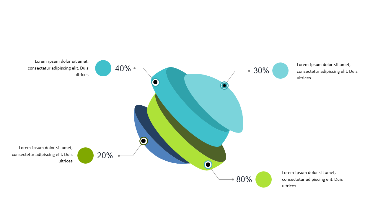
Visualize percentage distributions engagingly with this 3D circular diagram.
View full slide →
✓
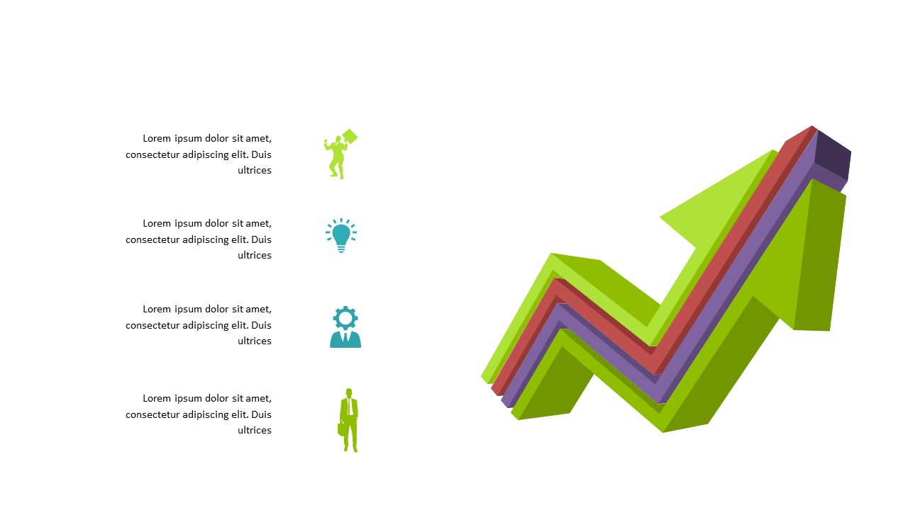
Visualize growth effectively with this 3D chart layout for business presentations.
 SlideSwift