SlideSwift
By Category
💼Business 📊Infographics □Minimal 🕐Timelines ✨Neumorphic 🗑Diagrams 🔄Flow Charts ✨Glassmorphism 🎨Creative 🌍Abstract 🔄Cycle Diagrams 💎Isometric 🖼Illustrations 📱Social Media 🗺MapsBy Slide Type
🚀Pitch Deck 📌Roadmap 🔍SWOT Analysis 📅Timeline 📈Gantt Chart 🏢Org Chart 📋Funnel ⚖Comparison 📄Case Study 📋Agenda ⭐Icons & Lists 👏Thank You
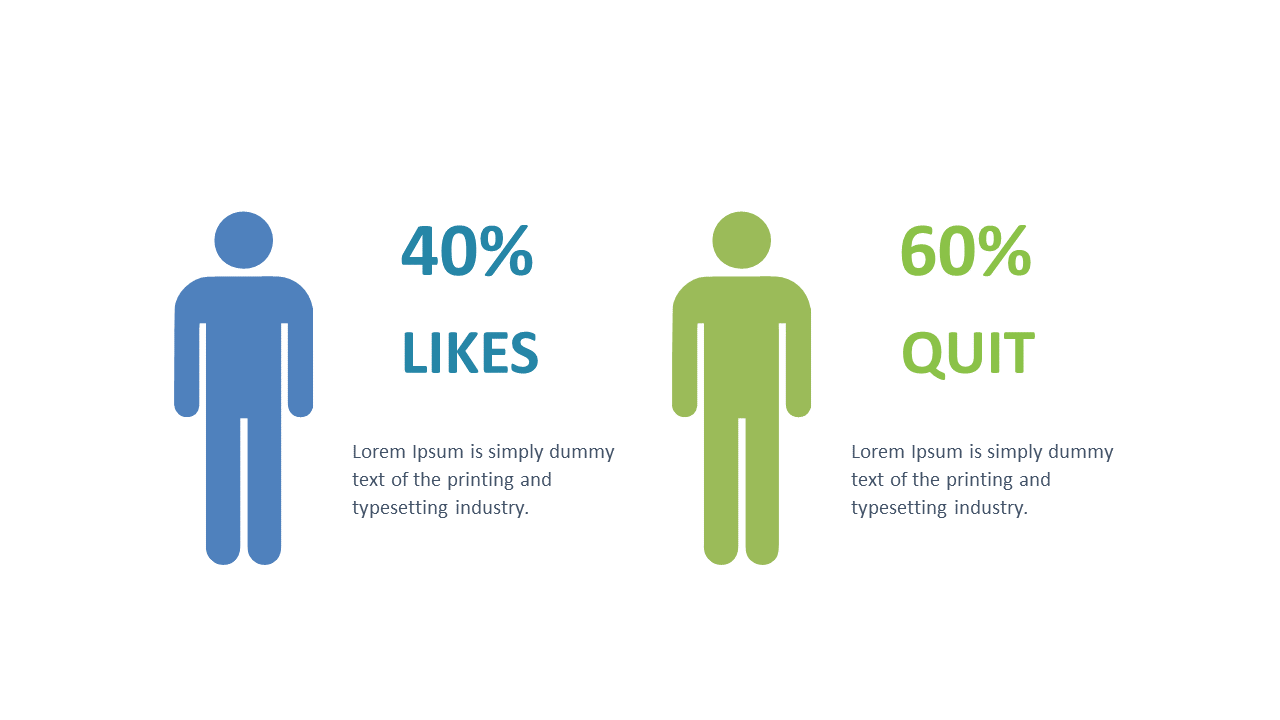
In the fast-paced world of data presentations, clarity is key. When you’re tasked with conveying comparative metrics, every detail counts. This slide provides a clean and engaging layout where two icons are accompanied by percentage data, allowing you to clearly illustrate your findings. The design emphasizes visual appeal while ensuring that critical information stands out, making it an essential tool in your PowerPoint arsenal.
As a BI developer, you can use this slide to present data-driven insights that your team can act upon. For finance leads, it’s perfect for showcasing budget comparisons or financial metrics that require immediate attention. Data analysts will find it invaluable for displaying survey results or performance metrics, simplifying complex data into a format that’s easy to understand.
Customization is straightforward; both the figures and colors can be edited directly in PowerPoint, ensuring the slide can match your company’s branding. $0.99 — add this single slide to any deck from the SlideSwift Slide Library. No subscription needed. Mix slides from any category to build your perfect deck.
Add more from this category to your custom deck