SlideSwift
By Category
💼Business 📊Infographics □Minimal 🕐Timelines ✨Neumorphic 🗑Diagrams 🔄Flow Charts ✨Glassmorphism 🎨Creative 🌍Abstract 🔄Cycle Diagrams 💎Isometric 🖼Illustrations 📱Social Media 🗺MapsBy Slide Type
🚀Pitch Deck 📌Roadmap 🔍SWOT Analysis 📅Timeline 📈Gantt Chart 🏢Org Chart 📋Funnel ⚖Comparison 📄Case Study 📋Agenda ⭐Icons & Lists 👏Thank You
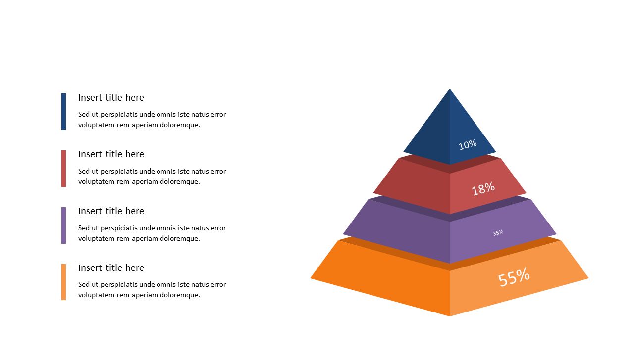
When you’re elbow-deep in data, getting your message across can be a struggle, especially when dealing with complex metrics. The Pyramid Diagram slide is designed to showcase proportional data in a simple yet impactful way. Visually, this slide presents a multi-layered pyramid, where each segment represents percentage distributions among categories. You can easily customize colors and text to match your branding or specific data points. For a BI developer, this slide serves as an excellent tool to illustrate key metrics during stakeholder meetings, making data interpretations straightforward. As a finance lead, you can leverage this pyramid to depict budget allocations or revenue distributions, ensuring your team understands critical financial insights at a glance. Data analysts will find this slide invaluable for presenting research findings, allowing them to communicate complex data trends in an accessible format. $0.99 — add this single slide to any deck from the SlideSwift Slide Library. No subscription needed. Mix slides from any category to build your perfect deck.
Add more from this category to your custom deck