Showing 365 slides
in Data Visualization

View full slide →
✓
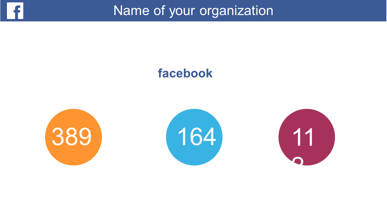
Highlight performance metrics effectively with this engaging circular layout for presentations.
View full slide →
✓
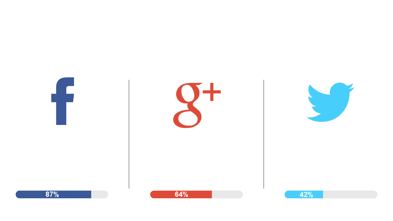
Visualize and compare social media engagement metrics with this editable bar chart layout.
View full slide →
✓
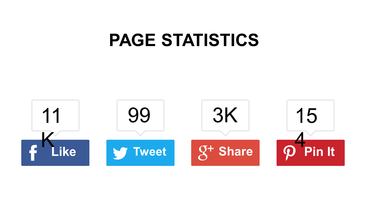
Present social media engagement metrics visually with this effective icon-based layout.
View full slide →
✓
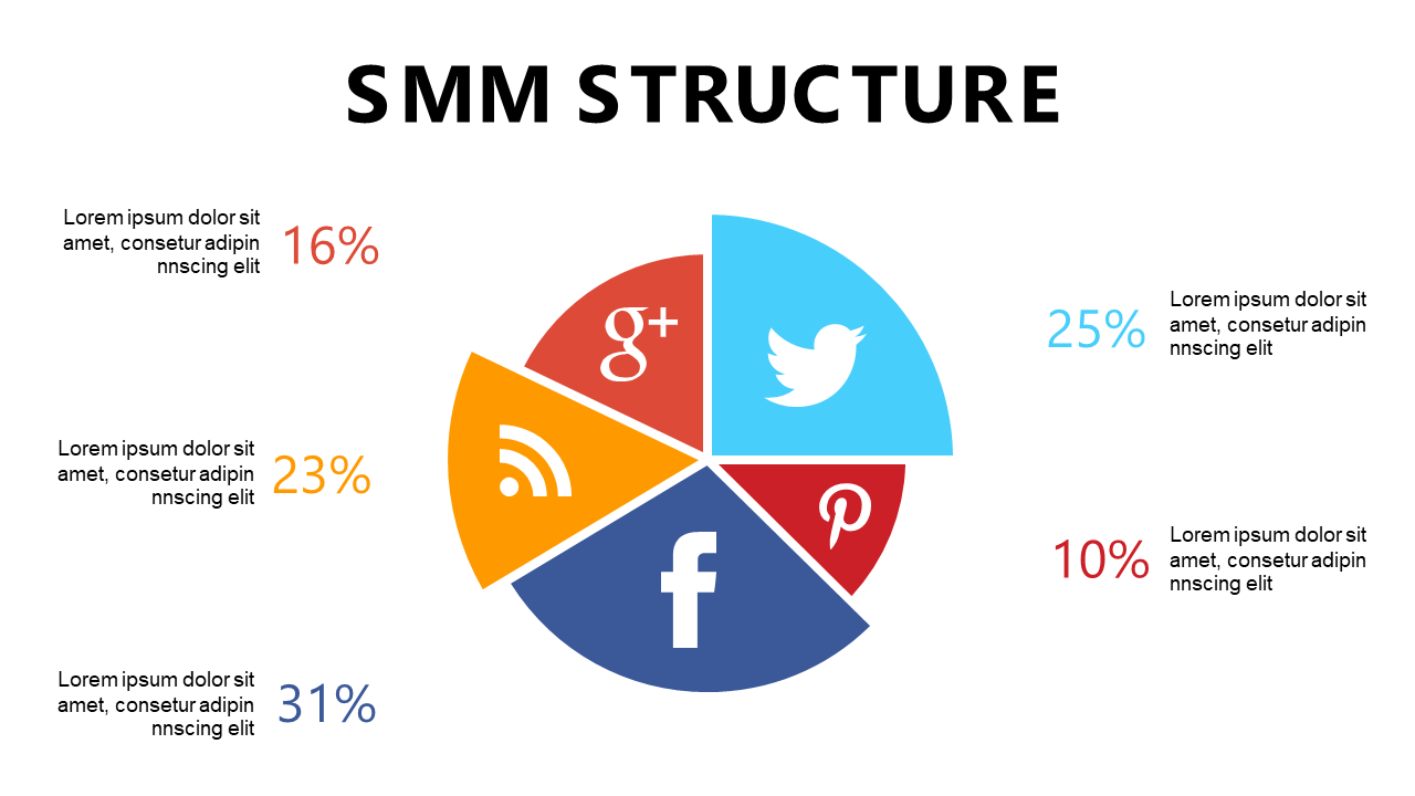
Use this PowerPoint slide to compare social media platform performance with an editable segmented circle.
View full slide →
✓
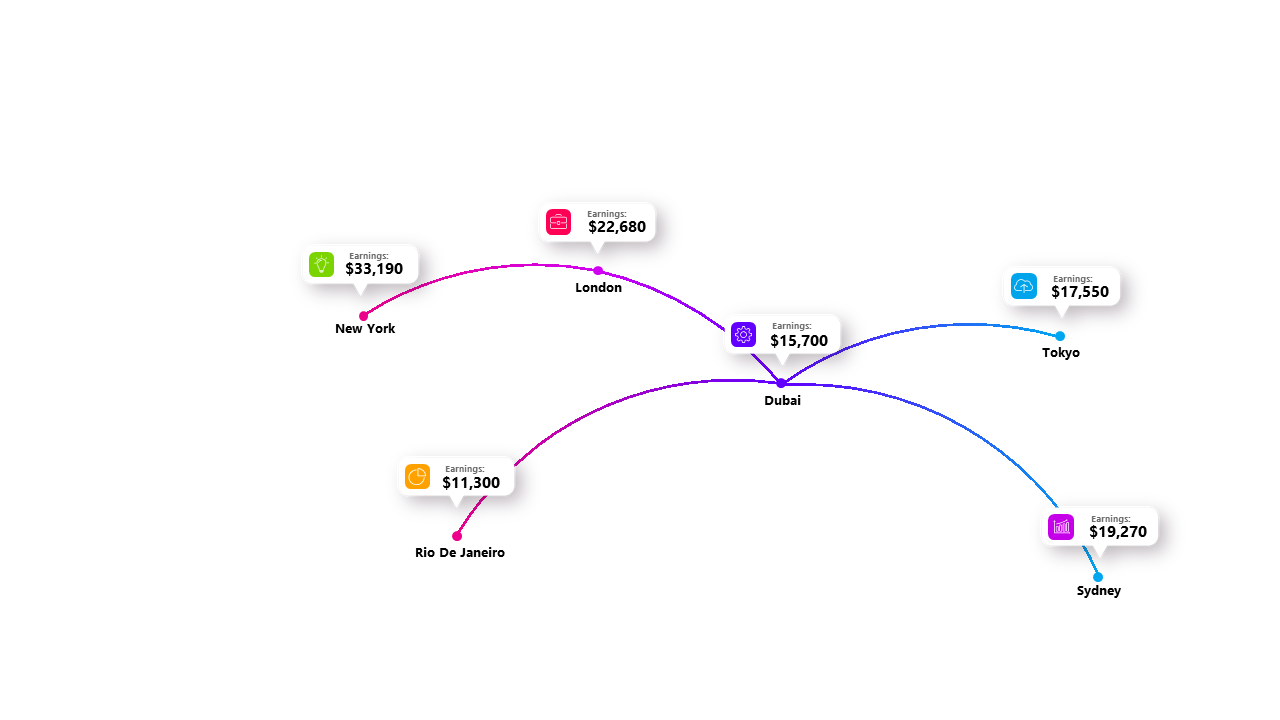
Use this flowchart to visually compare costs across different cities.
View full slide →
✓
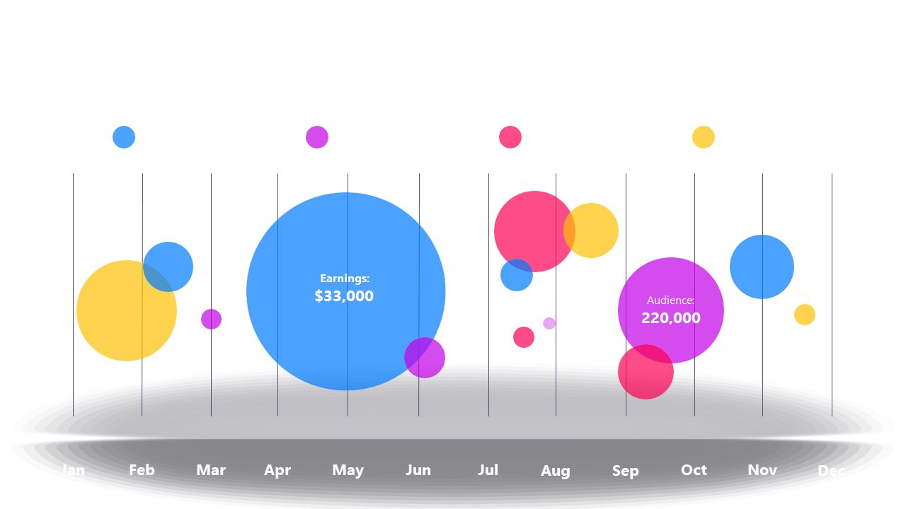
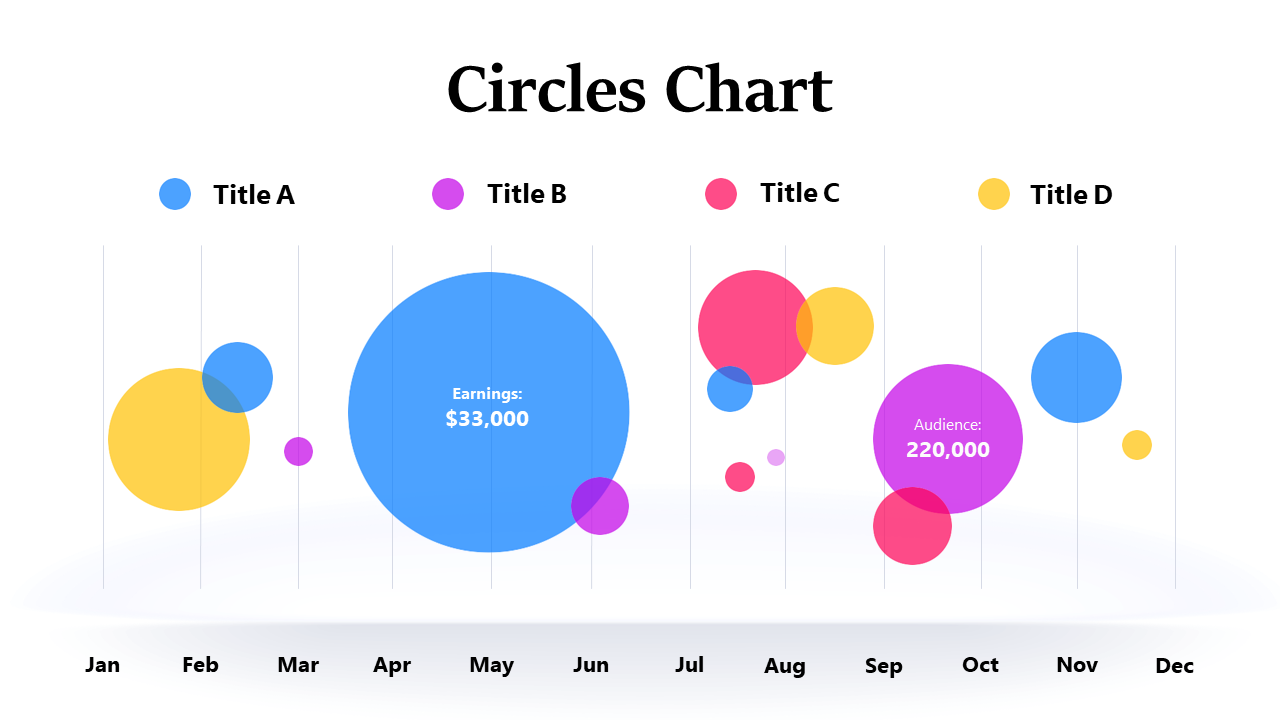
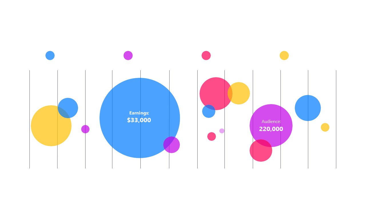
Showcase earnings and audience metrics over time with a customizable bubble chart.
View full slide →
✓
Engage audiences with an interactive bubble chart for performance analysis.
View full slide →
✓
Visualize audience metrics effectively using an interactive bubble chart.
View full slide →
✓
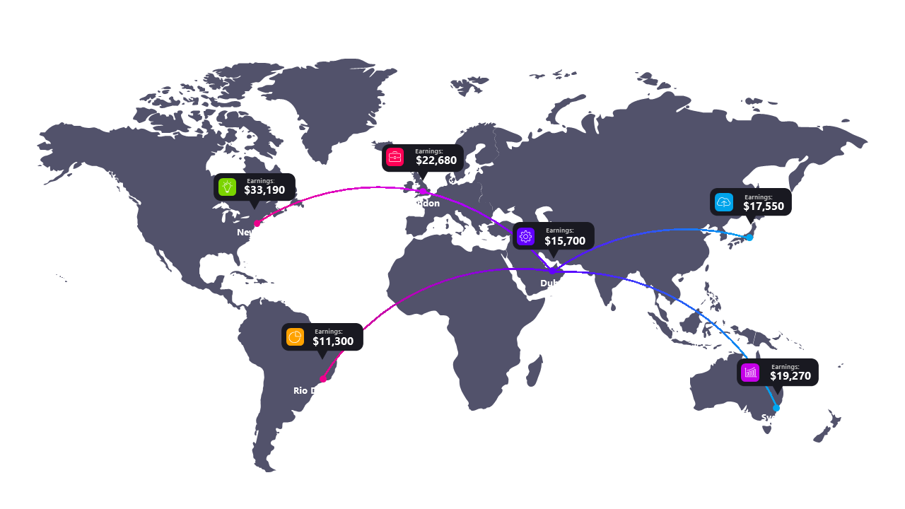
Display international financial statistics clearly on a world map layout.
View full slide →
✓
Present geographic revenue insights effectively using a world map layout.
View full slide →
✓
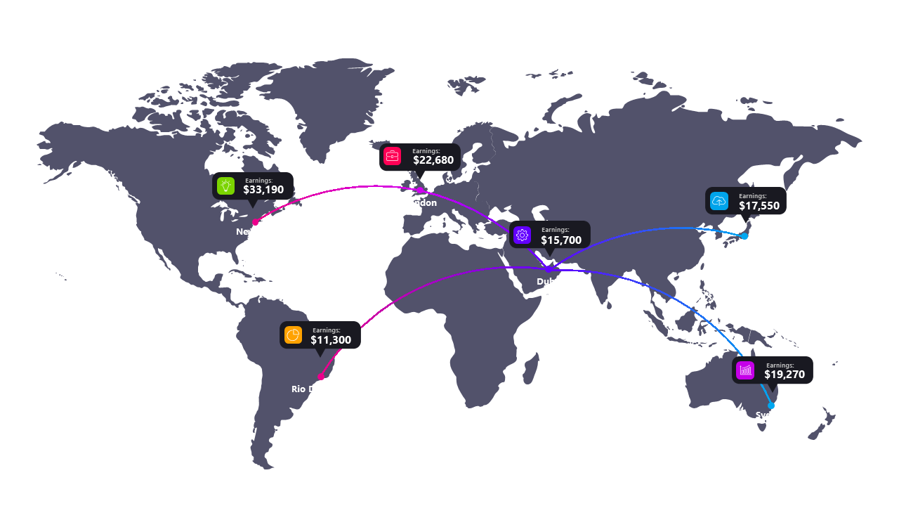
Showcase international financial statistics effectively with this editable world map layout for PowerPoint and Google Slides.
View full slide →
✓
Highlight international financial data clearly with this customizable world map layout for impactful presentations.
 SlideSwift