Showing 117 slides
in Charts and Graphs

View full slide →
✓
Use segmented bar charts for clear comparative analysis in PowerPoint and Google Slides.
View full slide →
✓
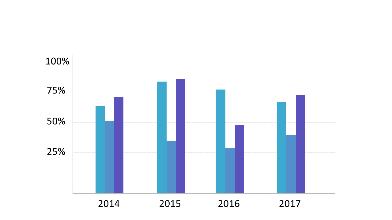
Compare performance metrics visually with a dual color vertical bar chart.
View full slide →
✓
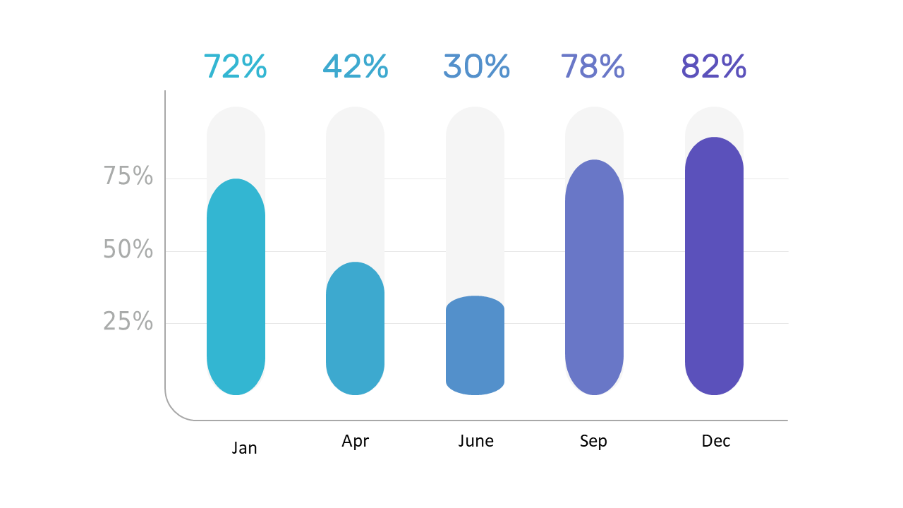
Present performance data effectively with a dynamic vertical bar graph.
View full slide →
✓
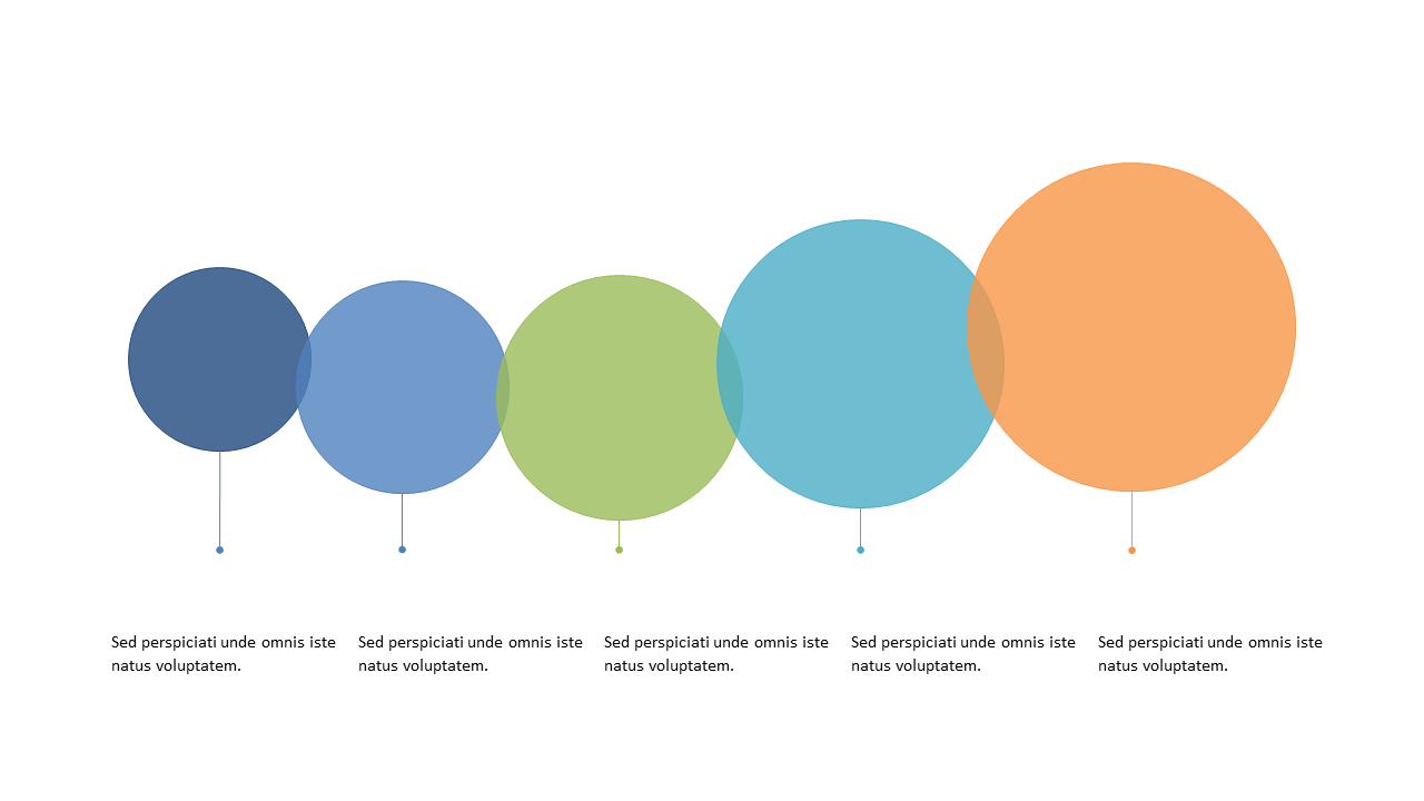
Use a colorful bubble chart to present data effectively in your slides.
View full slide →
✓
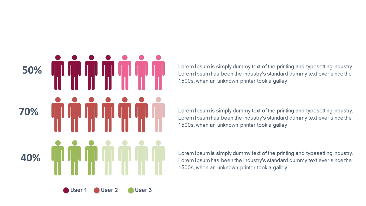
Present user statistics effectively using this engaging bar chart layout.
View full slide →
✓
Use this dotted line graph template in PowerPoint or Google Slides for clear data visualization.
View full slide →
✓
Present your statistical data effectively with this editable dotted line graph for PowerPoint and Google Slides.
View full slide →
✓
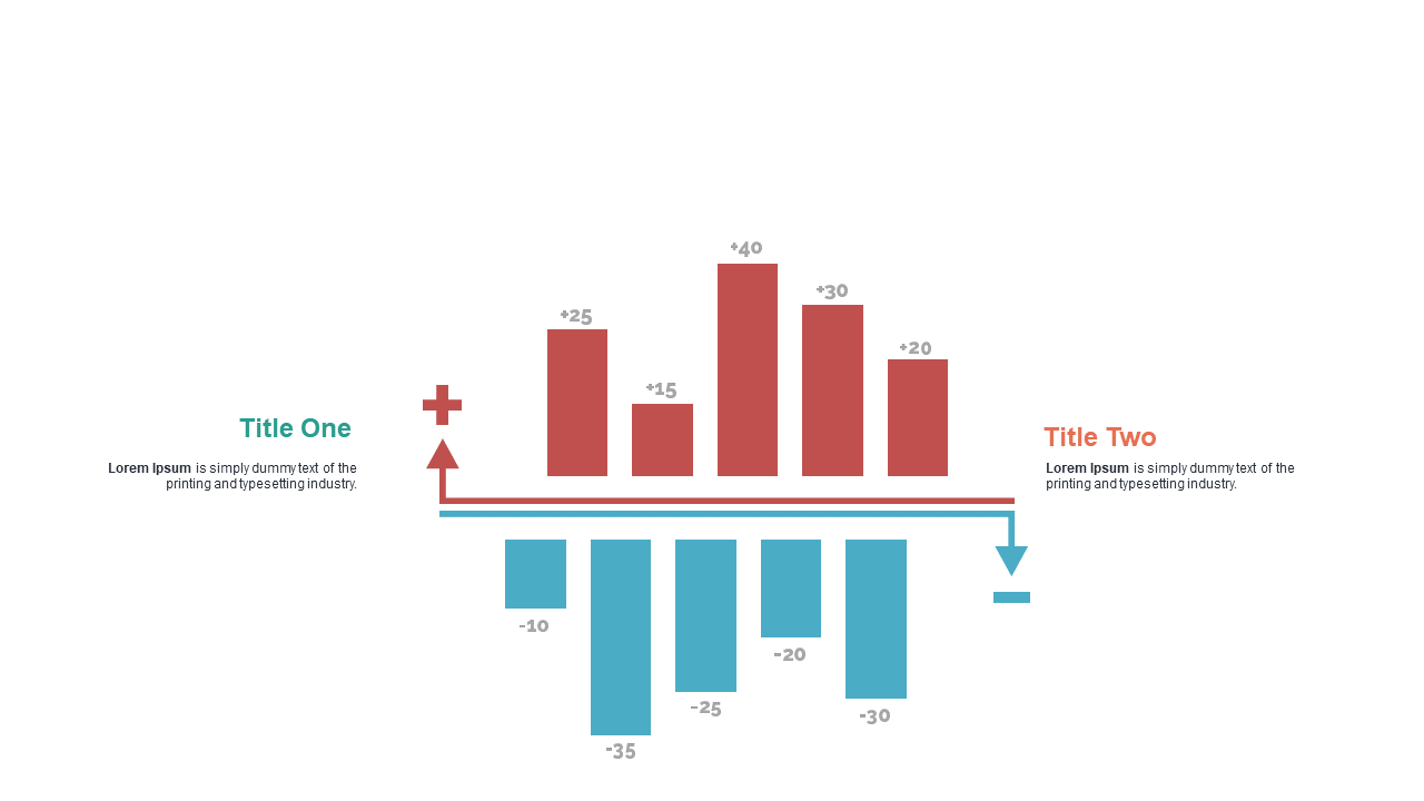
Effectively present comparative data using dual bar charts with flow arrows in PowerPoint and Google Slides.
View full slide →
✓
Use dual bar charts with flow arrows to visualize metrics side-by-side in your presentations.
View full slide →
✓
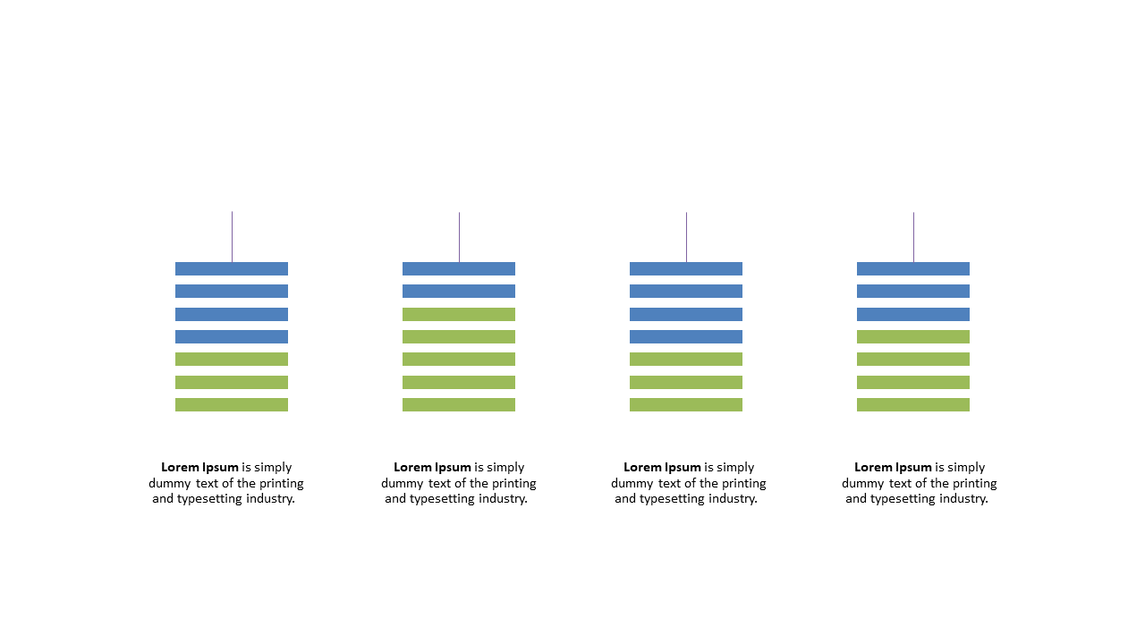
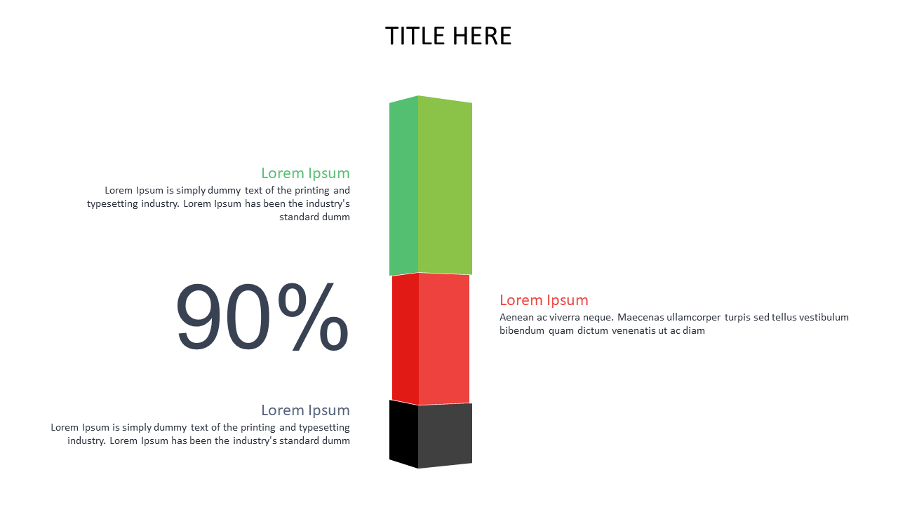
Present quantitative data with context using this stacked bar chart layout in PowerPoint and Google Slides.
View full slide →
✓
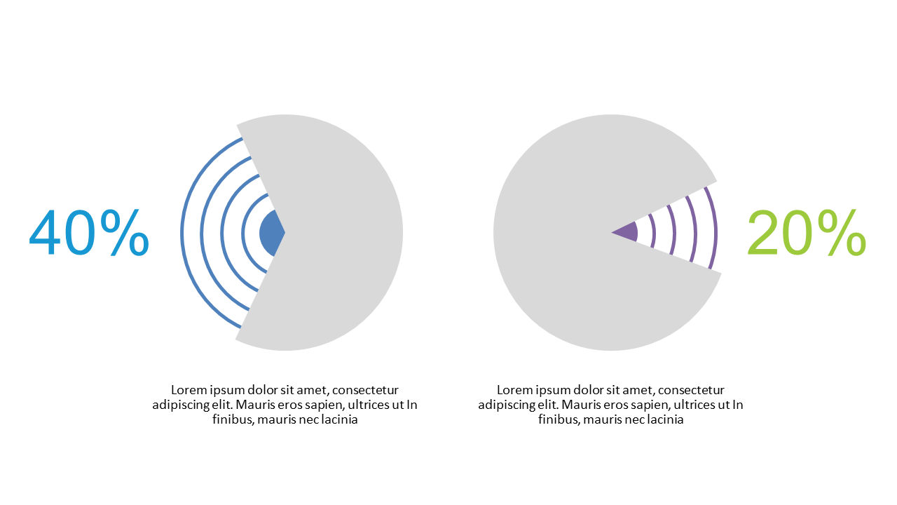
Visualize and compare performance metrics using dual percentage circles in your presentations.
View full slide →
✓
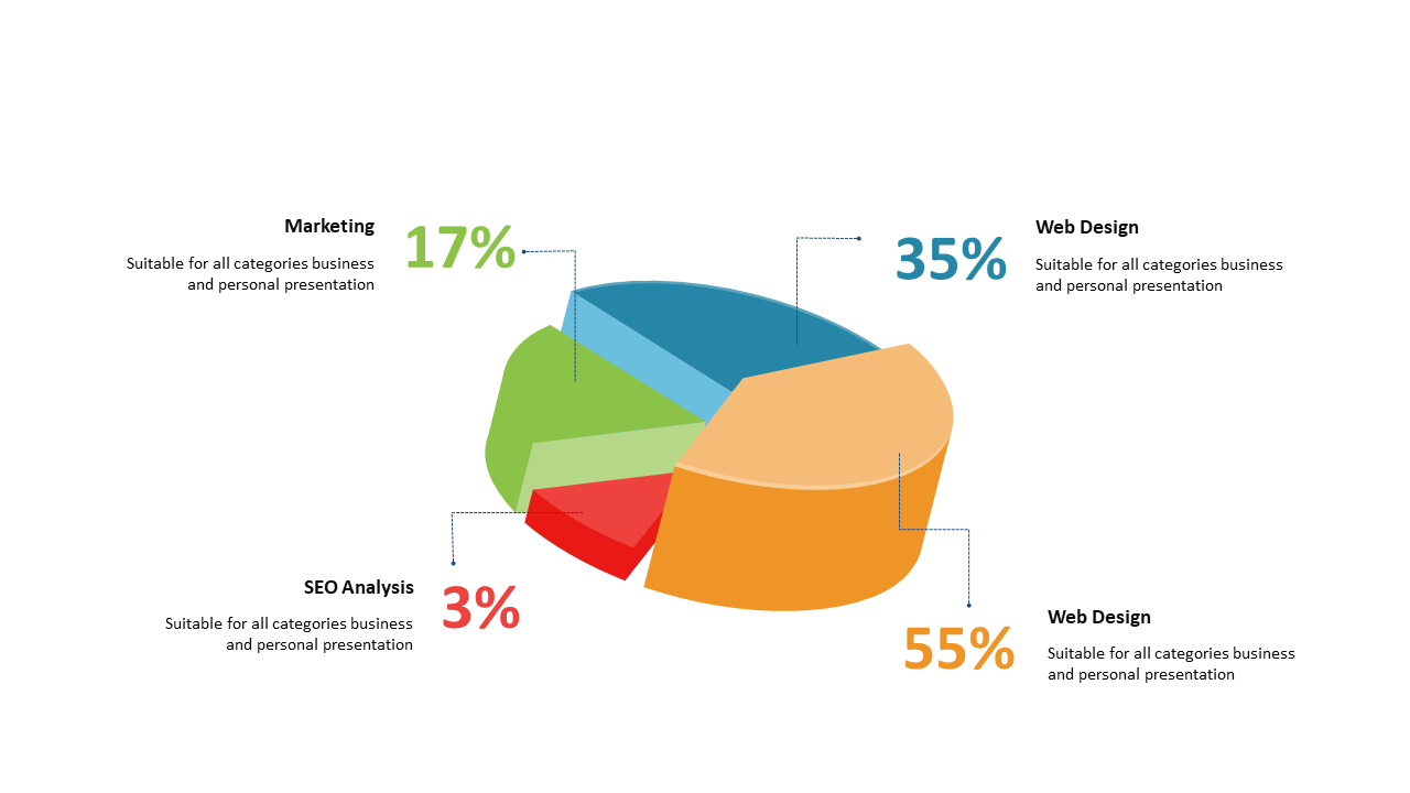
Engage your audience with a 3D exploded pie chart for effective data representation.
 SlideSwift