SlideSwift
By Category
💼Business 📊Infographics □Minimal 🕐Timelines ✨Neumorphic 🗑Diagrams 🔄Flow Charts ✨Glassmorphism 🎨Creative 🌍Abstract 🔄Cycle Diagrams 💎Isometric 🖼Illustrations 📱Social Media 🗺MapsBy Slide Type
🚀Pitch Deck 📌Roadmap 🔍SWOT Analysis 📅Timeline 📈Gantt Chart 🏢Org Chart 📋Funnel ⚖Comparison 📄Case Study 📋Agenda ⭐Icons & Lists 👏Thank You
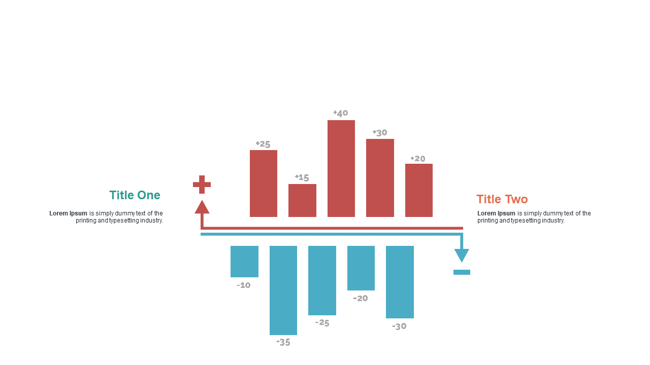
Presenting comparative metrics can be tricky, especially when clarity is crucial. This slide uses dual bar charts complemented by flow arrows to visually represent data side-by-side, making it easy for your audience to grasp key insights at a glance. The clean design ensures that your data stands out, allowing for quick interpretation and discussion. As a data analyst, you can showcase trends over time or compare performance across departments. For a finance lead, this slide is perfect for illustrating revenue versus expenses, enhancing decision-making during meetings. Meanwhile, a business analyst can utilize it to compare forecasted vs. actual sales, driving home the importance of data accuracy. Customization is straightforward, giving you the freedom to adjust bar values, colors, and titles to fit your narrative. $0.99 — add this single slide to any deck from the SlideSwift Slide Library. No subscription needed. Mix slides from any category to build your perfect deck.
Add more from this category to your custom deck