SlideSwift
By Category
💼Business 📊Infographics □Minimal 🕐Timelines ✨Neumorphic 🗑Diagrams 🔄Flow Charts ✨Glassmorphism 🎨Creative 🌍Abstract 🔄Cycle Diagrams 💎Isometric 🖼Illustrations 📱Social Media 🗺MapsBy Slide Type
🚀Pitch Deck 📌Roadmap 🔍SWOT Analysis 📅Timeline 📈Gantt Chart 🏢Org Chart 📋Funnel ⚖Comparison 📄Case Study 📋Agenda ⭐Icons & Lists 👏Thank You
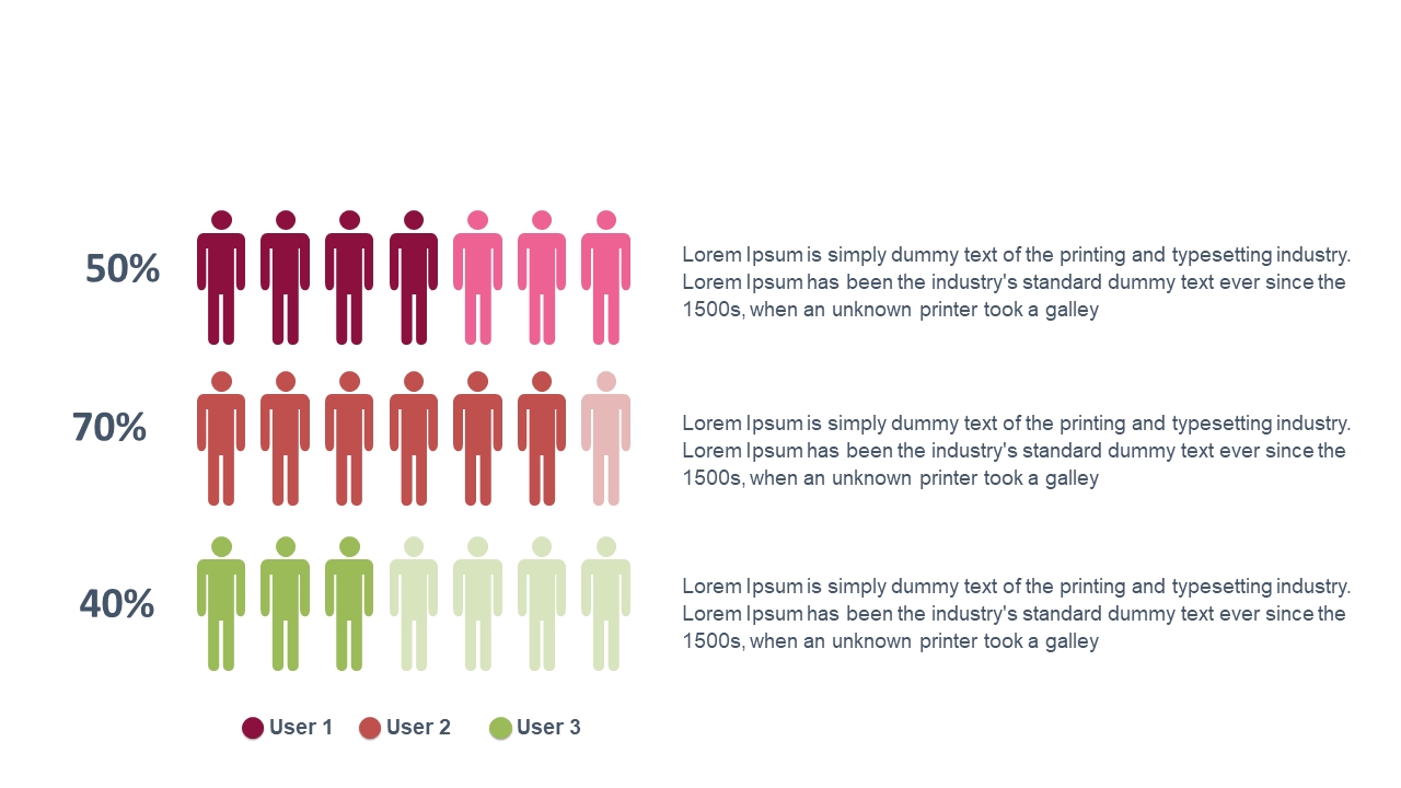
In today’s fast-paced environment, data can often feel overwhelming and difficult to interpret. You need a way to present user data clearly and effectively. This slide showcases a comparison bar chart that uses visual icons to enhance the impact of your information, making it easy to digest at a glance. Imagine using this slide to illustrate user statistics from a recent survey, providing a clear picture that highlights trends and differences. For finance leads, this means presenting financial metrics alongside user engagement in a way that drives decisions. A business analyst can leverage this slide to compare user demographics, clearly showing how different segments interact with your services. A reporting manager will find it invaluable for summarizing quarterly data, ensuring that the key points stand out to their audience. You can easily customize the colors, icons, and data values to match your brand or presentation style. $0.99 — add this single slide to any deck from the SlideSwift Slide Library. No subscription needed. Mix slides from any category to build your perfect deck.
Add more from this category to your custom deck