SlideSwift
By Category
💼Business 📊Infographics □Minimal 🕐Timelines ✨Neumorphic 🗑Diagrams 🔄Flow Charts ✨Glassmorphism 🎨Creative 🌍Abstract 🔄Cycle Diagrams 💎Isometric 🖼Illustrations 📱Social Media 🗺MapsBy Slide Type
🚀Pitch Deck 📌Roadmap 🔍SWOT Analysis 📅Timeline 📈Gantt Chart 🏢Org Chart 📋Funnel ⚖Comparison 📄Case Study 📋Agenda ⭐Icons & Lists 👏Thank You
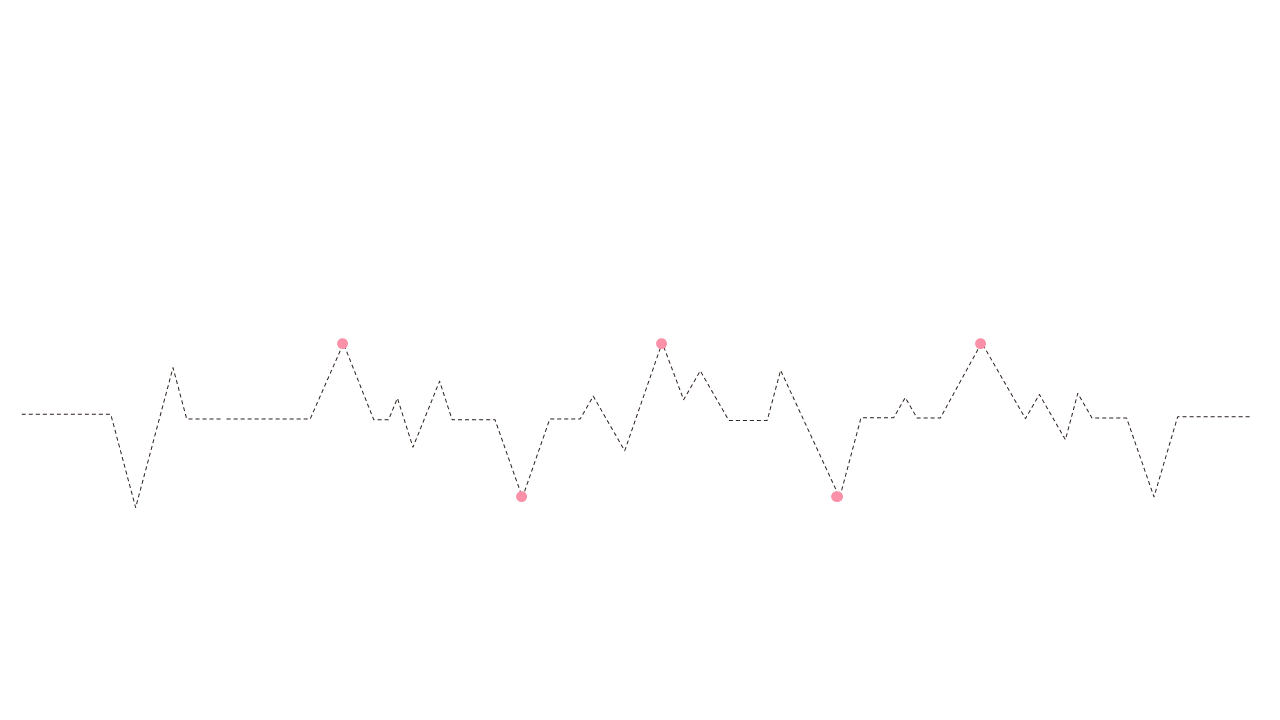
In today’s fast-paced work environment, presenting data trends clearly can make a significant difference. If you’re struggling to showcase your findings in a way that resonates, this slide is your solution. The dotted line graph visually represents trends over time, with marked data points that allow your audience to follow the narrative easily. Designed for clarity, the slide’s layout helps display complex data in a straightforward manner. As a data analyst, you can utilize this slide to highlight key insights from your reports, ensuring your audience understands the implications of the numbers. For finance leads, the slide is perfect for presenting quarterly earnings trends, making it easy to spot fluctuations and patterns. Business analysts will find this slide useful for illustrating market research data, helping to connect the dots for stakeholders. You can easily customize the line colors and data points to match your corporate branding or specific data sets. $0.99 — add this single slide to any deck from the SlideSwift Slide Library. No subscription needed. Mix slides from any category to build your perfect deck.
Add more from this category to your custom deck