SlideSwift
By Category
💼Business 📊Infographics □Minimal 🕐Timelines ✨Neumorphic 🗑Diagrams 🔄Flow Charts ✨Glassmorphism 🎨Creative 🌍Abstract 🔄Cycle Diagrams 💎Isometric 🖼Illustrations 📱Social Media 🗺MapsBy Slide Type
🚀Pitch Deck 📌Roadmap 🔍SWOT Analysis 📅Timeline 📈Gantt Chart 🏢Org Chart 📋Funnel ⚖Comparison 📄Case Study 📋Agenda ⭐Icons & Lists 👏Thank You
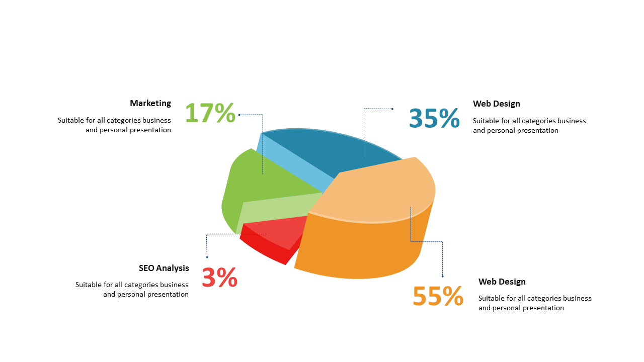
Presenting data insights can be challenging, especially when you want to convey complex information in a digestible format. This 3D exploded pie chart is designed to make your data stand out, displaying segments with percentage labels that provide immediate clarity. Imagine incorporating this slide into your presentation, allowing your audience to visualize key data points effortlessly. For a data analyst, this chart can illustrate survey results, making it easy to highlight trends. As a finance lead, you can use it to break down departmental performance, enabling stakeholders to quickly grasp financial allocations. If you’re a business analyst, this slide is perfect for presenting market analysis that demands attention and comprehension. You can easily customize the colors, labels, and data points to suit your branding or specific audience needs. At $0.99 — add this single slide to any deck from the SlideSwift Slide Library. No subscription needed. Mix slides from any category to build your perfect deck.
Add more from this category to your custom deck