SlideSwift
By Category
💼Business 📊Infographics □Minimal 🕐Timelines ✨Neumorphic 🗑Diagrams 🔄Flow Charts ✨Glassmorphism 🎨Creative 🌍Abstract 🔄Cycle Diagrams 💎Isometric 🖼Illustrations 📱Social Media 🗺MapsBy Slide Type
🚀Pitch Deck 📌Roadmap 🔍SWOT Analysis 📅Timeline 📈Gantt Chart 🏢Org Chart 📋Funnel ⚖Comparison 📄Case Study 📋Agenda ⭐Icons & Lists 👏Thank You
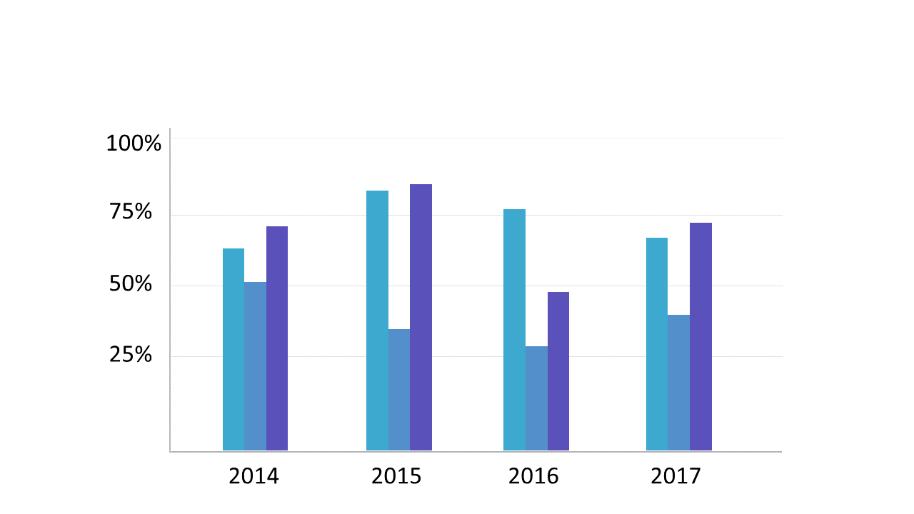
When you’re under pressure to present complex data, a clear visual can make all the difference. A dual color vertical bar chart allows you to compare multiple datasets side by side, making trends immediately apparent. This slide’s clean design showcases bars in two distinct colors, representing different data points across several years, ensuring your audience easily grasps the information at a glance. As a business analyst, you can use this slide to highlight quarterly performance trends, making your findings more impactful during team meetings. Reporting managers will find it effective for summarizing sales figures versus targets, providing a straightforward visual representation that keeps stakeholders informed. Data analysts can leverage this slide to track changes over time, identifying patterns that drive decision-making. With fully editable elements, you can customize the colors and data to fit your specific needs. $0.99 — add this single slide to any deck from the SlideSwift Slide Library. No subscription needed. Mix slides from any category to build your perfect deck.
Add more from this category to your custom deck