Showing 365 slides
in Data Visualization

View full slide →
✓
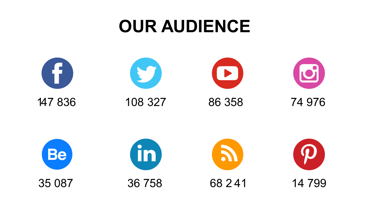
Engage your audience with metrics using this social media reach layout featuring icons.
View full slide →
✓
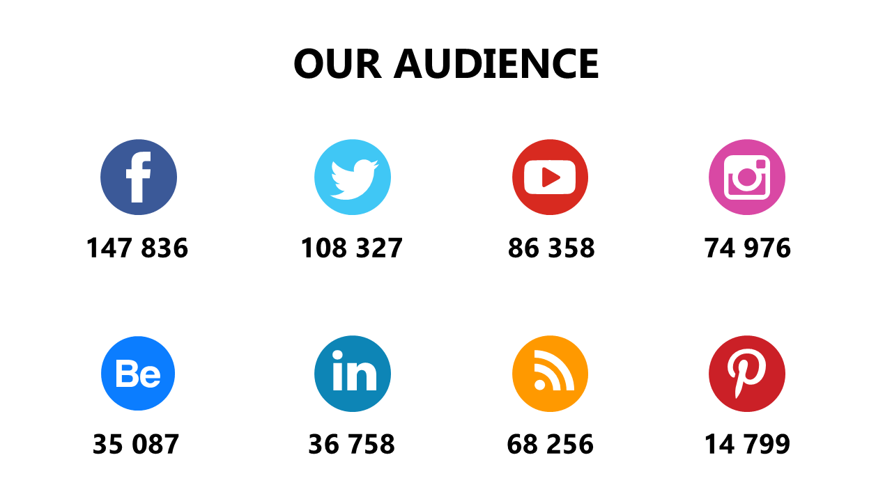
Visualize your social media audience metrics effectively with this customizable icon layout.
View full slide →
✓
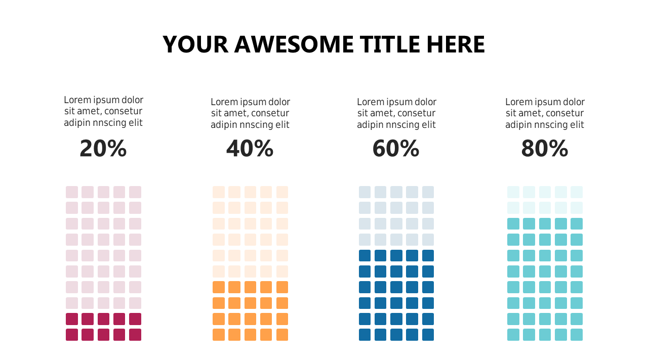
Use these engaging gradient progress bars for data visualization in PowerPoint or Google Slides.
View full slide →
✓
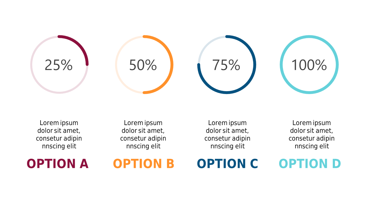
Visualize performance metrics using circular progress indicators in your PowerPoint presentations.
View full slide →
✓
Present complex data using this customizable gradient area chart in PowerPoint or Google Slides.
View full slide →
✓
Utilize this gradient area chart for effective data presentation in PowerPoint or Google Slides.
View full slide →
✓
Present data effectively using this customizable gradient area chart in PowerPoint or Google Slides.
View full slide →
✓
Use this gradient area chart with trend lines for effective data visualization in presentations.
View full slide →
✓
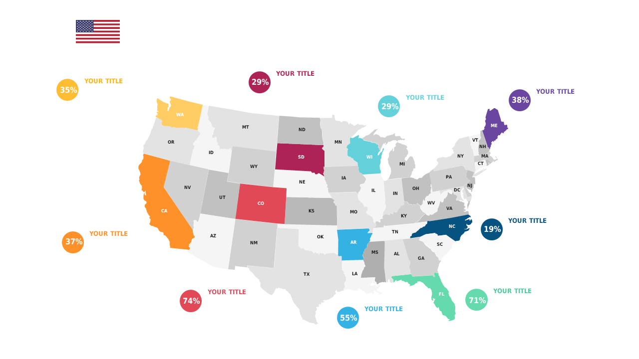
Display state metrics visually with this customizable U.S. heat map for presentations.
View full slide →
✓
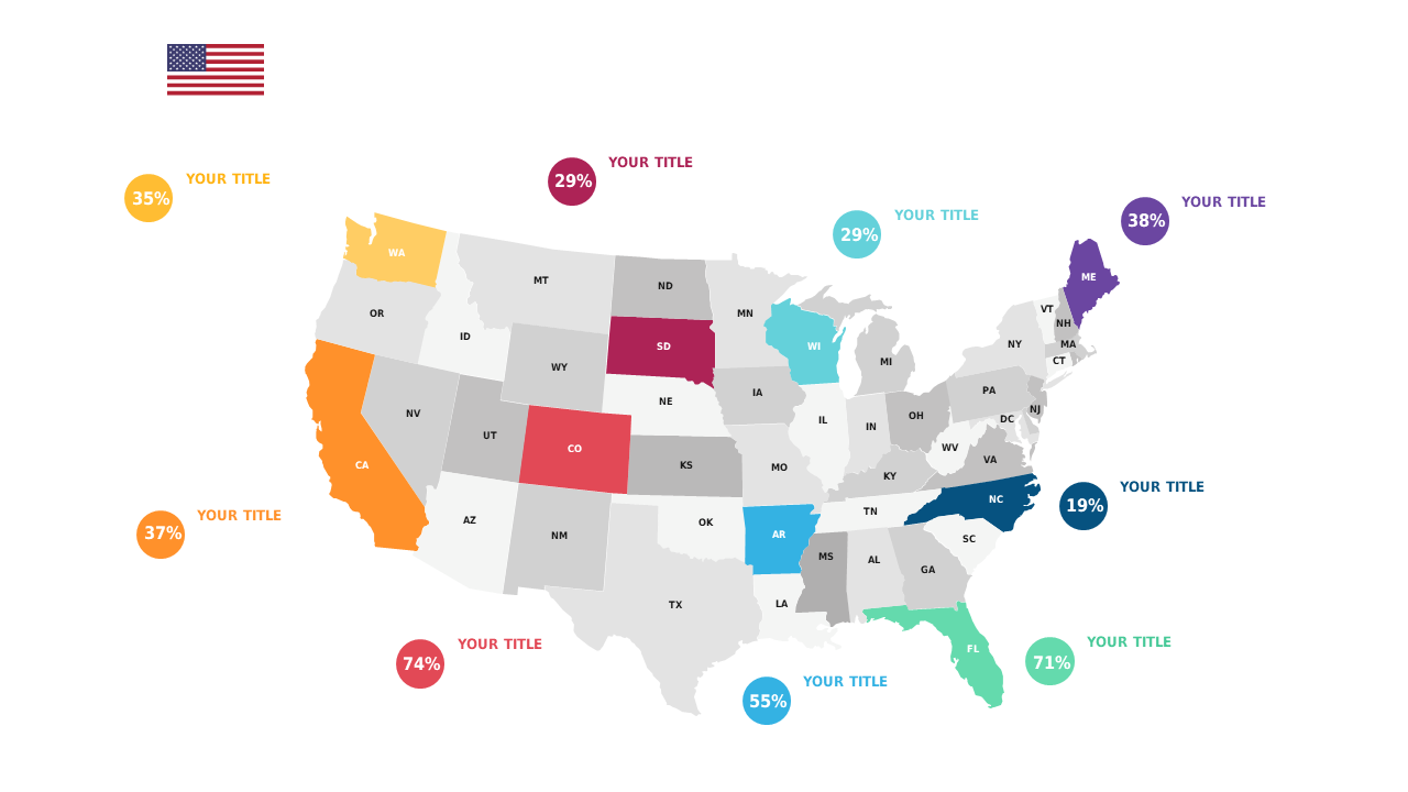
Present U.S. data metrics effectively with this editable heat map layout.
View full slide →
✓
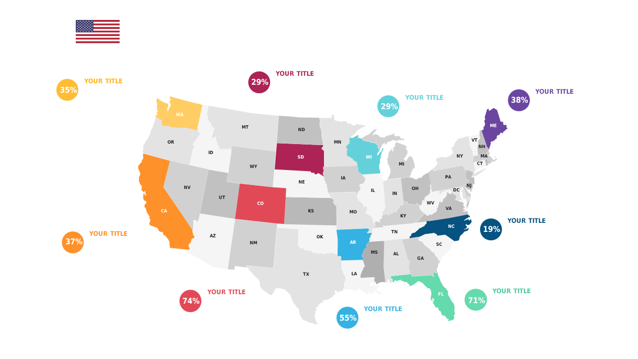
Showcase state metrics with this visually appealing and customizable heat map.
View full slide →
✓
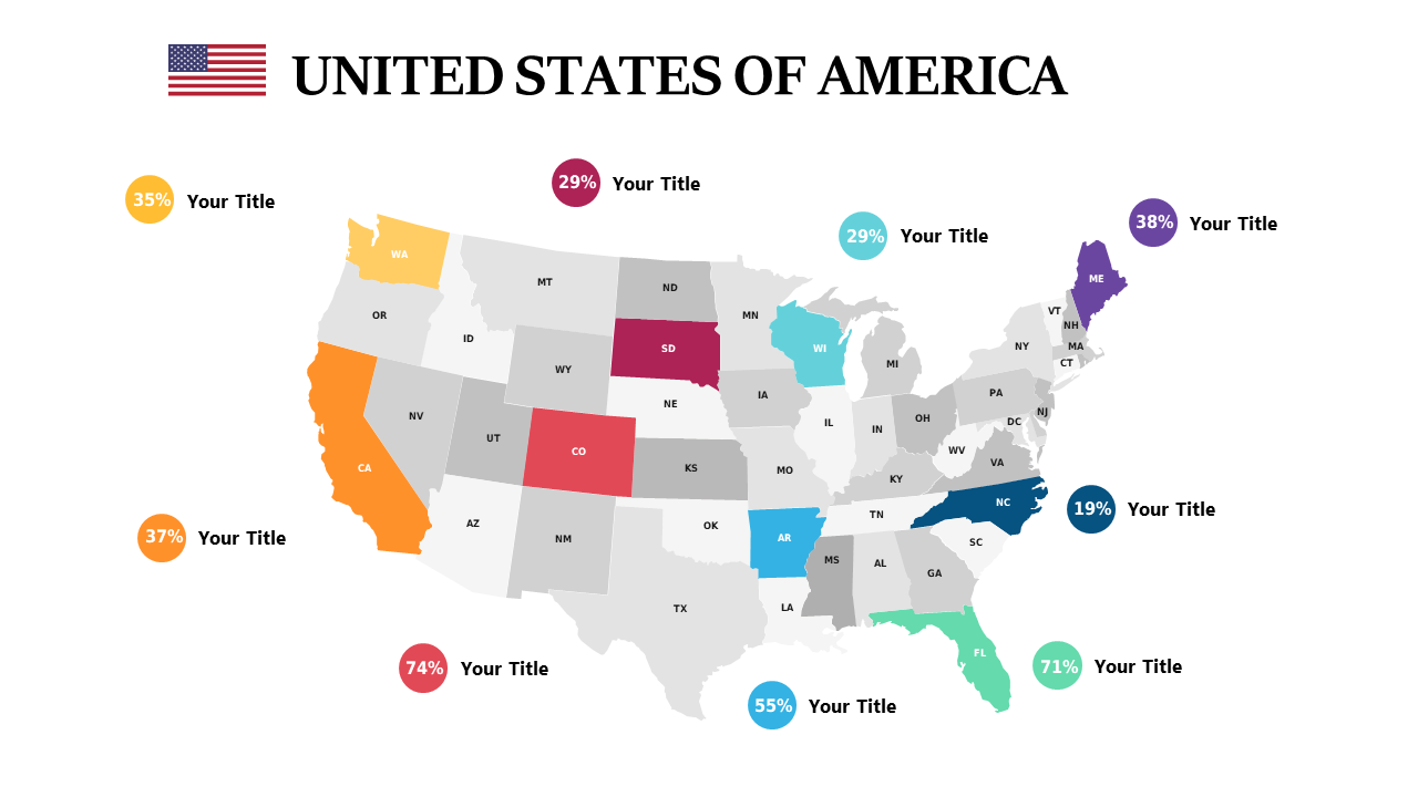
Visualize U.S. data metrics with this customizable heat map for effective presentations.
 SlideSwift