SlideSwift
By Category
💼Business 📊Infographics □Minimal 🕐Timelines ✨Neumorphic 🗑Diagrams 🔄Flow Charts ✨Glassmorphism 🎨Creative 🌍Abstract 🔄Cycle Diagrams 💎Isometric 🖼Illustrations 📱Social Media 🗺MapsBy Slide Type
🚀Pitch Deck 📌Roadmap 🔍SWOT Analysis 📅Timeline 📈Gantt Chart 🏢Org Chart 📋Funnel ⚖Comparison 📄Case Study 📋Agenda ⭐Icons & Lists 👏Thank You
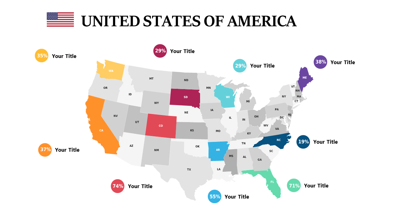
When you’re racing against the clock to gather insights, a clear visual representation can make all the difference. This U.S. heat map slide allows you to illustrate percentages across states with clarity, providing an immediate grasp of the data. Visually, it displays a vibrant map filled with color-coded state percentages, making it easy to identify trends and outliers at a glance. As a data analyst, you can quickly drop this slide into your presentation to showcase engagement metrics regionally. For a business analyst, using this heat map can highlight market opportunities or areas needing attention. A BI developer can customize this slide to track performance metrics, creating a compelling narrative around the data. Feel free to adjust the color scheme and metrics to align with your specific data sets. $0.99 — add this single slide to any deck from the SlideSwift Slide Library. No subscription needed. Mix slides from any category to build your perfect deck.
Add more from this category to your custom deck