Showing 365 slides
in Data Visualization

View full slide →
✓
Use stacked progress bars to compare performance metrics in your presentation.
View full slide →
✓
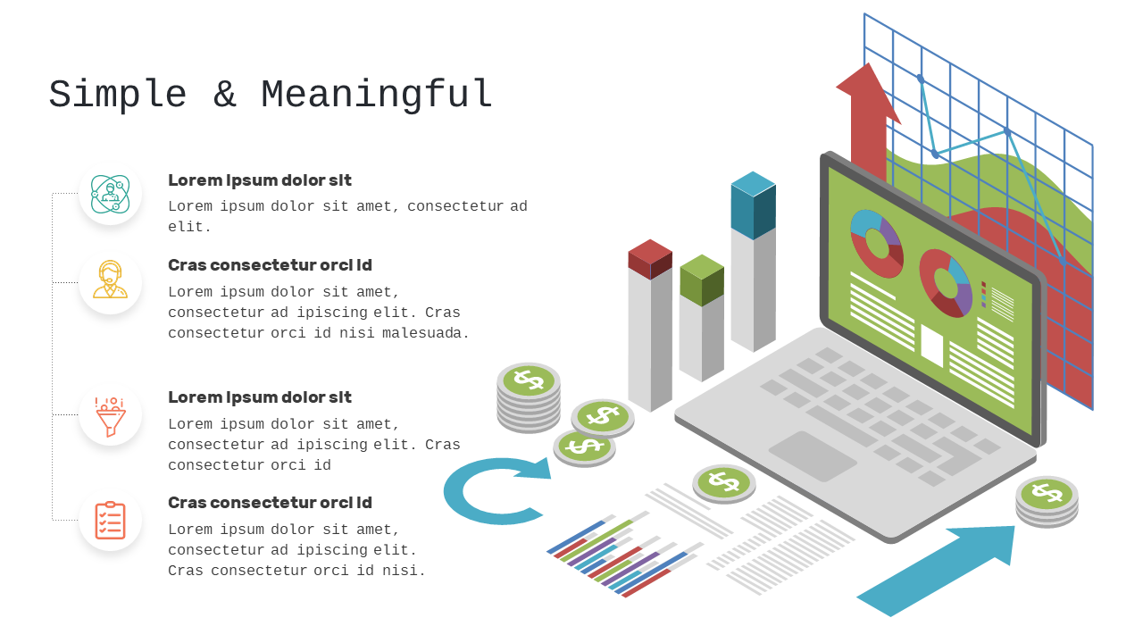
Use this layout for effective data visualization and information flow presentations.
View full slide →
✓
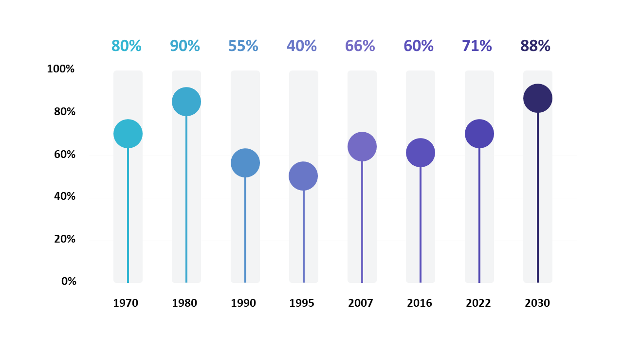
Visualize data trends over time using vertical bars and percentage indicators.
View full slide →
✓
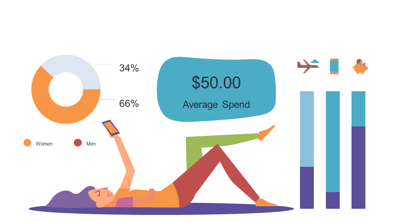
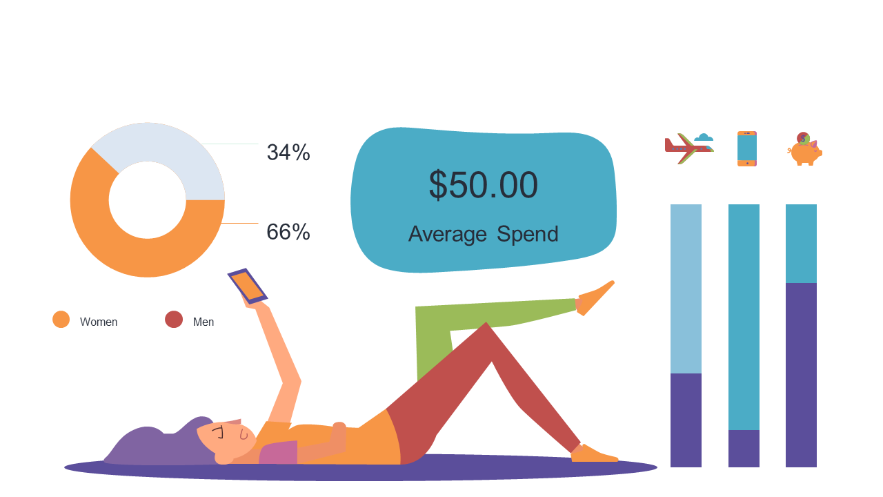
Use PowerPoint to visualize gender spending data with pie and bar charts.
View full slide →
✓
Present gender-based spending analysis using customizable charts in PowerPoint.
View full slide →
✓
Engage audiences with a creative data visualization layout for PowerPoint.
View full slide →
✓
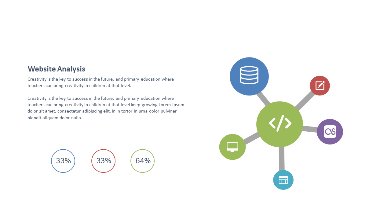
Effectively present website analysis metrics using this visual layout.
View full slide →
✓
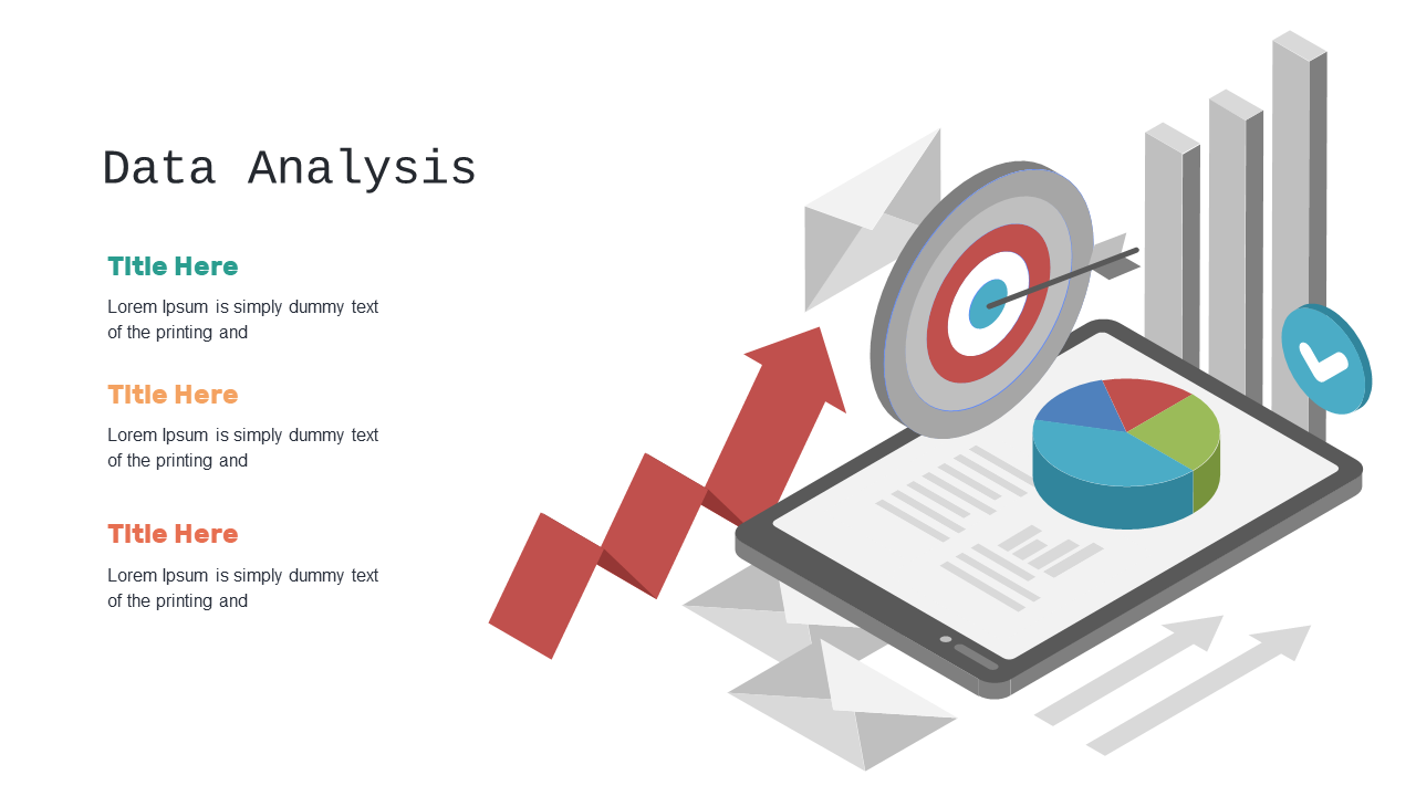
Present data analysis findings with targets and graphs in PowerPoint.
View full slide →
✓
Utilize a pie chart with annotations for clear data presentation in PowerPoint.
View full slide →
✓
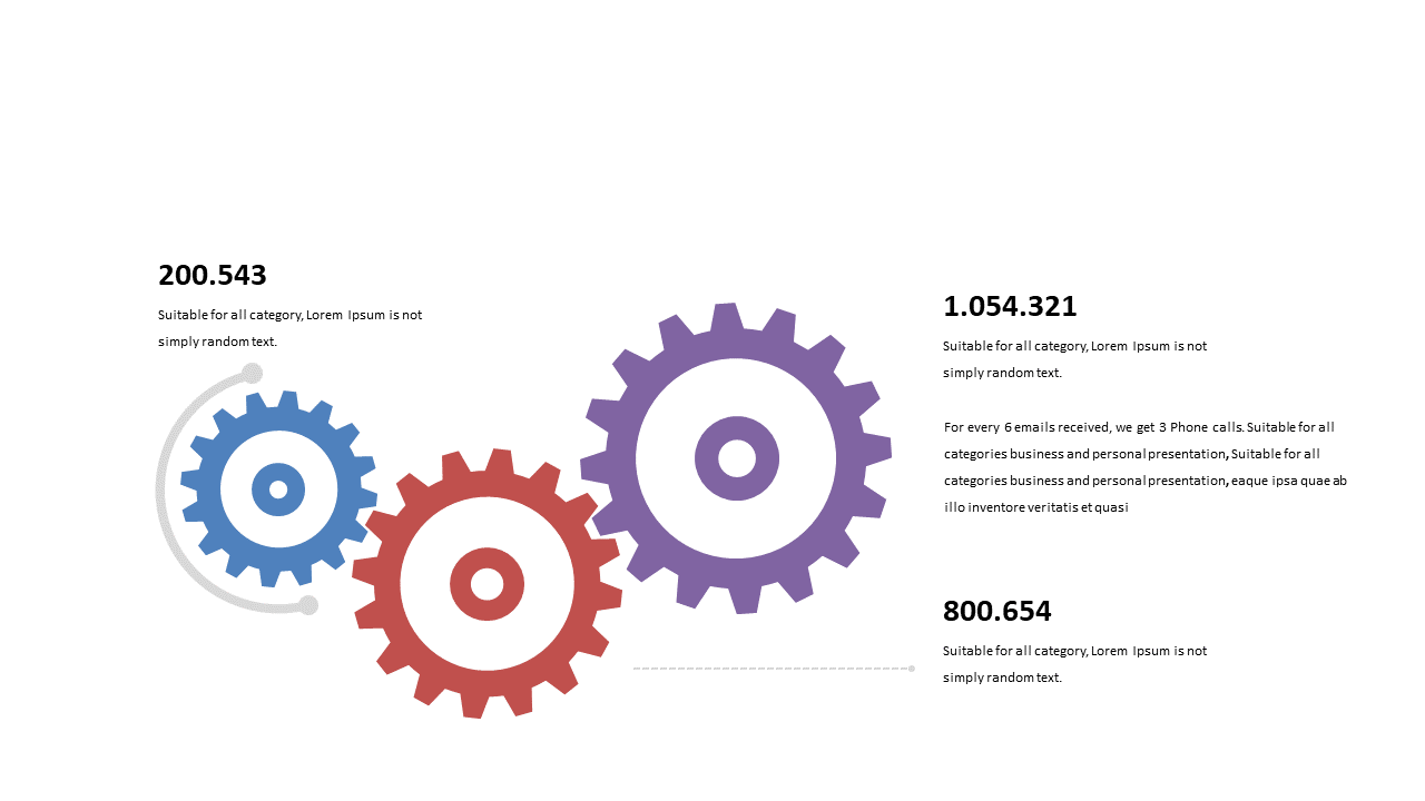
Showcase performance data using engaging gear designs in presentations.
View full slide →
✓
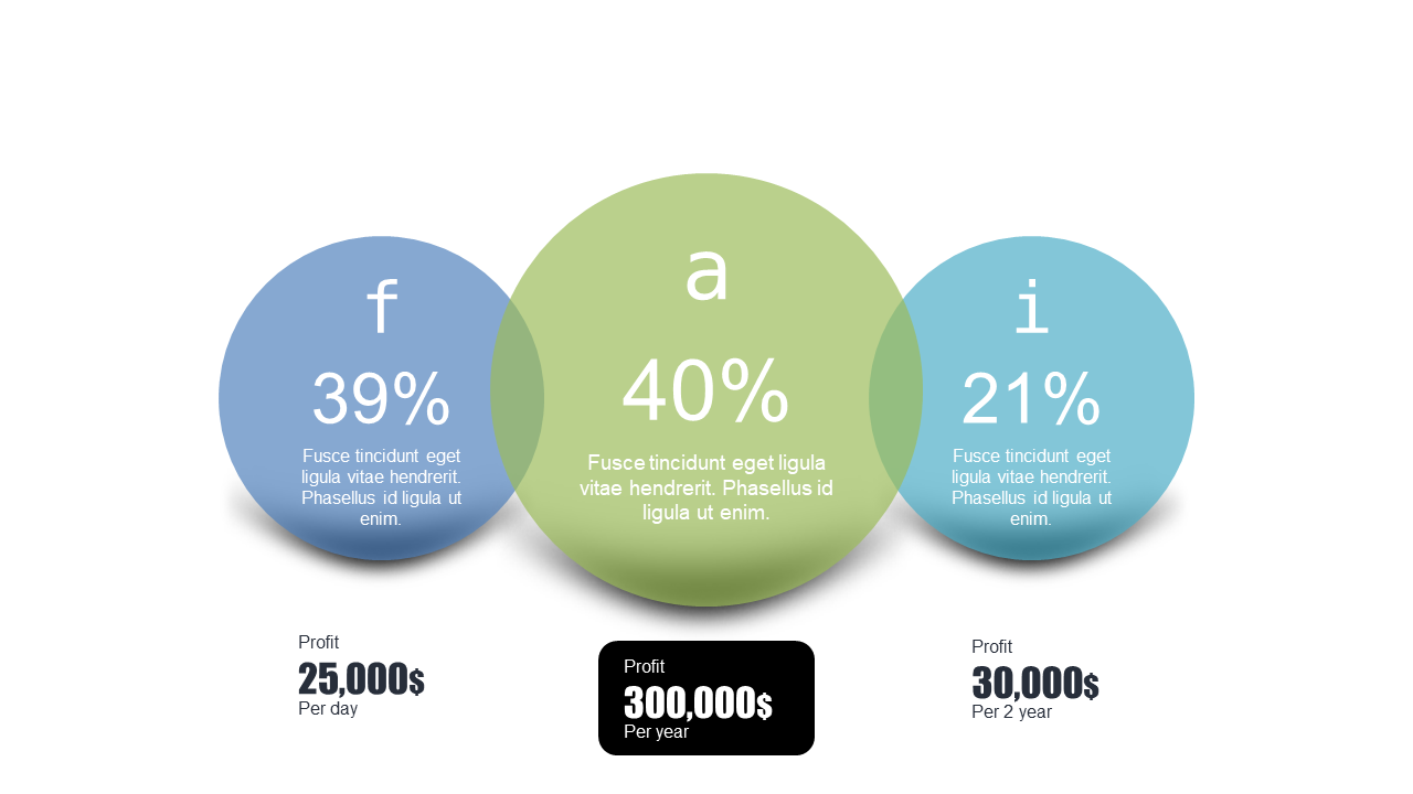
Showcase profit distribution using circular data layouts in financial presentations.
View full slide →
✓
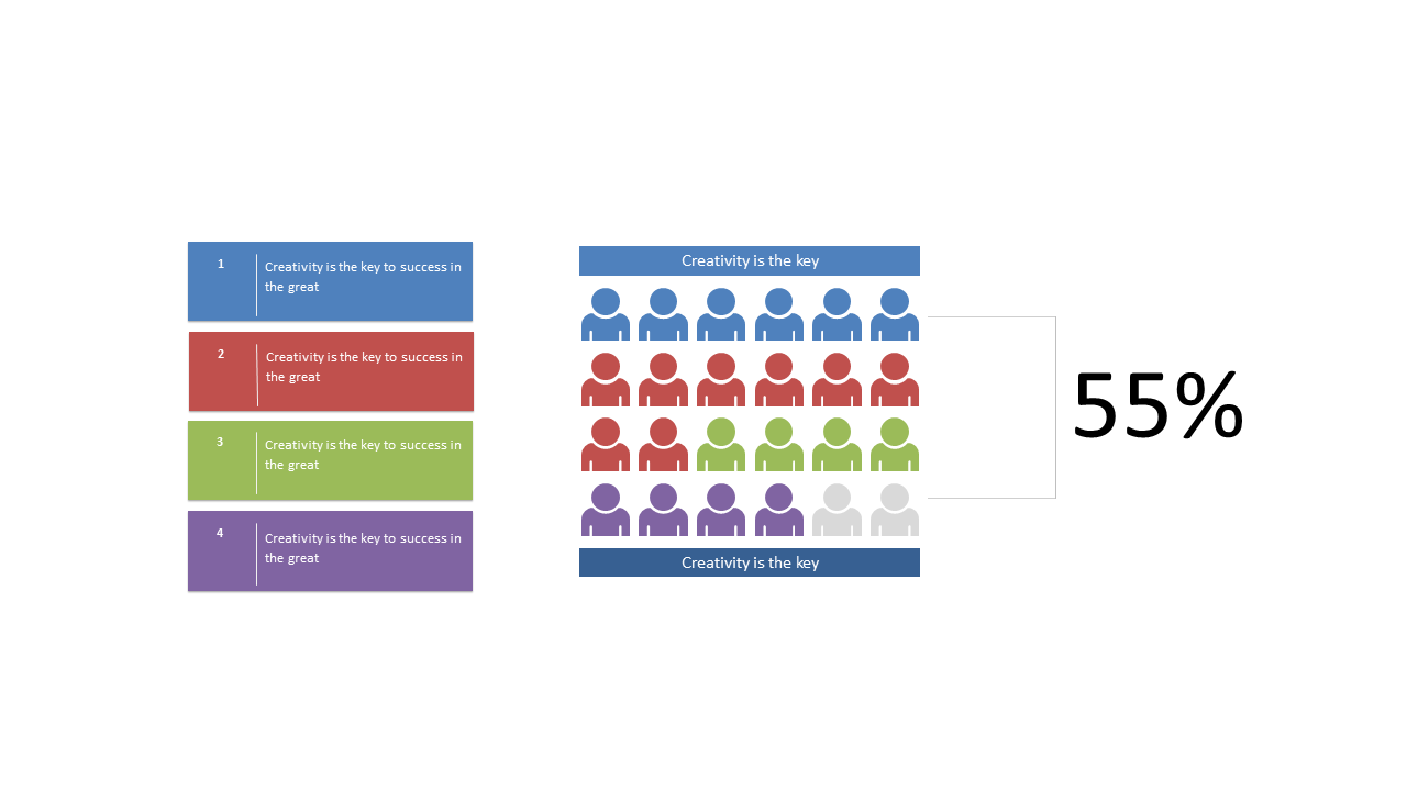
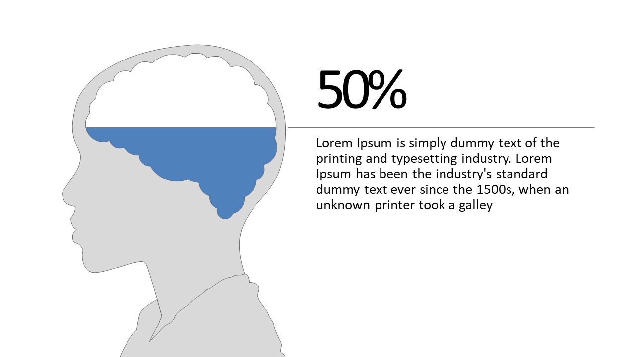
Highlight important statistics using a silhouette layout for presentations.
 SlideSwift