Showing 365 slides
in Data Visualization

View full slide →
✓
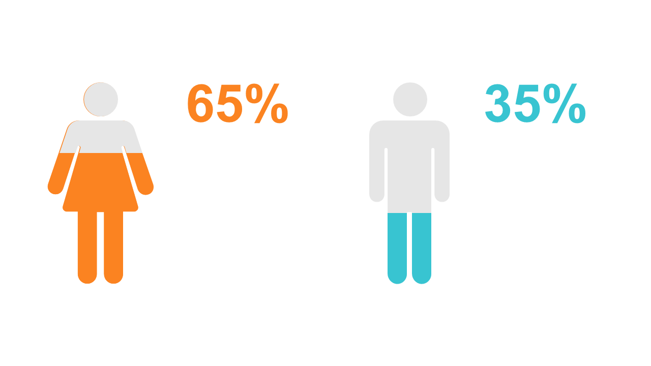
Use this structured data table for effective numerical analysis in your presentations.
View full slide →
✓
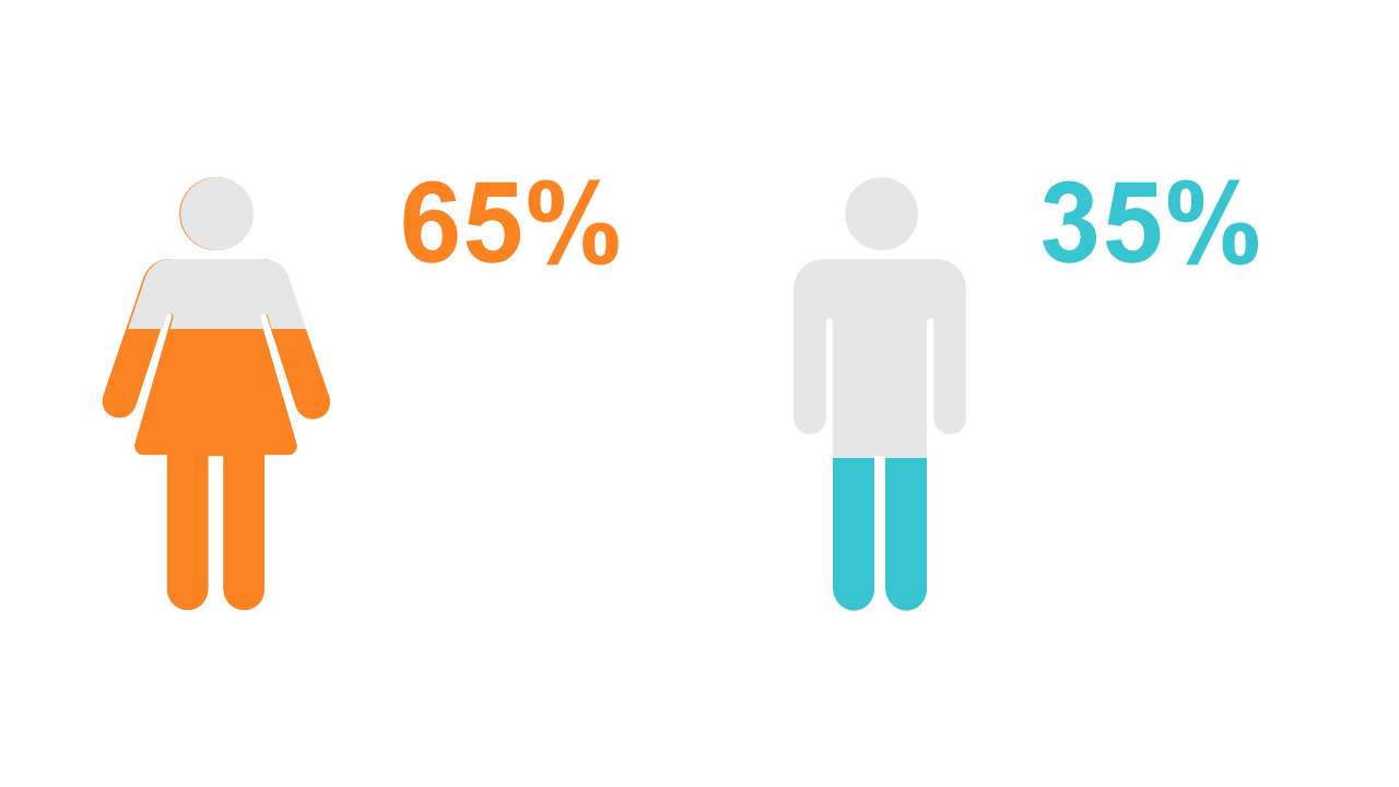
Showcase numerical data clearly with this customizable data table layout.
View full slide →
✓
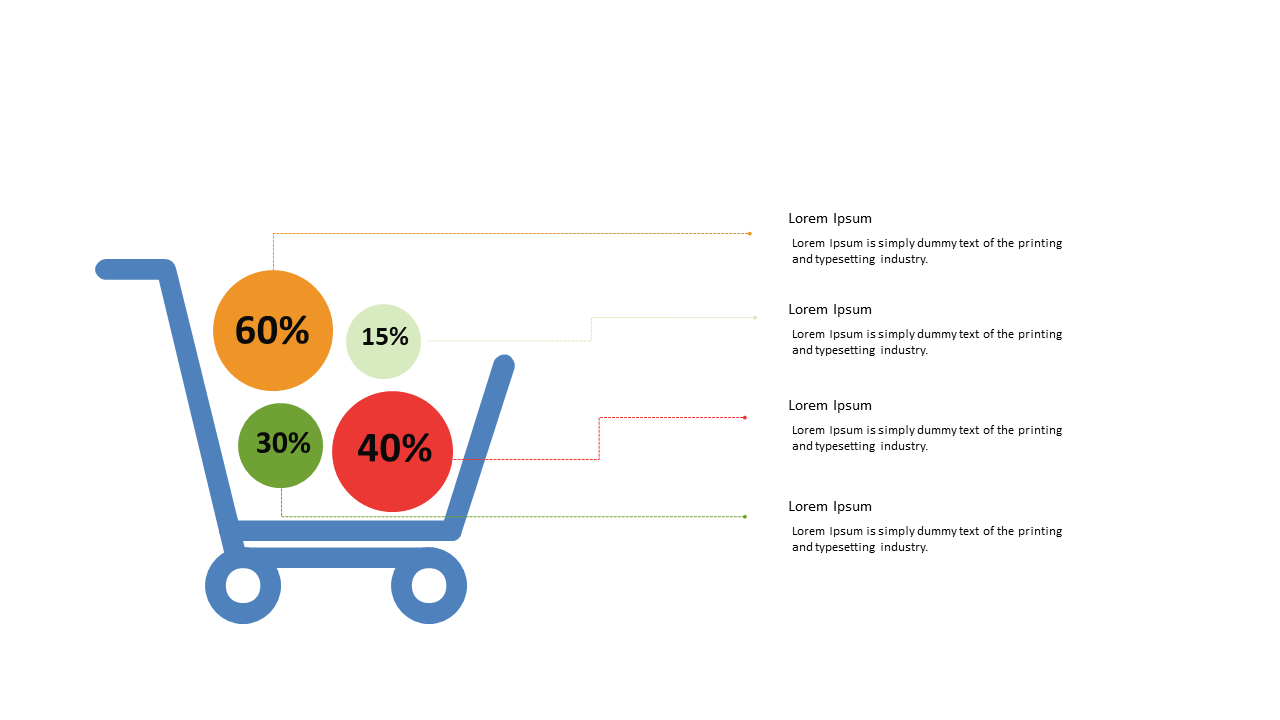
Visualize product distribution using a pie chart in a shopping cart layout for PowerPoint and Google Slides.
View full slide →
✓
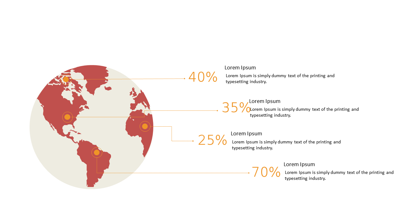
Visualize global percentage distributions using a customizable world map in PowerPoint and Google Slides.
View full slide →
✓
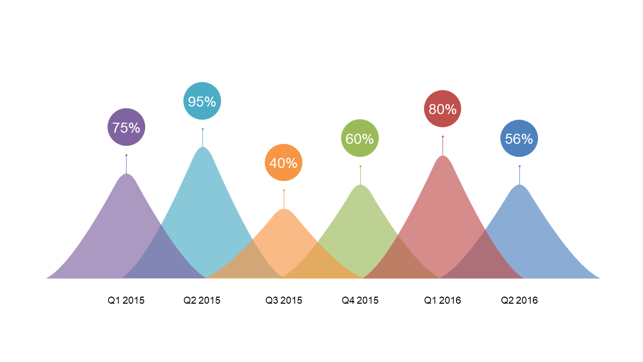
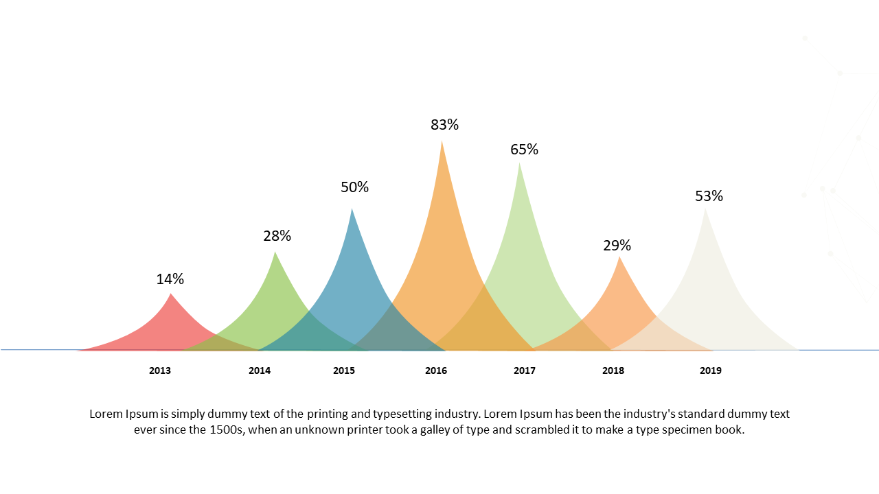
Showcase performance data trends over time with peak comparisons in your presentations.
View full slide →
✓
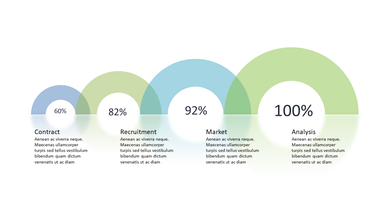
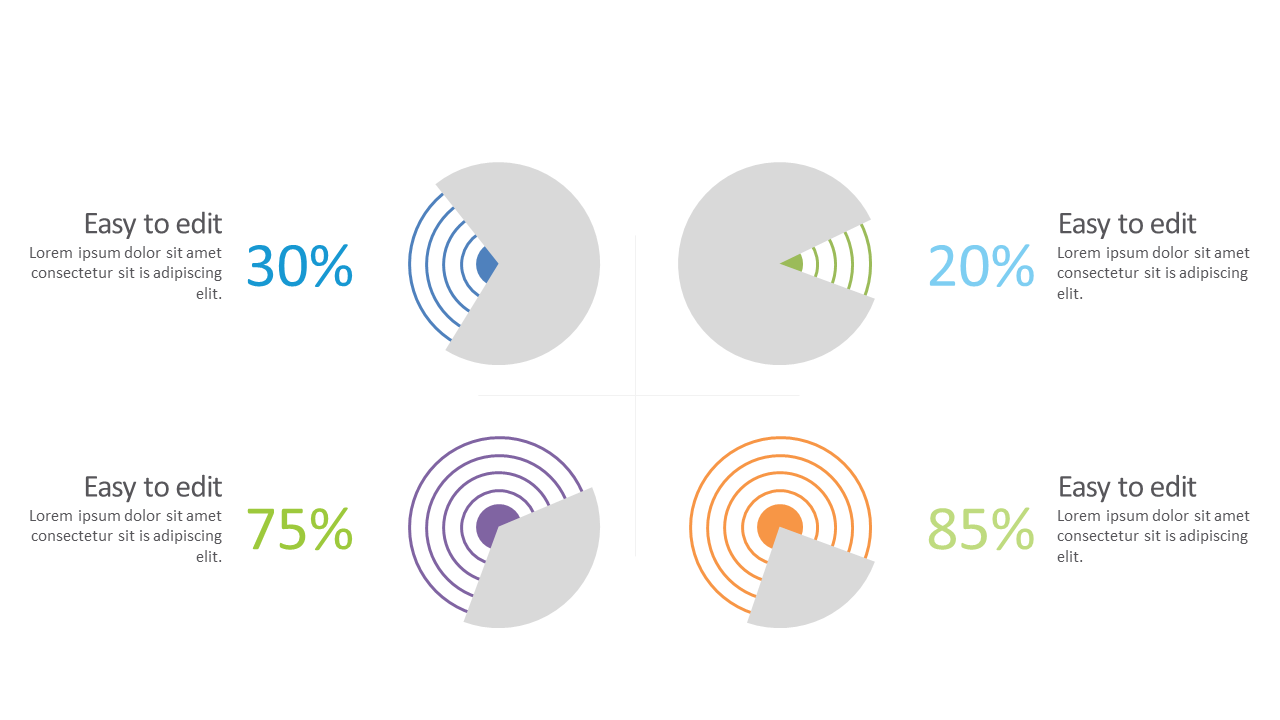
Showcase evaluations and project status with this editable circular progress indicator template.
View full slide →
✓
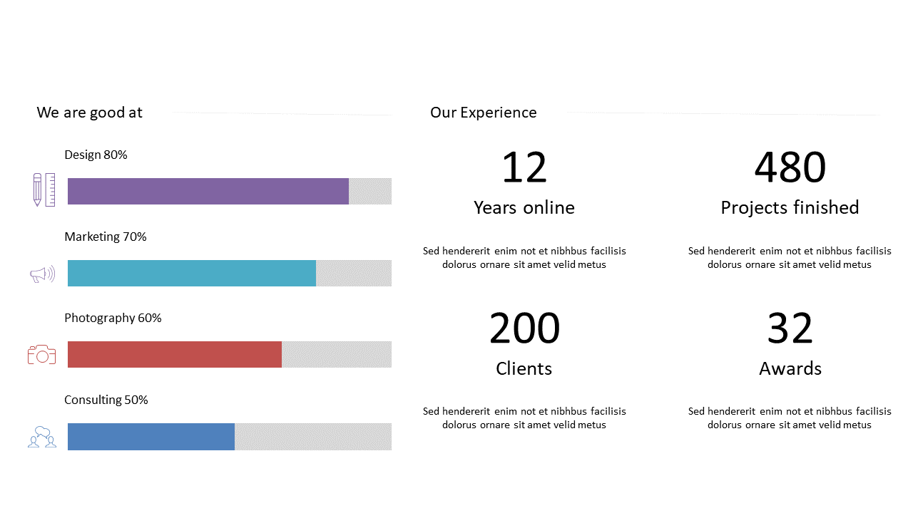
Visualize skills and experience metrics effectively with engaging bar graphs for business presentations.
View full slide →
✓
Present performance metrics clearly using circular progress indicators in presentations.
View full slide →
✓
Present data trends effectively using a colorful bell curve layout for analysis.
View full slide →
✓
Visualize changes in metrics using a colorful bell curve layout for presentations.
View full slide →
✓
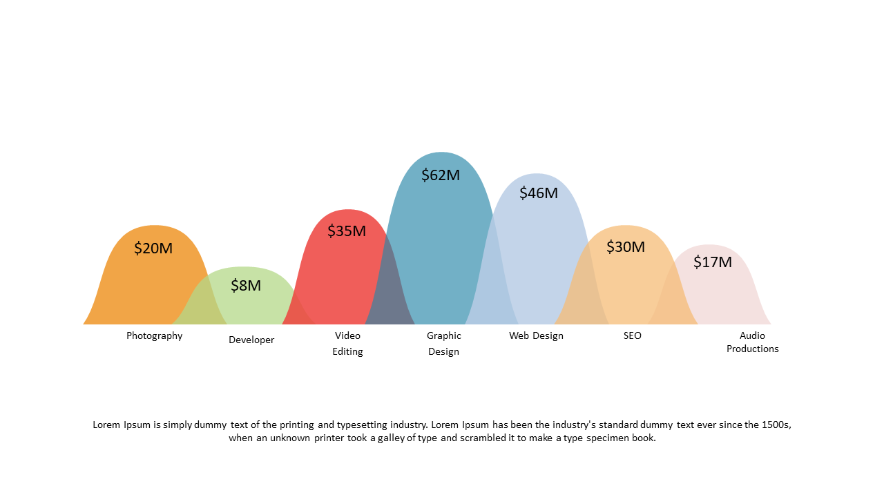
Present financial distributions effectively using a colored wave chart layout.
View full slide →
✓
Use this editable colored wave chart in PowerPoint or Google Slides to present financial data clearly.
 SlideSwift