SlideSwift
By Category
💼Business 📊Infographics □Minimal 🕐Timelines ✨Neumorphic 🗑Diagrams 🔄Flow Charts ✨Glassmorphism 🎨Creative 🌍Abstract 🔄Cycle Diagrams 💎Isometric 🖼Illustrations 📱Social Media 🗺MapsBy Slide Type
🚀Pitch Deck 📌Roadmap 🔍SWOT Analysis 📅Timeline 📈Gantt Chart 🏢Org Chart 📋Funnel ⚖Comparison 📄Case Study 📋Agenda ⭐Icons & Lists 👏Thank You
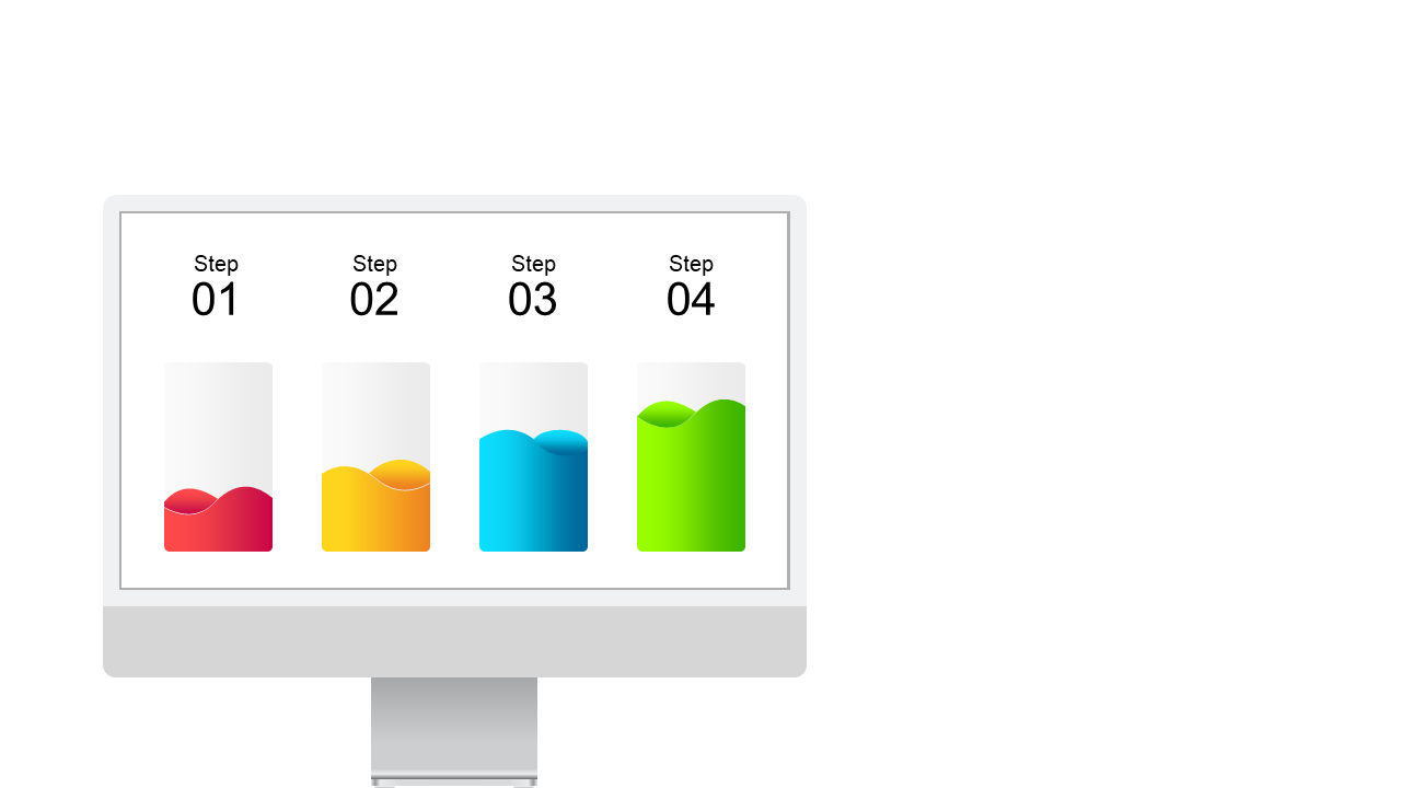
Everyone knows that presenting data can be a challenge, especially when trying to convey trends and patterns clearly. This eye-catching slide showcases a colorful bell curve, designed specifically for illustrating changes over time in a visually appealing manner. The vibrant gradient colors not only make your data stand out but are also easily editable to suit your specific branding needs. As a BI developer, you can use this slide to communicate complex data trends to stakeholders, making it more digestible and engaging. For a finance lead, this slide is perfect for presenting historical performance metrics in a way that highlights fluctuations and forecasts. Meanwhile, a data analyst can employ this visual to support their findings during team meetings, translating raw data into actionable insights. Feel free to customize the colors and text to align with your presentation style. $0.99 — add this single slide to any deck from the SlideSwift Slide Library. No subscription needed. Mix slides from any category to build your perfect deck.
Add more from this category to your custom deck