SlideSwift
By Category
💼Business 📊Infographics □Minimal 🕐Timelines ✨Neumorphic 🗑Diagrams 🔄Flow Charts ✨Glassmorphism 🎨Creative 🌍Abstract 🔄Cycle Diagrams 💎Isometric 🖼Illustrations 📱Social Media 🗺MapsBy Slide Type
🚀Pitch Deck 📌Roadmap 🔍SWOT Analysis 📅Timeline 📈Gantt Chart 🏢Org Chart 📋Funnel ⚖Comparison 📄Case Study 📋Agenda ⭐Icons & Lists 👏Thank You
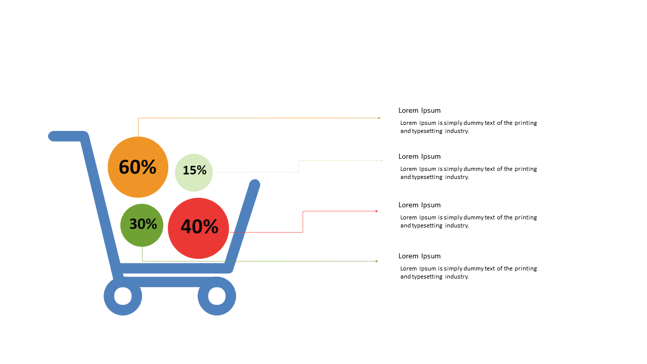
Finding the right way to present sales data can be a challenge, especially when you want to make it engaging and easy to understand. This slide visually represents a shopping cart filled with pie chart segments, each illustrating the percentage of different sales categories. It’s an effective way to capture attention while delivering essential information. For a data analyst, this slide allows you to quickly communicate where sales are coming from, helping to identify trends at a glance. A business analyst can use this visualization to discuss product distribution during team meetings, making data-driven decisions easier for everyone involved. For BI developers, integrating this slide into a report can enhance clarity and make complex data more digestible for stakeholders. You can easily customize the colors, percentages, and text to fit your brand’s identity. $0.99 — add this single slide to any deck from the SlideSwift Slide Library. No subscription needed. Mix slides from any category to build your perfect deck.
Add more from this category to your custom deck