Showing 365 slides
in Data Visualization

View full slide →
✓
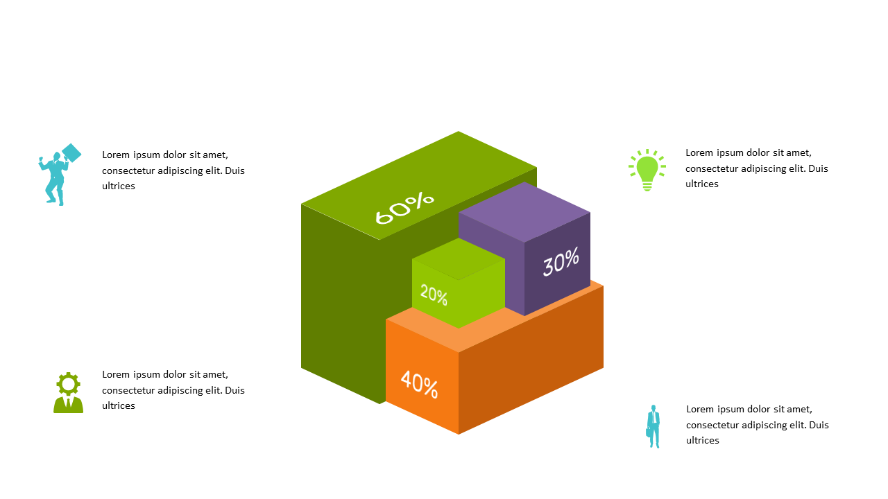
Utilize this 3D bar chart for effective data visualization in reports and meetings.
View full slide →
✓
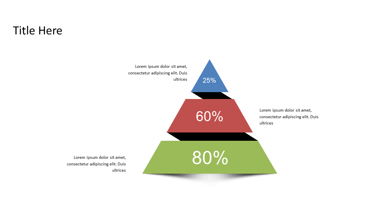
Illustrate data comparisons effectively with a triangular percentage pyramid.
View full slide →
✓
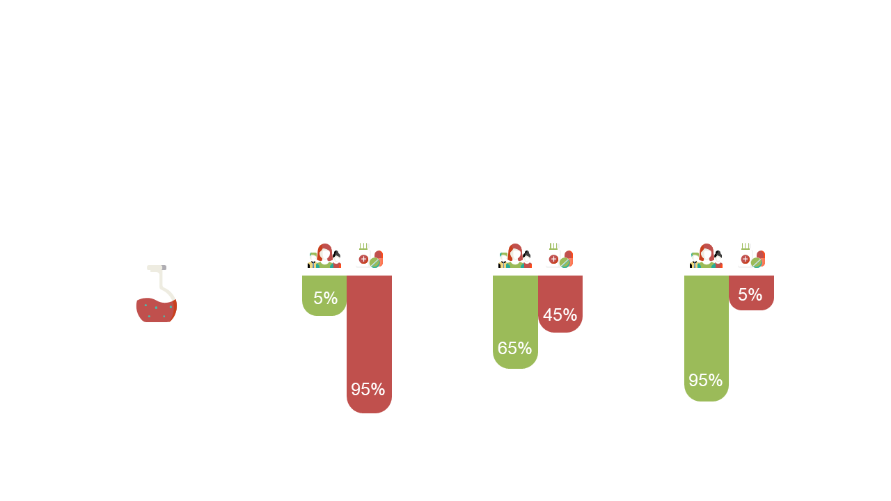
Create impactful reports with a horizontal stacked bar chart layout.
View full slide →
✓
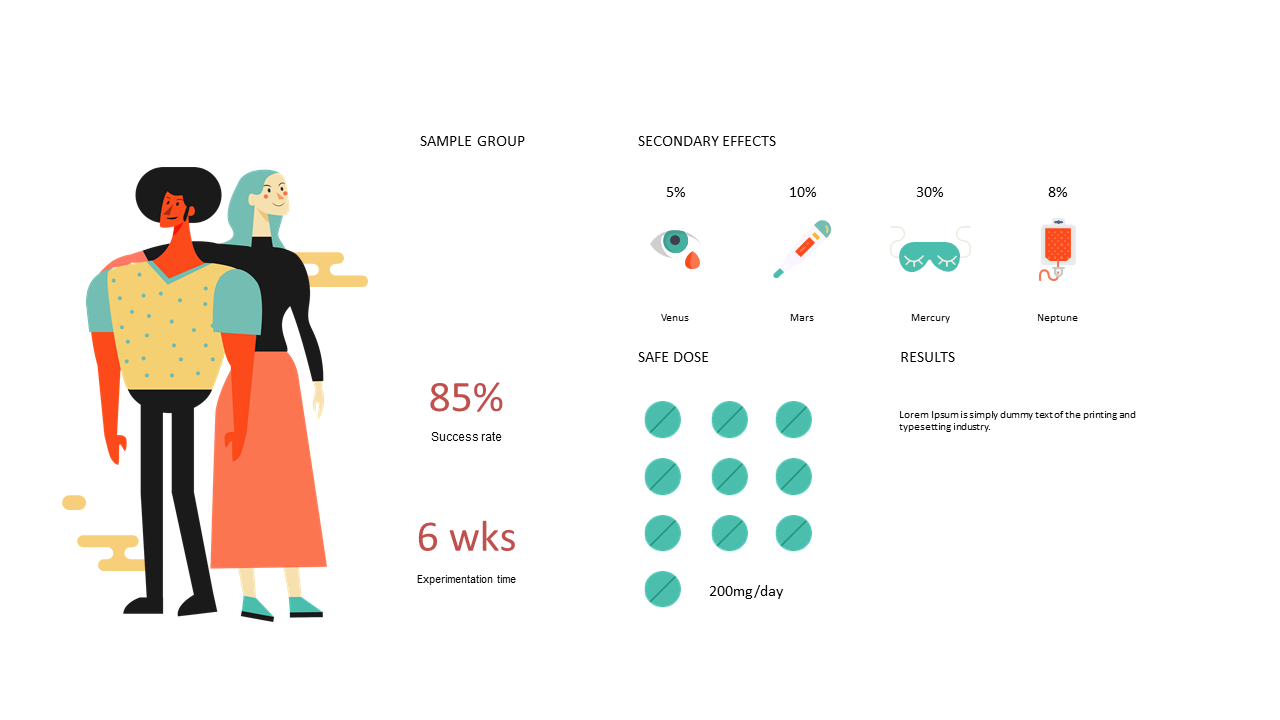
Showcase clinical study results using visual data representation in PowerPoint.
View full slide →
✓
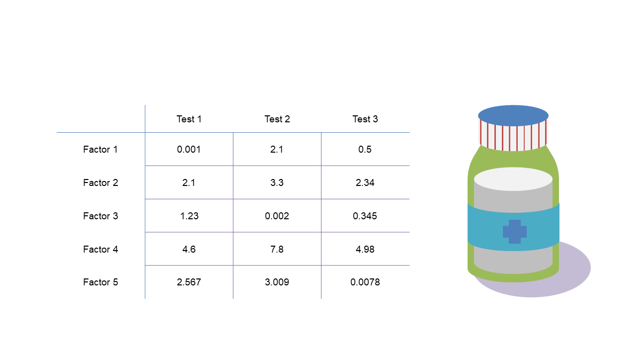
Compare pharmaceutical test results clearly with this structured comparison table.
View full slide →
✓
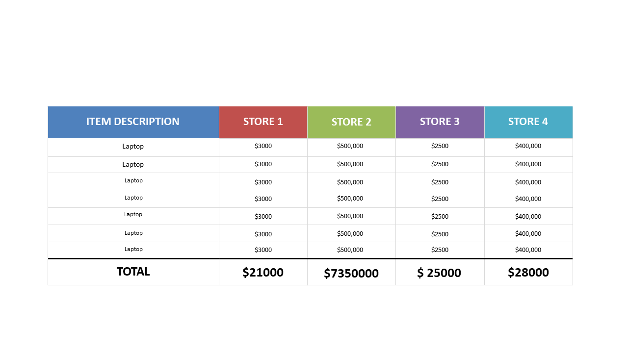
Easily compare laptop prices across stores with this editable table layout for PowerPoint and Google Slides.
View full slide →
✓
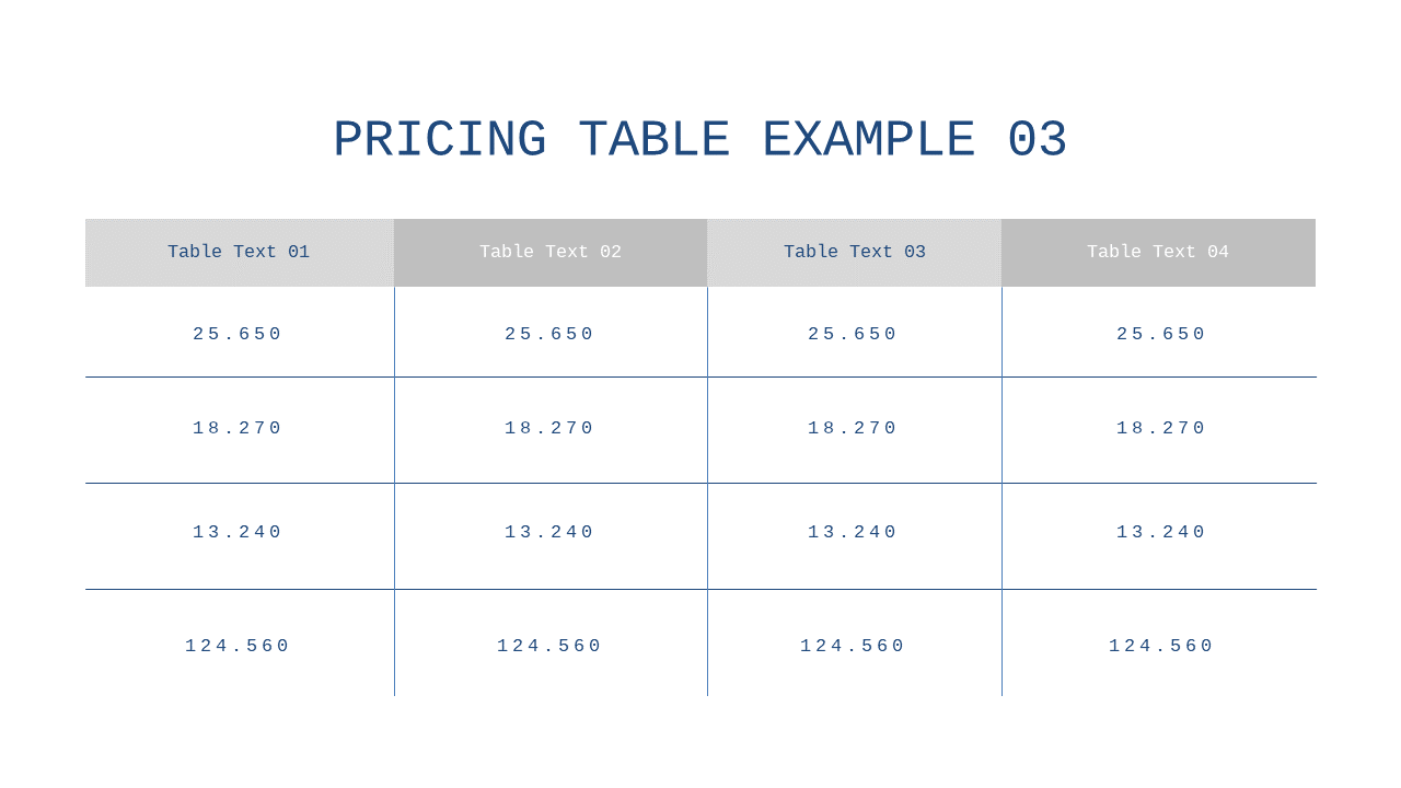
Present pricing options clearly with this structured four-column comparison table in PowerPoint and Google Slides.
View full slide →
✓
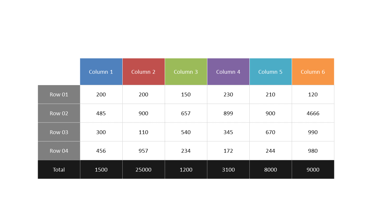
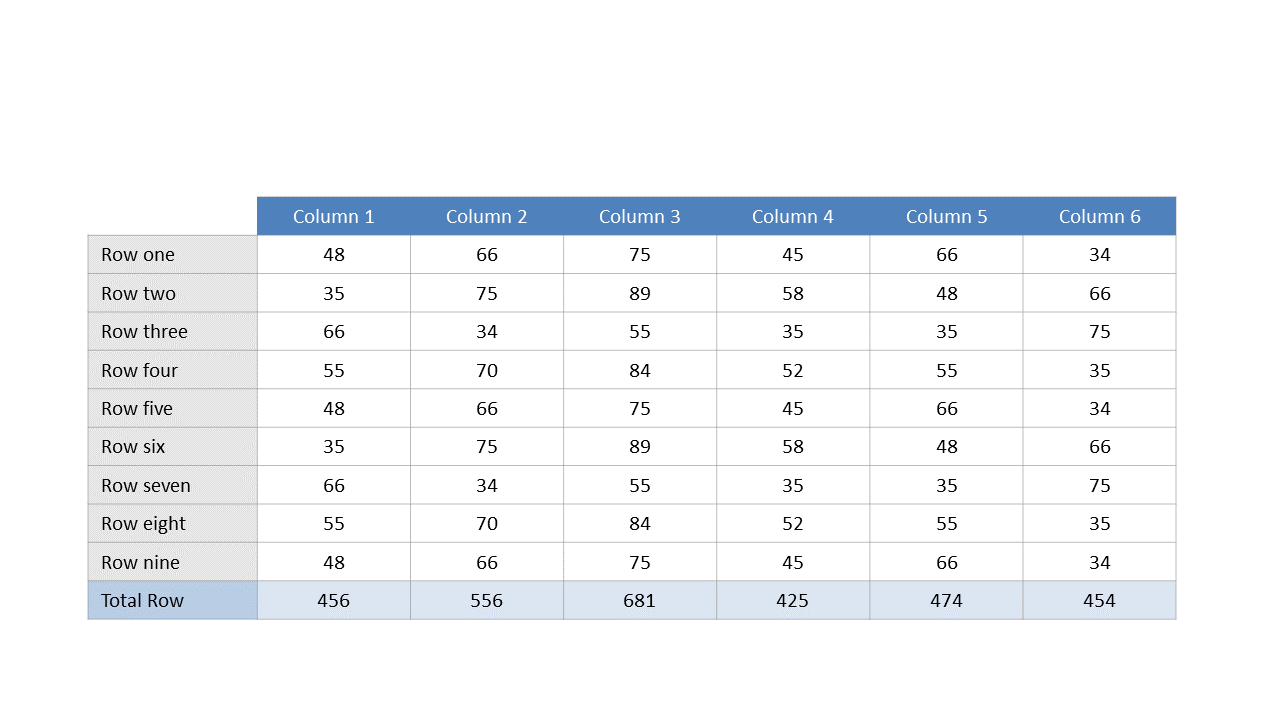
Use this structured data table to effectively present quantitative comparisons.
View full slide →
✓
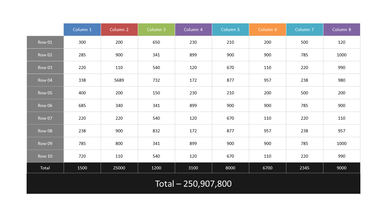
Use this comprehensive data table for effective financial reporting.
View full slide →
✓
Visualize laptop pricing data effectively with this comparative sales table.
View full slide →
✓
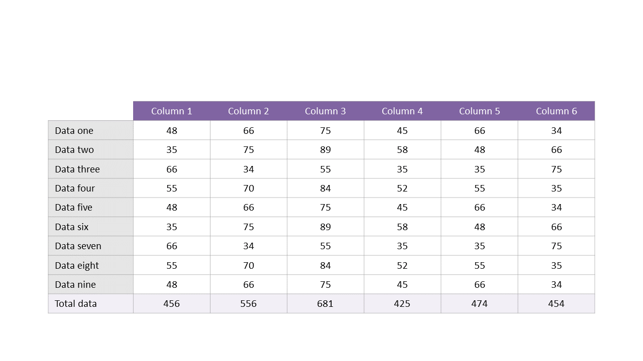
Use this data table layout for effective numerical analysis in PowerPoint and Google Slides.
View full slide →
✓
Present numerical comparisons effectively with this editable data table in PowerPoint and Google Slides.
 SlideSwift