SlideSwift
By Category
💼Business 📊Infographics □Minimal 🕐Timelines ✨Neumorphic 🗑Diagrams 🔄Flow Charts ✨Glassmorphism 🎨Creative 🌍Abstract 🔄Cycle Diagrams 💎Isometric 🖼Illustrations 📱Social Media 🗺MapsBy Slide Type
🚀Pitch Deck 📌Roadmap 🔍SWOT Analysis 📅Timeline 📈Gantt Chart 🏢Org Chart 📋Funnel ⚖Comparison 📄Case Study 📋Agenda ⭐Icons & Lists 👏Thank You
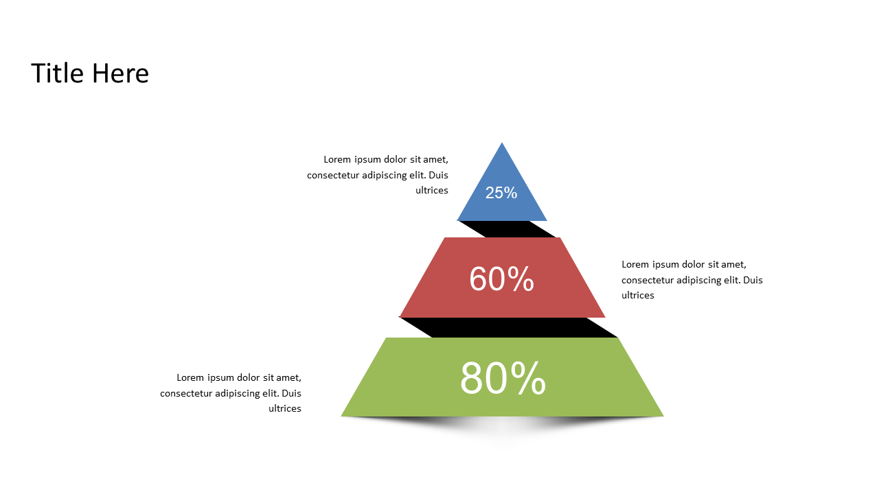
In the fast-paced world of finance, effectively communicating data can be a challenge. You might find yourself sifting through complex datasets, trying to present clear comparisons without overwhelming your audience. The triangular percentage pyramid in this slide offers a sleek and intuitive way to visualize hierarchical data. With three distinct segments, each clearly labeled with percentage values, this slide allows for quick understanding and engagement. As a finance lead, you can use this slide to compare financial metrics or illustrate market share percentages during a strategy meeting. If you’re a data analyst, this visual can help you present data findings concisely during a report, ensuring stakeholders grasp the key takeaways. For business analysts, this slide can effectively showcase customer segmentation data, allowing you to discuss insights in a straightforward manner. The design is fully customizable; you can easily adjust colors and values to fit your presentation’s theme. $0.99 — add this single slide to any deck from the SlideSwift Slide Library. No subscription needed. Mix slides from any category to build your perfect deck.
Add more from this category to your custom deck