SlideSwift
By Category
💼Business 📊Infographics □Minimal 🕐Timelines ✨Neumorphic 🗑Diagrams 🔄Flow Charts ✨Glassmorphism 🎨Creative 🌍Abstract 🔄Cycle Diagrams 💎Isometric 🖼Illustrations 📱Social Media 🗺MapsBy Slide Type
🚀Pitch Deck 📌Roadmap 🔍SWOT Analysis 📅Timeline 📈Gantt Chart 🏢Org Chart 📋Funnel ⚖Comparison 📄Case Study 📋Agenda ⭐Icons & Lists 👏Thank You
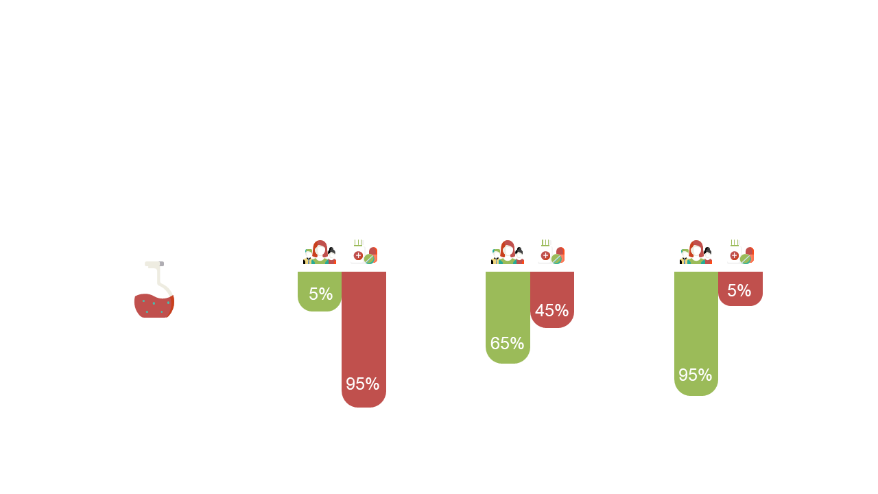
When data piles up, it can be difficult to communicate important insights effectively. A well-crafted visual can turn complex information into something clear and engaging. This slide showcases a horizontal stacked bar chart that highlights percentages, making your data easy to compare and understand. With integrated icons, it adds a professional touch to your presentation without overwhelming the viewer. As a BI developer, you can use this slide to present key metrics to stakeholders, ensuring everyone is on the same page. If you’re a finance lead, this slide is perfect for illustrating budget allocations or financial performance in meetings. Data analysts can utilize it to visualize survey results or sales performance, turning raw numbers into impactful narratives. Feel free to customize the colors and icons to align with your branding. $0.99 — add this single slide to any deck from the SlideSwift Slide Library. No subscription needed. Mix slides from any category to build your perfect deck.
Add more from this category to your custom deck