SlideSwift
By Category
💼Business 📊Infographics □Minimal 🕐Timelines ✨Neumorphic 🗑Diagrams 🔄Flow Charts ✨Glassmorphism 🎨Creative 🌍Abstract 🔄Cycle Diagrams 💎Isometric 🖼Illustrations 📱Social Media 🗺MapsBy Slide Type
🚀Pitch Deck 📌Roadmap 🔍SWOT Analysis 📅Timeline 📈Gantt Chart 🏢Org Chart 📋Funnel ⚖Comparison 📄Case Study 📋Agenda ⭐Icons & Lists 👏Thank You
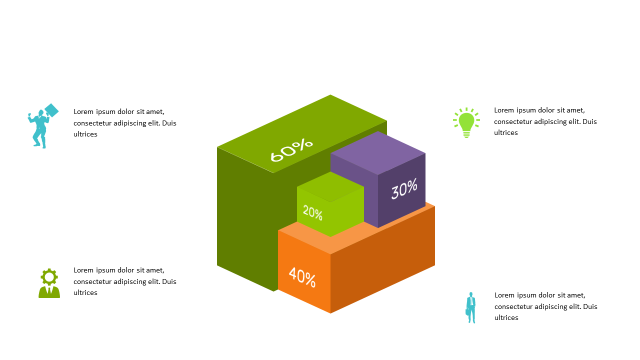
When you’re tasked with presenting complex data, clarity is key. A 3D percentage bar chart can bring your numbers to life, helping your audience grasp the information at a glance. This slide showcases a sleek 3D stacked bar chart, where each segment is clearly defined to represent percentage distributions. Its visual appeal not only captures attention but also communicates your data effectively. As a data analyst, you can use this slide to break down social media engagement metrics, highlighting key performance indicators to your team. For a business analyst, the chart serves as a powerful tool to compare data trends across different categories, making it easier to draw insights. BI developers can leverage this slide during client meetings, transforming raw data into meaningful visuals that foster discussions. Remember, you can easily edit the percentages and categories to fit your specific needs. $0.99 — add this single slide to any deck from the SlideSwift Slide Library. No subscription needed. Mix slides from any category to build your perfect deck.
Add more from this category to your custom deck