SlideSwift
By Category
💼Business 📊Infographics □Minimal 🕐Timelines ✨Neumorphic 🗑Diagrams 🔄Flow Charts ✨Glassmorphism 🎨Creative 🌍Abstract 🔄Cycle Diagrams 💎Isometric 🖼Illustrations 📱Social Media 🗺MapsBy Slide Type
🚀Pitch Deck 📌Roadmap 🔍SWOT Analysis 📅Timeline 📈Gantt Chart 🏢Org Chart 📋Funnel ⚖Comparison 📄Case Study 📋Agenda ⭐Icons & Lists 👏Thank You
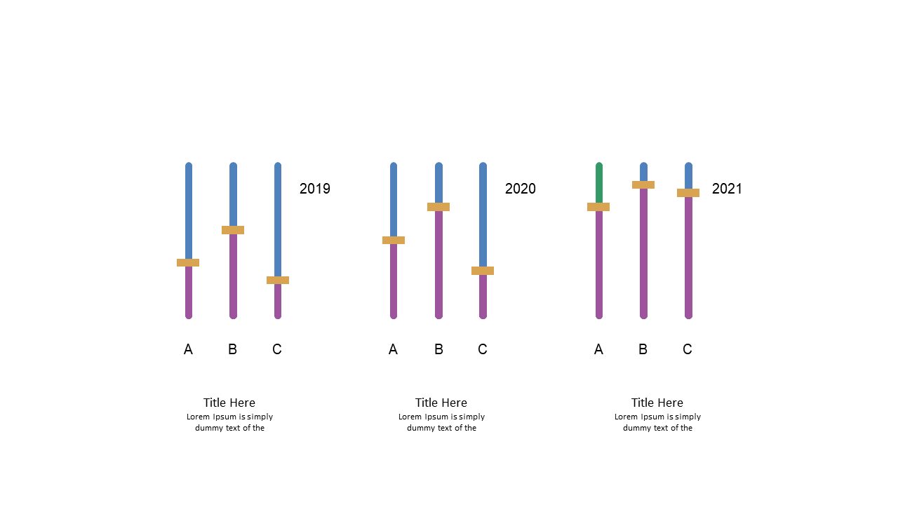
When you need to illustrate yearly data comparisons, having a clear visual can make all the difference. This slide presents a vertical comparison chart, showcasing data across three years with bold bars that make trends easy to spot. The straightforward design allows for quick comprehension, making it perfect for your next presentation. As a data analyst, this slide enables you to present complex datasets in an easily digestible format for your audience. For business analysts, this chart serves as a powerful tool to highlight growth or decline trends when discussing strategic initiatives. If you’re a BI developer, this slide can help you convey insights drawn from your data, ensuring your clients grasp the key takeaways effectively. You can easily customize the colors, labels, and values to fit your specific data. $0.99 — add this single slide to any deck from the SlideSwift Slide Library. No subscription needed. Mix slides from any category to build your perfect deck.
Add more from this category to your custom deck