SlideSwift
By Category
💼Business 📊Infographics □Minimal 🕐Timelines ✨Neumorphic 🗑Diagrams 🔄Flow Charts ✨Glassmorphism 🎨Creative 🌍Abstract 🔄Cycle Diagrams 💎Isometric 🖼Illustrations 📱Social Media 🗺MapsBy Slide Type
🚀Pitch Deck 📌Roadmap 🔍SWOT Analysis 📅Timeline 📈Gantt Chart 🏢Org Chart 📋Funnel ⚖Comparison 📄Case Study 📋Agenda ⭐Icons & Lists 👏Thank You
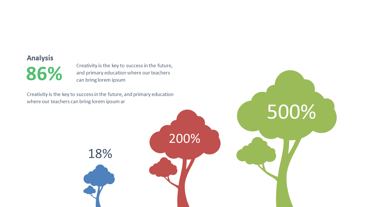
When analyzing data, it’s crucial to convey information clearly and effectively. This editable tree diagram allows you to present various percentage data points in a visually engaging manner. With a layout that makes comparisons simple, your audience will grasp analytical findings at a glance. Imagine inserting this slide into your next PowerPoint presentation, transforming raw data into a clear visual story. As a data analyst, you can use this diagram to display survey results or performance metrics, making your insights more impactful. Business analysts can leverage this slide to communicate trends and insights drawn from extensive data analysis, facilitating informed decision-making among stakeholders. Meanwhile, BI developers can utilize this diagram to present data insights during team meetings, ensuring everyone understands the key metrics. The slide is fully customizable, so you can adjust colors and text to match your presentation style. $0.99 — add this single slide to any deck from the SlideSwift Slide Library. No subscription needed. Mix slides from any category to build your perfect deck.
Add more from this category to your custom deck