SlideSwift
By Category
💼Business 📊Infographics □Minimal 🕐Timelines ✨Neumorphic 🗑Diagrams 🔄Flow Charts ✨Glassmorphism 🎨Creative 🌍Abstract 🔄Cycle Diagrams 💎Isometric 🖼Illustrations 📱Social Media 🗺MapsBy Slide Type
🚀Pitch Deck 📌Roadmap 🔍SWOT Analysis 📅Timeline 📈Gantt Chart 🏢Org Chart 📋Funnel ⚖Comparison 📄Case Study 📋Agenda ⭐Icons & Lists 👏Thank You
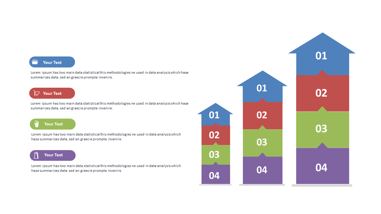
If you often find yourself grappling with complex data, this slide can help you present hierarchical information in a way that’s easy to understand. Imagine dropping a cleanly designed stacked column chart into your PowerPoint presentation tomorrow, showcasing comparisons with clarity. This slide is perfect for illustrating how different segments contribute to a whole, making it visually intuitive for your audience. For a BI developer, it provides a straightforward way to represent data metrics over time. As a finance lead, you can use it to highlight revenue growth across various departments, ensuring stakeholders grasp the financial landscape at a glance. Meanwhile, a data analyst can leverage this slide to break down survey results, making the findings digestible for team discussions. The color-coded sections allow for easy customization, so you can adjust the labels and colors to fit your specific data needs. $0.99 — add this single slide to any deck from the SlideSwift Slide Library. No subscription needed. Mix slides from any category to build your perfect deck.
Add more from this category to your custom deck