SlideSwift
By Category
💼Business 📊Infographics □Minimal 🕐Timelines ✨Neumorphic 🗑Diagrams 🔄Flow Charts ✨Glassmorphism 🎨Creative 🌍Abstract 🔄Cycle Diagrams 💎Isometric 🖼Illustrations 📱Social Media 🗺MapsBy Slide Type
🚀Pitch Deck 📌Roadmap 🔍SWOT Analysis 📅Timeline 📈Gantt Chart 🏢Org Chart 📋Funnel ⚖Comparison 📄Case Study 📋Agenda ⭐Icons & Lists 👏Thank You
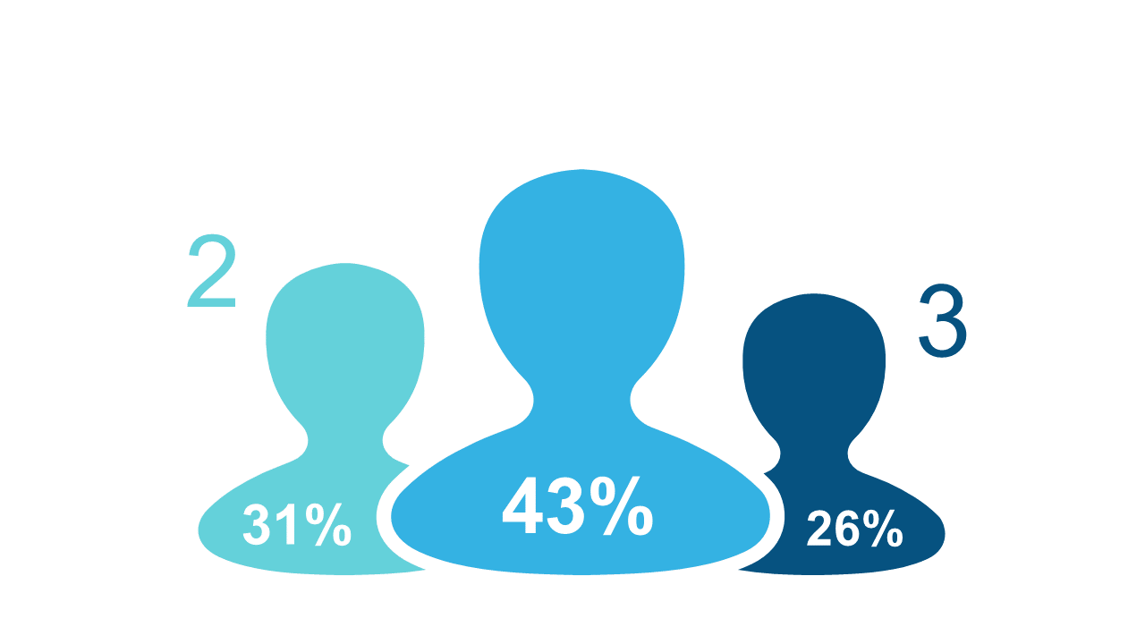
When presenting financial insights, clearly visualizing data is crucial. If you’re dealing with varied audience segments, the challenge often lies in making those figures relatable and understandable. This slide uses stylized human figures to effectively show percentage distributions among different audience segments, making it easier for your audience to grasp complex data quickly. The clean design allows you to edit colors and percentage values effortlessly to match your brand or theme. For a finance lead, this slide can instantly clarify how different segments contribute to your overall strategy. Data analysts can utilize it to present survey results or demographic data in a compelling way, ensuring that stakeholders understand key trends. Meanwhile, business analysts can leverage this visualization to support market research findings during presentations. Customizing this slide to fit your unique needs is simple and intuitive. $0.99 — add this single slide to any deck from the SlideSwift Slide Library. No subscription needed. Mix slides from any category to build your perfect deck.
Add more from this category to your custom deck