SlideSwift
By Category
💼Business 📊Infographics □Minimal 🕐Timelines ✨Neumorphic 🗑Diagrams 🔄Flow Charts ✨Glassmorphism 🎨Creative 🌍Abstract 🔄Cycle Diagrams 💎Isometric 🖼Illustrations 📱Social Media 🗺MapsBy Slide Type
🚀Pitch Deck 📌Roadmap 🔍SWOT Analysis 📅Timeline 📈Gantt Chart 🏢Org Chart 📋Funnel ⚖Comparison 📄Case Study 📋Agenda ⭐Icons & Lists 👏Thank You
When it comes to conveying geographical data trends, clarity is crucial, yet often difficult to achieve. Visual clutter can easily distract from the story you’re trying to tell with your data.
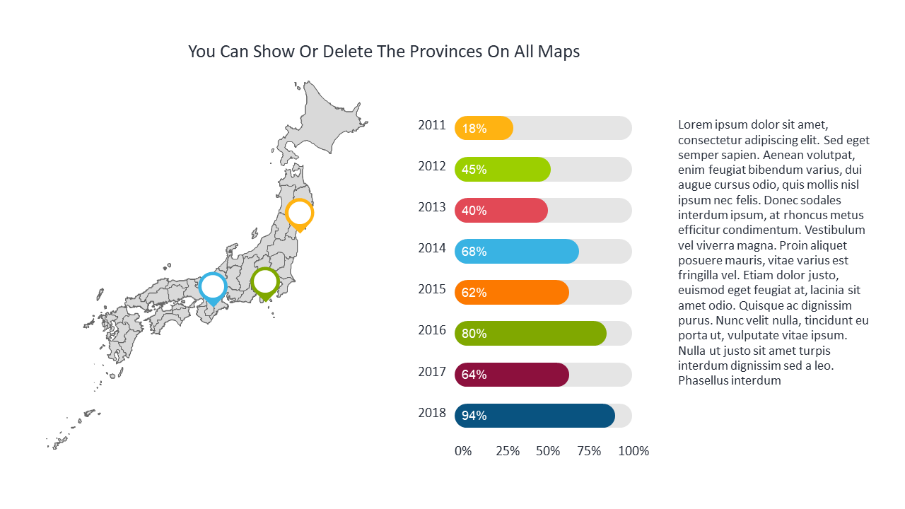
This slide provides a straightforward map highlighting provinces with comparative percentages, allowing your audience to understand regional trends at a glance. This presentation tool is essential for market analysts, regional sales managers, and consultants who need to illustrate geographical data in client meetings or reports. Picture using it to highlight performance differences in a quarterly business review, where clear visuals can spark decisive discussions.
At just $0.99, this slide is available for instant download, making it easy to start using immediately. You’ll be able to edit it in PowerPoint and Google Slides, customizing it to fit your presentation in no time.
$0.99 – Purchase Checkout
Added to cart
Add more from this category to your custom deck