SlideSwift
By Category
💼Business 📊Infographics □Minimal 🕐Timelines ✨Neumorphic 🗑Diagrams 🔄Flow Charts ✨Glassmorphism 🎨Creative 🌍Abstract 🔄Cycle Diagrams 💎Isometric 🖼Illustrations 📱Social Media 🗺MapsBy Slide Type
🚀Pitch Deck 📌Roadmap 🔍SWOT Analysis 📅Timeline 📈Gantt Chart 🏢Org Chart 📋Funnel ⚖Comparison 📄Case Study 📋Agenda ⭐Icons & Lists 👏Thank You
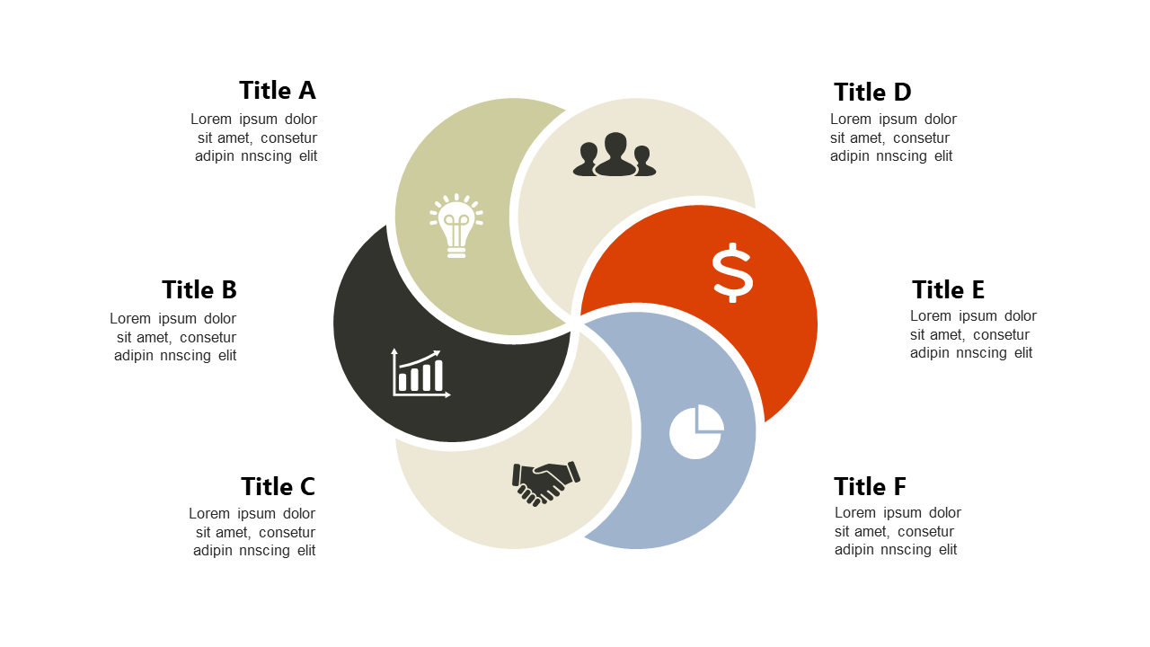
As a data analyst, you often need to showcase changes in key performance indicators (KPIs) to your stakeholders. This slide provides a clear visual comparison of current and future KPIs using hexagonal shapes that draw attention to critical metrics. You can present a strategic overview that highlights the transition from one state to another, making it easy for your audience to grasp the implications of these changes. For performance managers, this slide is perfect for demonstrating improvements or shifts in focus, enabling you to articulate the impact of your strategies effectively. Operations managers can use this slide to communicate how changes in KPIs can lead to better resource allocation and operational efficiency. The visual layout allows for easy customization, so you can adapt the content to suit your specific needs or branding. $0.99 — add this single slide to any deck from the SlideSwift Slide Library. No subscription needed. Mix slides from any category to build your perfect deck.
Add more from this category to your custom deck