SlideSwift
By Category
💼Business 📊Infographics □Minimal 🕐Timelines ✨Neumorphic 🗑Diagrams 🔄Flow Charts ✨Glassmorphism 🎨Creative 🌍Abstract 🔄Cycle Diagrams 💎Isometric 🖼Illustrations 📱Social Media 🗺MapsBy Slide Type
🚀Pitch Deck 📌Roadmap 🔍SWOT Analysis 📅Timeline 📈Gantt Chart 🏢Org Chart 📋Funnel ⚖Comparison 📄Case Study 📋Agenda ⭐Icons & Lists 👏Thank You
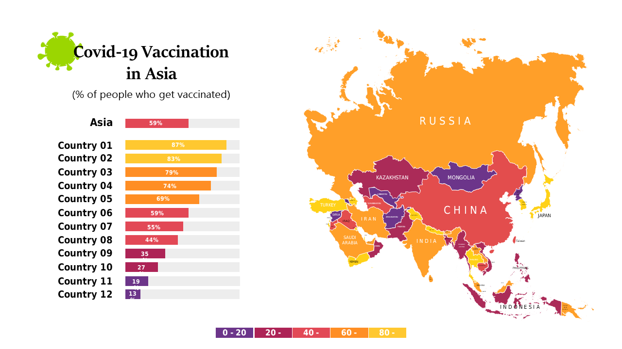
In today’s fast-paced world, presenting clear and impactful data is crucial, especially when discussing critical topics like COVID-19 vaccination rates. This slide showcases a color-coded map of Asia, clearly indicating vaccination rates by country. Accompanying data bars enhance comparative analysis, making it easy to grasp the varying levels of vaccination across the region. As a data analyst, you can utilize this slide to present key insights during team meetings or reports, ensuring your audience understands the implications of the data at a glance. Business analysts can leverage this slide to highlight trends and make data-driven recommendations for health policies. Meanwhile, BI developers might find it useful to integrate this visual into dashboards or presentations to engage stakeholders effectively. Customization is simple, allowing you to adjust colors and data points to fit your specific narrative. $0.99 — add this single slide to any deck from the SlideSwift Slide Library. No subscription needed. Mix slides from any category to build your perfect deck.
Add more from this category to your custom deck