SlideSwift
By Category
💼Business 📊Infographics □Minimal 🕐Timelines ✨Neumorphic 🗑Diagrams 🔄Flow Charts ✨Glassmorphism 🎨Creative 🌍Abstract 🔄Cycle Diagrams 💎Isometric 🖼Illustrations 📱Social Media 🗺MapsBy Slide Type
🚀Pitch Deck 📌Roadmap 🔍SWOT Analysis 📅Timeline 📈Gantt Chart 🏢Org Chart 📋Funnel ⚖Comparison 📄Case Study 📋Agenda ⭐Icons & Lists 👏Thank You
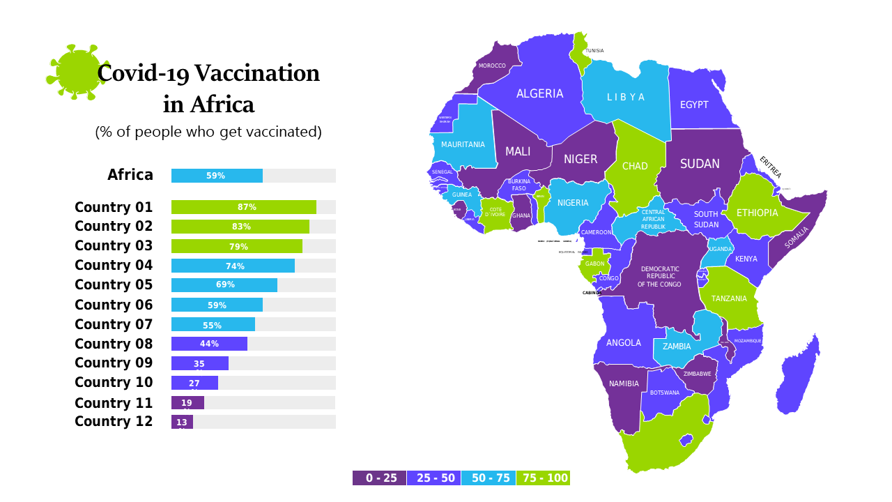
In today’s data-driven world, presenting complex information in a clear, engaging way is crucial. Many professionals find it challenging to convey the nuances of vaccination data, particularly when addressing diverse audiences. This slide offers a choropleth map detailing COVID-19 vaccination rates across African countries, paired with a supporting bar chart that highlights key statistics. The combination ensures your audience can easily grasp the information at a glance. A BI developer can utilize this slide to create impactful reports that resonate with stakeholders. A finance lead may incorporate it to analyze the economic implications of vaccination rates on healthcare spending. Meanwhile, a data analyst can leverage this visual to identify trends and make data-backed recommendations. Customizing the color scheme or adding specific data points is simple, allowing you to tailor the slide to your unique presentation needs. $0.99 — add this single slide to any deck from the SlideSwift Slide Library. No subscription needed. Mix slides from any category to build your perfect deck.
Add more from this category to your custom deck