SlideSwift
By Category
💼Business 📊Infographics □Minimal 🕐Timelines ✨Neumorphic 🗑Diagrams 🔄Flow Charts ✨Glassmorphism 🎨Creative 🌍Abstract 🔄Cycle Diagrams 💎Isometric 🖼Illustrations 📱Social Media 🗺MapsBy Slide Type
🚀Pitch Deck 📌Roadmap 🔍SWOT Analysis 📅Timeline 📈Gantt Chart 🏢Org Chart 📋Funnel ⚖Comparison 📄Case Study 📋Agenda ⭐Icons & Lists 👏Thank You
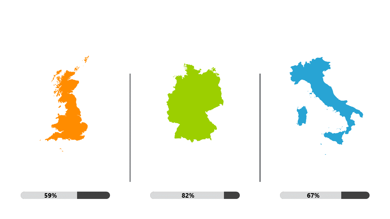
As a data analyst, you often find yourself needing to present complex information in a clear and engaging way. This slide allows you to compare country metrics through visually appealing maps paired with percentage progress bars, making it easier for your audience to grasp performance differences at a glance. The layout clearly highlights key statistics, ensuring your insights stand out. For business analysts, this slide serves as an excellent tool to showcase regional performance in reports or during meetings, allowing you to quickly communicate findings to stakeholders. Similarly, BI developers will appreciate how this visual can complement dashboards, providing a clear snapshot of progress across different regions. Customizing the colors and data points is straightforward, making it easy to tailor the slide to fit your specific needs. This slide is not just a visual aid; it’s a powerful communication tool that adds value to your presentations. $0.99 — add this single slide to any deck from the SlideSwift Slide Library. No subscription needed. Mix slides from any category to build your perfect deck.
Add more from this category to your custom deck