SlideSwift
By Category
💼Business 📊Infographics □Minimal 🕐Timelines ✨Neumorphic 🗑Diagrams 🔄Flow Charts ✨Glassmorphism 🎨Creative 🌍Abstract 🔄Cycle Diagrams 💎Isometric 🖼Illustrations 📱Social Media 🗺MapsBy Slide Type
🚀Pitch Deck 📌Roadmap 🔍SWOT Analysis 📅Timeline 📈Gantt Chart 🏢Org Chart 📋Funnel ⚖Comparison 📄Case Study 📋Agenda ⭐Icons & Lists 👏Thank You
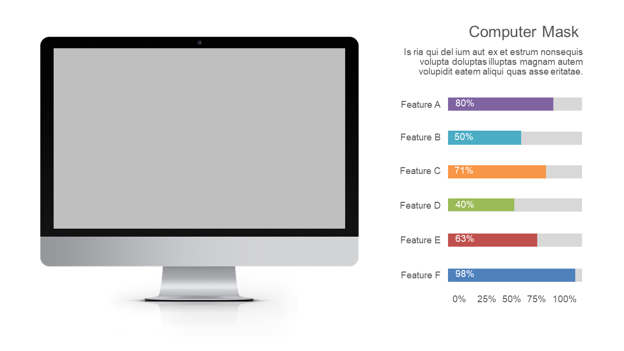
When presenting data, making complex comparisons clear can be a challenge. You need a way to communicate feature performance effectively without overwhelming your audience. This slide showcases a Computer Mask chart that presents feature comparisons in a straightforward manner, using percentage bars and descriptive labels for clarity. With its clean layout, the slide draws attention to key metrics, making it easy for your audience to grasp essential insights quickly. A BI developer can use this slide to illustrate software capabilities side by side, enhancing understanding during stakeholder presentations. Meanwhile, a finance lead can leverage the same layout to compare features of different financial tools, showcasing how each aligns with the company’s goals. A data analyst can take advantage of this slide to highlight variations in performance across products, providing actionable insights for decision-making. Plus, you can easily customize the colors and labels to match your brand or specific data needs. $0.99 — add this single slide to any deck from the SlideSwift Slide Library. No subscription needed. Mix slides from any category to build your perfect deck.
Add more from this category to your custom deck