SlideSwift
By Category
💼Business 📊Infographics □Minimal 🕐Timelines ✨Neumorphic 🗑Diagrams 🔄Flow Charts ✨Glassmorphism 🎨Creative 🌍Abstract 🔄Cycle Diagrams 💎Isometric 🖼Illustrations 📱Social Media 🗺MapsBy Slide Type
🚀Pitch Deck 📌Roadmap 🔍SWOT Analysis 📅Timeline 📈Gantt Chart 🏢Org Chart 📋Funnel ⚖Comparison 📄Case Study 📋Agenda ⭐Icons & Lists 👏Thank You
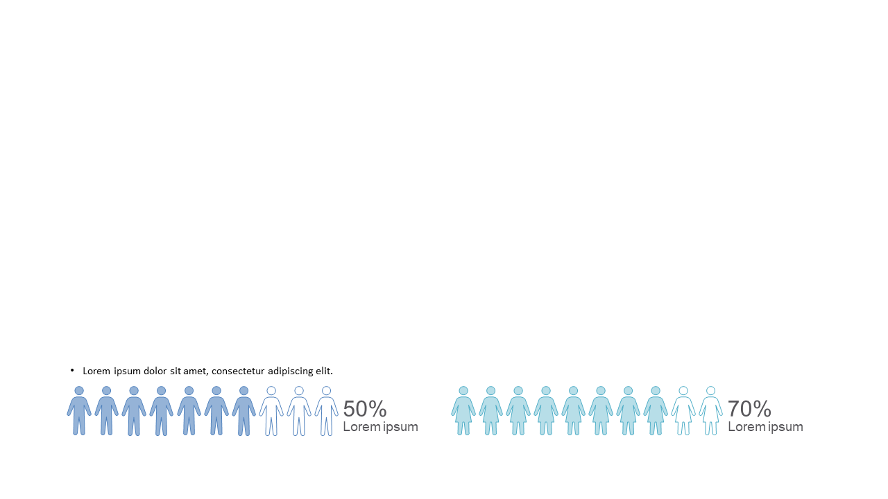
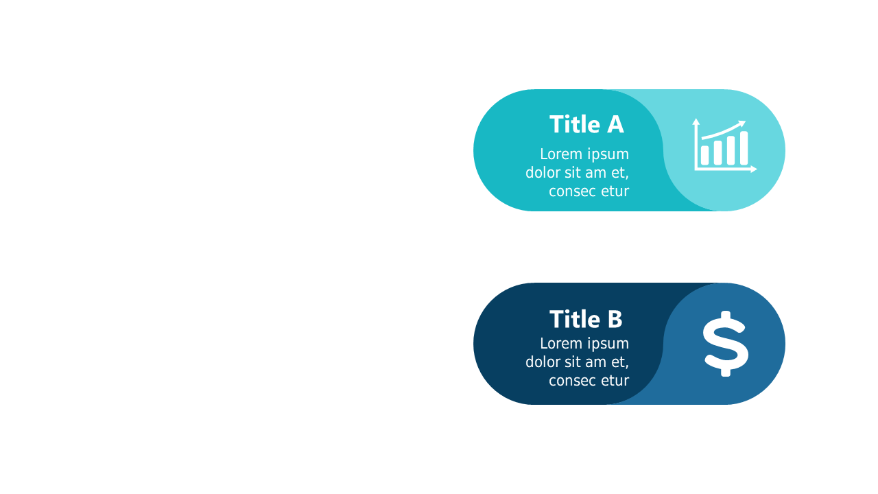
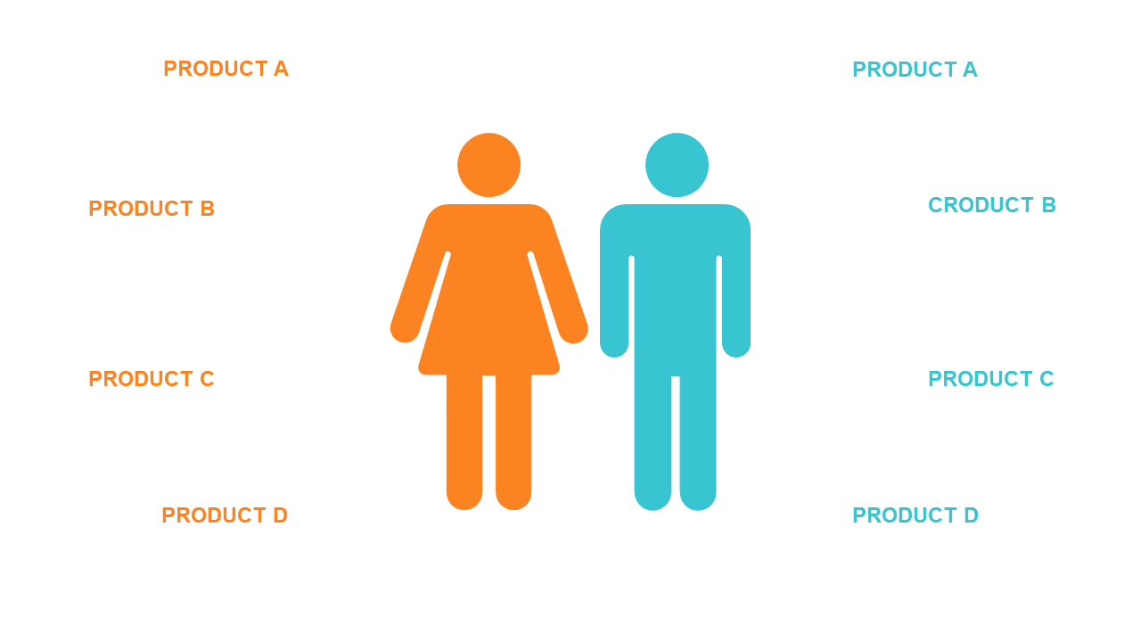
When you need to present data clearly, this slide is your solution. It provides a side-by-side comparison of two groups with eye-catching icons and percentage indicators, making complex information easy to digest. The visual design allows you to highlight key differences and similarities, ensuring your audience grasps the critical points quickly. As a sales lead, you can use this slide to effectively demonstrate the performance metrics of two different products, showcasing the advantages to your team or clients. A strategy manager could leverage this slide to compare market segments and their respective growth percentages, facilitating informed decision-making during strategic meetings. For analysts, this slide serves as an excellent tool for displaying survey results, allowing for straightforward interpretation of demographic data. Plus, the icons, colors, and percentage figures are fully customizable to fit your brand. $0.99 — add this single slide to any deck from the SlideSwift Slide Library. No subscription needed. Mix slides from any category to build your perfect deck.
Add more from this category to your custom deck