SlideSwift
By Category
💼Business 📊Infographics □Minimal 🕐Timelines ✨Neumorphic 🗑Diagrams 🔄Flow Charts ✨Glassmorphism 🎨Creative 🌍Abstract 🔄Cycle Diagrams 💎Isometric 🖼Illustrations 📱Social Media 🗺MapsBy Slide Type
🚀Pitch Deck 📌Roadmap 🔍SWOT Analysis 📅Timeline 📈Gantt Chart 🏢Org Chart 📋Funnel ⚖Comparison 📄Case Study 📋Agenda ⭐Icons & Lists 👏Thank You
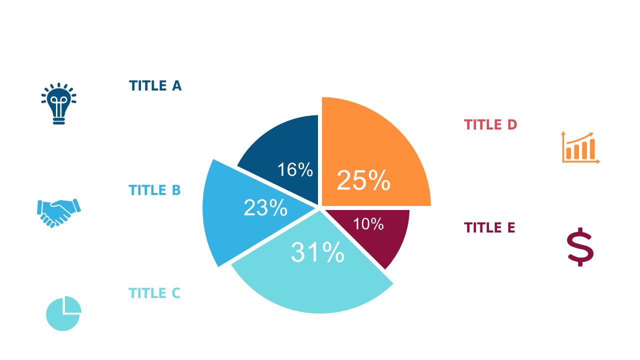
As a business analyst, you often face the challenge of making complex data relatable and engaging. This slide showcases a colorful pie chart that effectively breaks down percentage distributions across various categories, making it visually appealing and easy to comprehend. Imagine dropping this slide into your next PowerPoint presentation to convey important data trends or comparisons with clarity and style. For BI developers, this slide serves as an excellent tool to visualize insights derived from data analytics, allowing you to present findings in a straightforward manner during team meetings or client pitches. Finance leads can utilize this slide to succinctly summarize budget allocations or expense distributions, ensuring that stakeholders grasp the critical figures without getting lost in details. The slide is fully customizable, allowing you to update colors and categories to fit your specific needs. $0.99 — add this single slide to any deck from the SlideSwift Slide Library. No subscription needed. Mix slides from any category to build your perfect deck.
Add more from this category to your custom deck