SlideSwift
By Category
💼Business 📊Infographics □Minimal 🕐Timelines ✨Neumorphic 🗑Diagrams 🔄Flow Charts ✨Glassmorphism 🎨Creative 🌍Abstract 🔄Cycle Diagrams 💎Isometric 🖼Illustrations 📱Social Media 🗺MapsBy Slide Type
🚀Pitch Deck 📌Roadmap 🔍SWOT Analysis 📅Timeline 📈Gantt Chart 🏢Org Chart 📋Funnel ⚖Comparison 📄Case Study 📋Agenda ⭐Icons & Lists 👏Thank You
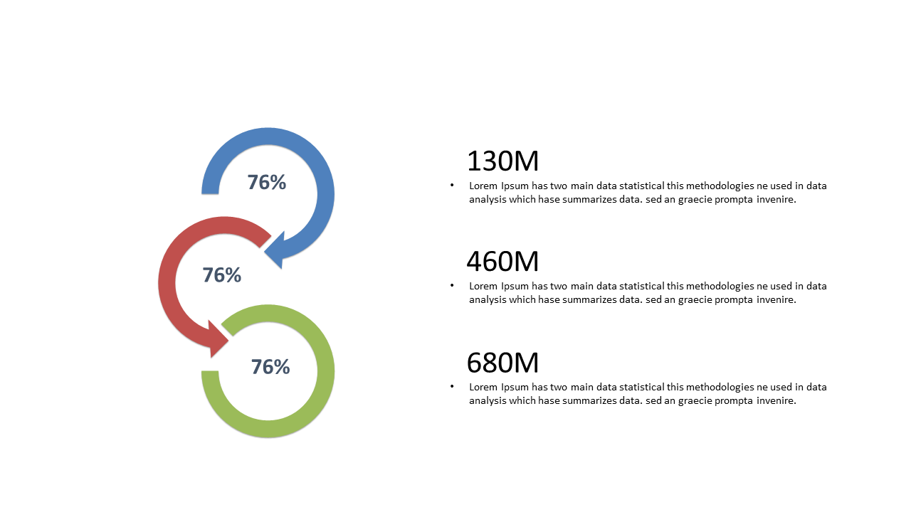
As a business analyst, presenting data in a way that captures attention is essential. This slide uses circular percentage indicators to visually compare metrics, making complex information easier to digest. You’ll see vibrant circular elements alongside numerical data that clearly highlight differences between values. Imagine dropping this slide into your next presentation to communicate key insights on social media engagement. A BI developer can utilize this slide to showcase performance metrics, allowing stakeholders to grasp trends at a glance. Similarly, a finance lead can use the circular indicators to illustrate budget allocations, ensuring clarity in financial discussions. The customization options are straightforward; you can easily edit the numbers, colors, and text to match your branding or specific context. This slide is not just another visual; it’s an impactful way to tell your data story. $0.99 — add this single slide to any deck from the SlideSwift Slide Library. No subscription needed. Mix slides from any category to build your perfect deck.
Add more from this category to your custom deck