SlideSwift
By Category
💼Business 📊Infographics □Minimal 🕐Timelines ✨Neumorphic 🗑Diagrams 🔄Flow Charts ✨Glassmorphism 🎨Creative 🌍Abstract 🔄Cycle Diagrams 💎Isometric 🖼Illustrations 📱Social Media 🗺MapsBy Slide Type
🚀Pitch Deck 📌Roadmap 🔍SWOT Analysis 📅Timeline 📈Gantt Chart 🏢Org Chart 📋Funnel ⚖Comparison 📄Case Study 📋Agenda ⭐Icons & Lists 👏Thank You
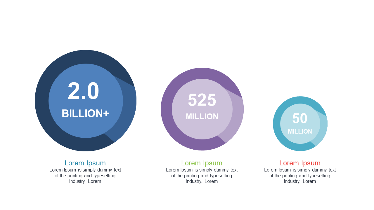
Keeping your audience engaged with data can be a challenge, especially when you need to present complex metrics clearly. This slide showcases three circular indicators, each displaying numerical data in a visually appealing manner, making it easy for viewers to grasp the differences at a glance. Perfect for any presentation, these indicators allow for straightforward customization of figures and text, ensuring your data is always front and center. As a finance lead, you might use this slide to compare quarterly results against targets, providing a clear visual representation that resonates with stakeholders. Data analysts can leverage this slide to present data trends over time, making it simple to identify shifts in performance. Meanwhile, business analysts can use it to illustrate the impact of different strategies across metrics, helping teams make informed decisions. Feel free to edit the colors and sizes to match your branding.
$0.99 —
add this single slide to any deck from the SlideSwift Slide Library. No subscription needed. Mix slides from any category to build your perfect deck.
$0.99 – Purchase Checkout
Added to cart
Add more from this category to your custom deck