SlideSwift
By Category
💼Business 📊Infographics □Minimal 🕐Timelines ✨Neumorphic 🗑Diagrams 🔄Flow Charts ✨Glassmorphism 🎨Creative 🌍Abstract 🔄Cycle Diagrams 💎Isometric 🖼Illustrations 📱Social Media 🗺MapsBy Slide Type
🚀Pitch Deck 📌Roadmap 🔍SWOT Analysis 📅Timeline 📈Gantt Chart 🏢Org Chart 📋Funnel ⚖Comparison 📄Case Study 📋Agenda ⭐Icons & Lists 👏Thank You
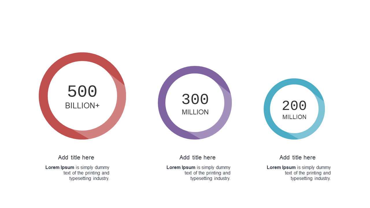
Presenting data in a clear, engaging way can be a challenge, especially with complex metrics that need to be easily understood. This circular data comparison slide uses visually appealing circular elements to represent your data, allowing your audience to grasp insights quickly. The layout is clean and modern, perfect for anyone looking to make a strong visual impact in their next PowerPoint presentation. As a finance lead, you can use this slide to showcase key financial metrics in a straightforward manner that resonates with stakeholders. A data analyst might find it invaluable for comparing various data sets during a review meeting, helping to highlight trends and discrepancies. Meanwhile, a business analyst can utilize this slide to present findings in a way that encourages discussion and decision-making.
You can easily customize the text and colors to match your brand’s style.
$0.99 —
add this single slide to any deck from the SlideSwift Slide Library. No subscription needed. Mix slides from any category to build your perfect deck.
$0.99 – Purchase Checkout
Added to cart
Add more from this category to your custom deck