SlideSwift
By Category
💼Business 📊Infographics □Minimal 🕐Timelines ✨Neumorphic 🗑Diagrams 🔄Flow Charts ✨Glassmorphism 🎨Creative 🌍Abstract 🔄Cycle Diagrams 💎Isometric 🖼Illustrations 📱Social Media 🗺MapsBy Slide Type
🚀Pitch Deck 📌Roadmap 🔍SWOT Analysis 📅Timeline 📈Gantt Chart 🏢Org Chart 📋Funnel ⚖Comparison 📄Case Study 📋Agenda ⭐Icons & Lists 👏Thank You
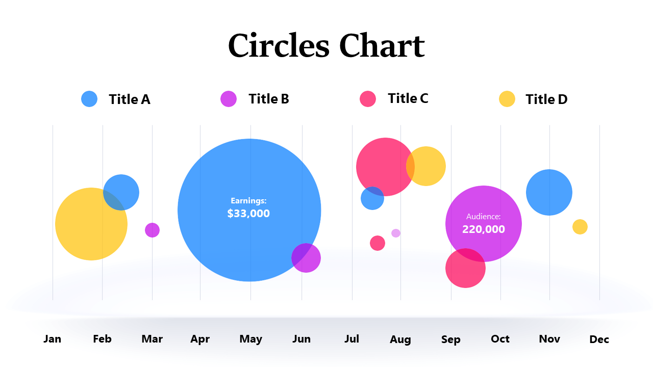
Tracking earnings trends can often feel overwhelming, especially when trying to present complex data in a way that’s easy to understand. This bubble chart simplifies that challenge, using varying sizes and colors to represent different metrics related to earnings over time, allowing you to see trends at a glance. Picture yourself inserting this compelling visual into your next PowerPoint presentation, immediately capturing your audience’s attention with clear, actionable insights. A business analyst can leverage this slide to illustrate key performance indicators and trends, making data discussions more engaging. Meanwhile, a BI developer might find this slide invaluable for reporting purposes, presenting data in a visually appealing way that invites deeper analysis. For finance leads, this chart provides a powerful tool for presenting year-over-year earnings growth in stakeholder meetings, driving home the story behind the numbers. Feel free to customize colors and labels to match your branding or specific data needs. $0.99 — add this single slide to any deck from the SlideSwift Slide Library. No subscription needed. Mix slides from any category to build your perfect deck.
Add more from this category to your custom deck