SlideSwift
By Category
💼Business 📊Infographics □Minimal 🕐Timelines ✨Neumorphic 🗑Diagrams 🔄Flow Charts ✨Glassmorphism 🎨Creative 🌍Abstract 🔄Cycle Diagrams 💎Isometric 🖼Illustrations 📱Social Media 🗺MapsBy Slide Type
🚀Pitch Deck 📌Roadmap 🔍SWOT Analysis 📅Timeline 📈Gantt Chart 🏢Org Chart 📋Funnel ⚖Comparison 📄Case Study 📋Agenda ⭐Icons & Lists 👏Thank You
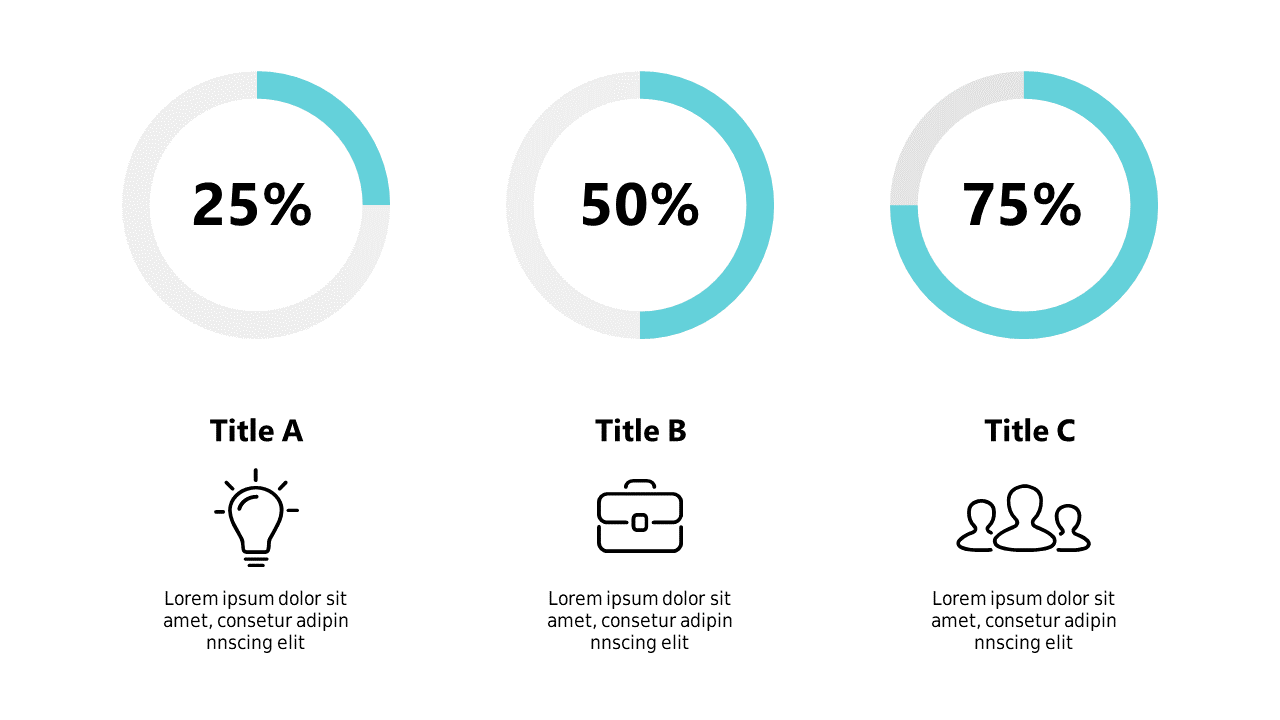
When you’re tasked with presenting data, clarity is paramount. You need a way to visually communicate progress that resonates with your audience. This slide uses percentage circles to display key metrics, allowing you to illustrate progress at a glance. Each circle represents a different data point, making it easy to compare results and showcase achievements in a compelling manner. As a BI developer, you can leverage this slide to demonstrate how your projects are advancing against set goals. The finance lead can utilize these visuals to convey the status of budgetary metrics, helping stakeholders quickly grasp financial health. Meanwhile, data analysts can use this slide to summarize findings in reports, making data insights more accessible. The circles are fully customizable, letting you adjust colors and labels to fit your presentation style. $0.99 — add this single slide to any deck from the SlideSwift Slide Library. No subscription needed. Mix slides from any category to build your perfect deck.
Add more from this category to your custom deck