SlideSwift
By Category
💼Business 📊Infographics □Minimal 🕐Timelines ✨Neumorphic 🗑Diagrams 🔄Flow Charts ✨Glassmorphism 🎨Creative 🌍Abstract 🔄Cycle Diagrams 💎Isometric 🖼Illustrations 📱Social Media 🗺MapsBy Slide Type
🚀Pitch Deck 📌Roadmap 🔍SWOT Analysis 📅Timeline 📈Gantt Chart 🏢Org Chart 📋Funnel ⚖Comparison 📄Case Study 📋Agenda ⭐Icons & Lists 👏Thank You
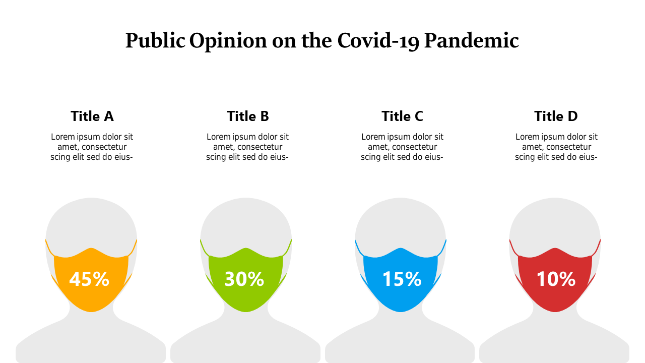
In today’s fast-paced world, delivering clear insights quickly is essential. This slide offers a clean and impactful bar chart designed specifically for presenting public opinion on the COVID-19 pandemic. The chart is visually appealing, segmented into three demographic categories, allowing for easy comparisons and a straightforward narrative.
Data analysts can use this slide to effectively communicate survey results, ensuring that critical insights are accessible. Business analysts might find it useful for illustrating market research findings, making data relatable for stakeholders. BI developers can leverage this slide to enhance dashboards and reports, providing a visual representation that supports data-driven decisions.
Customization is simple; you can easily adjust the colors or labels to better fit your brand or specific data points. Whether you need to present findings in a meeting or create engaging reports, this slide is the perfect addition. $0.99 — add this single slide to any deck from the SlideSwift Slide Library. No subscription needed. Mix slides from any category to build your perfect deck.
Add more from this category to your custom deck